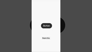
How make buttons not boring
30 Mar 2026 · 1 min
0:42
Learn how to add depth to a button with inner shadows, gradients, and realistic outer shadows in Framer. A top white shadow creates shine, a bottom black shadow adds depth, and a hover state that lightens the button makes it feel interactive and real.
Chapters
More from Andres


youtube.com
Claude Design, meet Aqua Chat (anyone else obsessed with Aqua UI 👀) #claude #design @claude #ad
2w ago
youtube.com
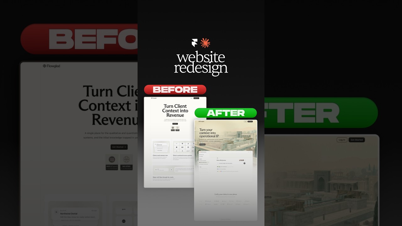
Website redesign for the coolest Y-Combinator startup everrrrr 😏#framer #webdesign #ad
2w ago



youtube.com
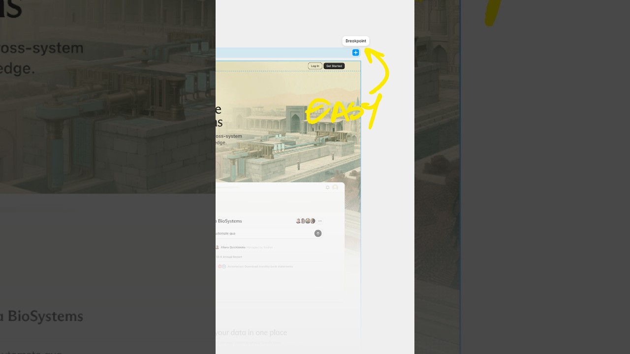
Break barriers by letting Framer agents' break points 😏 #webdesign #framer #framerpartner
2mo ago