How to create buttery smooooth text animations 🦇
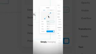
In this tutorial segment, the creator critiques a basic text animation that uses a linear easing, describing it as flat and unappealing. He demonstrates three concrete improvements to make the animation feel smoother and more premium: (1) replace the linear easing with Framer’s built-in spring easing, which adds natural acceleration and deceleration; (2) introduce a slight delay for the sub‑headline and apply a per‑word stagger so the animation follows the page’s visual hierarchy; and (3) add a subtle 10‑pixel blur to the text, giving it a high‑end, “Bruce Wayne” polish. These steps collectively transform a rough animation into a buttery‑smooth, visually hierarchical, and premium‑looking effect.
Chapters
More from Andres

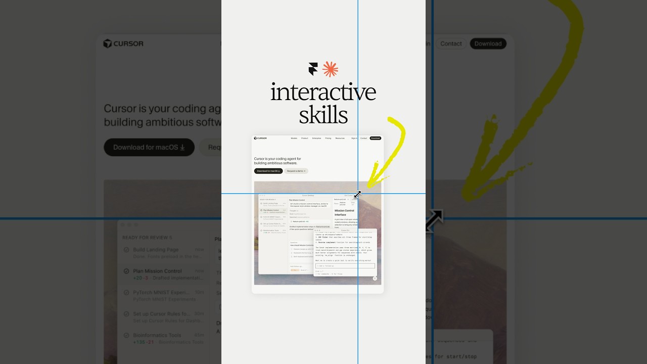

Claude Design, meet Aqua Chat (anyone else obsessed with Aqua UI 👀) #claude #design @claude #ad

Website redesign for the coolest Y-Combinator startup everrrrr 😏#framer #webdesign #ad
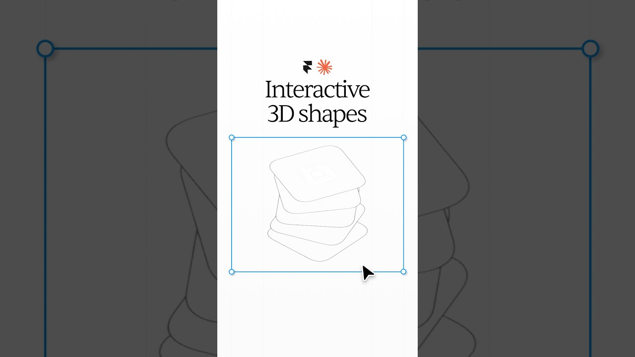




Break barriers by letting Framer agents' break points 😏 #webdesign #framer #framerpartner