Learn Figma in 10 Minutes! Beginner Tutorial

A 10-minute walkthrough of Figma's core tools: Auto Layout for responsive navigation, constraints for frame resizing, components and variants for reusable buttons with hover states, and prototyping with animations. Includes a hands-on exercise to rebuild an AirPods Max webpage.
Chapters
Step 1: Figma Basics. Before we start designing anything, we need to get familiar with Figma. There are 4 sections that I want you to pay attention to: the canvas, the top menu, and the left and right sidebar. You'll see the top menu here where you can find things like the move tool where you can move or edit elements on the canvas. You'll also find the frame tool where you can create frames that act like screens on a device, but frames also act as containers for things like buttons and other elements. We have the shape tool where you can create shapes, the pen tool where you can draw lines and bend them, and also the pencil tool where you can draw lines and and bend them. We have this text tool and the resources menu where you can find components, plugins, and widgets. We have the hand tool where you can grab the canvas and move it around. And finally, the comment tool where your future clients can pin a comment like, "Can we make this logo bigger?" I'm like, "No, God! No, God, please!" Now this is the canvas. Here we'll be doing most of our design work. We can select and move elements, edit text, design buttons, and create frames. And notice that when we select something on the canvas, the element becomes highlighted on the layers panel within this sidebar, which brings us to the left sidebar. The left sidebar will have this layers panel, which will represent the elements we have on the canvas. Create a frame, you'll see it pop up here in the layers panel. Then create a button within the frame and you'll see it nested within this layer. On the left sidebar, you'll also find assets and pages. Assets can be reusable components like buttons or icons, and you'll also be able to create different pages within every Figma file. Which brings us to the right sidebar, which contains a design, prototype, and the inspect panel. By default, when you select something on the canvas, your design panel will automatically change to show all the properties of the thing you just selected. Here you can edit size and position, add auto layout, set a grid, change colors, add stroke and other effects, and finally export. But we also have this prototype panel where you can set specific interactions like animating a button on hover or clicking a button to navigate to a different frame. And then we have the inspect panel where developers can view your design as code. And that's the basics of Figma. Step 2: Auto Layout. Before we continue, you'll need to download the free Figma file that I've linked in the video description down below. This way you'll be able to follow along for the rest of the tutorial. So this is Auto Layout. It's one of those secret sauce features that makes Figma different than other design tools. And the cool thing about Auto Layout as well is that you can basically type in some text here like subscribe to the YouTube channel, shameless plug, and it adapts. So if you haven't subscribed already, you should probably, you should probably do that. So Auto Layout helps us create responsive buttons, but it can do much more than that. Let's take Apple's comparison section, for example. With Auto Layout applied, we can automatically change vertical padding, horizontal padding, the padding between elements, and even the way that they're stacked. So let's try to recreate Apple's top navigation bar. I've taken a screenshot of Apple's webpage here, and we'll design right above it. So the first thing that I'm gonna do is whack F on my keyboard click and drag, click Fill, Color Picker, and get the exact color I need. Then I'm gonna hit T on my keyboard and click within this frame and then type store. I'm going to change the font style to SF Pro Regular, 12, auto, and change this white to 90%. Then I'm gonna copy and paste and update this text respectively. Now we're ready to apply auto layout. Once applied, Figma automatically creates some of these settings for us. But we'll change this later. Now I just want to grab Apple's logo and their search and shopping bag icon here. Copy and paste. Voilà, we're getting close. Now it's time to adjust those auto layout settings. I see the proper direction is already applied. We'll change the spacing to 33, horizontal padding to 30, and vertical padding to 13. And you want to center everything in the middle. And I also want you to pay attention to this frame section here. When Auto Layout is applied, you'll see some additional options for horizontal and vertical resizing. We want to apply fixed width to our horizontal control because we want to manually change the width ourselves. However, notice how the navigation bar is thicker than Apple's. That's because some of our icons have a fixed height and our nav bar is hugging them. So to get the height that we want for our nav bar, we'll set the height to these icons to fill. Perfect. And that's Auto Layout. So if you're loving this tutorial so far, it's actually been supported by Tella. Think of them as your all-in-one screen recording software. You can send a quick video message about your designs to the rest of your team and skip those tedious meetings. And you can even use Tella to create tutorials like this one. I actually use Tella for a lot of the shots that you saw in this video. I was able to play cool backgrounds, change my layout, and export in 4K for those zoom-in shots. And you can actually sign up completely for free. So if you want to support me in creating more of these sort of videos, then support Tella by creating your free account. Now back to the tutorial. Step 3: Constraints and responsive design. Constraints determine how things Things like your navigation bar should respond when we resize our frame. This helps us create responsive design. And this is what constraints look like. We have the horizontal and the vertical constraint. But let me show you how it works. Let's create the main screen of our webpage. I'll set this frame to 1920 by 1080 pixels. Then I'll move our navigation bar into this frame. And if you've downloaded the free Figma file below, you'll also find the secondary navbar with a hero section ready for you to copy and paste. And now we'll set the horizontal constraint to scale because we want these items to scale horizontally as I make the width longer or shorter. But let's also take a deeper look into constraints set on this hero section. This hero section has constraints, but these two images within this hero section also also have separate constraints, constraint inception. If I set the AirPods Max to center and center, then it will remain the same size as I change the width of the frame. However, if we take a look at Apple's live site, we'll notice that the image does scale as your screen gets wider. So let's change it back to scale. And that's constraints and responsive design in Figma. Step number 4, components. Components are elements you can reuse across your designs. They can be reusable things like buttons, icons, navigation bars, and more. Ultimately, components help you create consistency across your designs, and they also save you tons of time. Let me show you how it works by making this button into a component. I select the button, then press Option Command K on my keyboard, and that creates a main component. And if I copy and paste this button, it creates an instance or a copy of the main component. If I change the color of the main component, it changes it across all instances. But if I change the color of one of the instances, it doesn't affect anything else. So let's create a hover state on this button, just like Apple does it. I'll select the component and create a variant property here. Then I'll apply auto layout to organize my variants. Copy and paste, rename this variant to hover, and I'll make this more transparent to 90%. Now I'll go to the prototype tab, select the default variant, click and drag to the hover variant, and change on click to while hovering. And to smooth it out, I'll change the animation to dissolve and set the animation time to 150 milliseconds. Now you should do the same thing for other links on the navigation bar as well, and we'll see how all this works in step 5, which brings us to step 5, prototypes. This is one of my favorite features of Figma. Prototypes make our designs interactive. It gets us closer to the real thing, and that's really cool. You'll find the prototype panel here on the right sidebar. When you don't have anything selected on the canvas, you can choose the device you'd like to use for your prototype. In our case, I'll create a custom size of 1920 by 1080 pixels. However, every page on Figma can have a different prototype setting, so you can create a separate page for desktop and mobile. When you want to share and play with your prototype, simply click on this play button here. But let's try to prototype this section on Figma. First, let's list out some observations. Each color has a hover and active state, and when clicked, the left image appears to be sliding in from a row, and the right image seems to be animating in place. Now, to make things easier for you, my free Figma file will have this component already created. All we have to do is make it interactive using the prototype panel. So let's go to the main component Color Gallery Wrapper. And like before, we go to the prototype panel and simply click and drag on the frame we'd like to change to. Silver should go with silver. We'll change this to smart animate and we'll set this to 30 milliseconds and ease in and out. And when we do the same thing for sky blue, our interaction settings automatically change to our most recent interaction. So now all we have to do is click and drag. Pink with pink, green with green, and we'll repeat this process on each variant. And now for the most exciting part. We're going to copy and paste one of these variants here, then click play. And voilà, it's like magic. And that, my friends, is the power of prototyping. Step 6: AirPods Max Webpage. Now, this step will be different from the rest. We'll be learning by doing. This step is an exercise that I want you to try instead of simply watching this video passively. You can try to apply what you've learned so far, and don't worry, you totally got this. My free Figma file will have all the different elements you need to put this webpage together. However, instead of copying and pasting, I'm challenging you to recreate some of these elements yourself. If you get stuck, you can always click on these elements and try to figure out what you might be missing. And before you try this exercise, you'll want to see step 7, HTML to Design. This Figma plugin will be an amazing tool for you to continue learning Figma. If there's a website that you're you're inspired by, simply copy and paste the URL here, and this plugin will literally turn HTML into design within your Figma file. It's not perfect, and sometimes it won't come out as expected, but it's a great way to practice your Figma design skills. Learning Figma by copying other designs is one of my favorite ways to learn. It'll teach you spacing, visual hierarchy, and other important design fundamentals subconsciously. And as long as you're not taking credit for their work, then don't be afraid to use this plugin and reverse engineer some designs. If you're looking for another great video to watch, I recommend watching one. May God bless your design journey. Till next time, adiós.
More from Andres

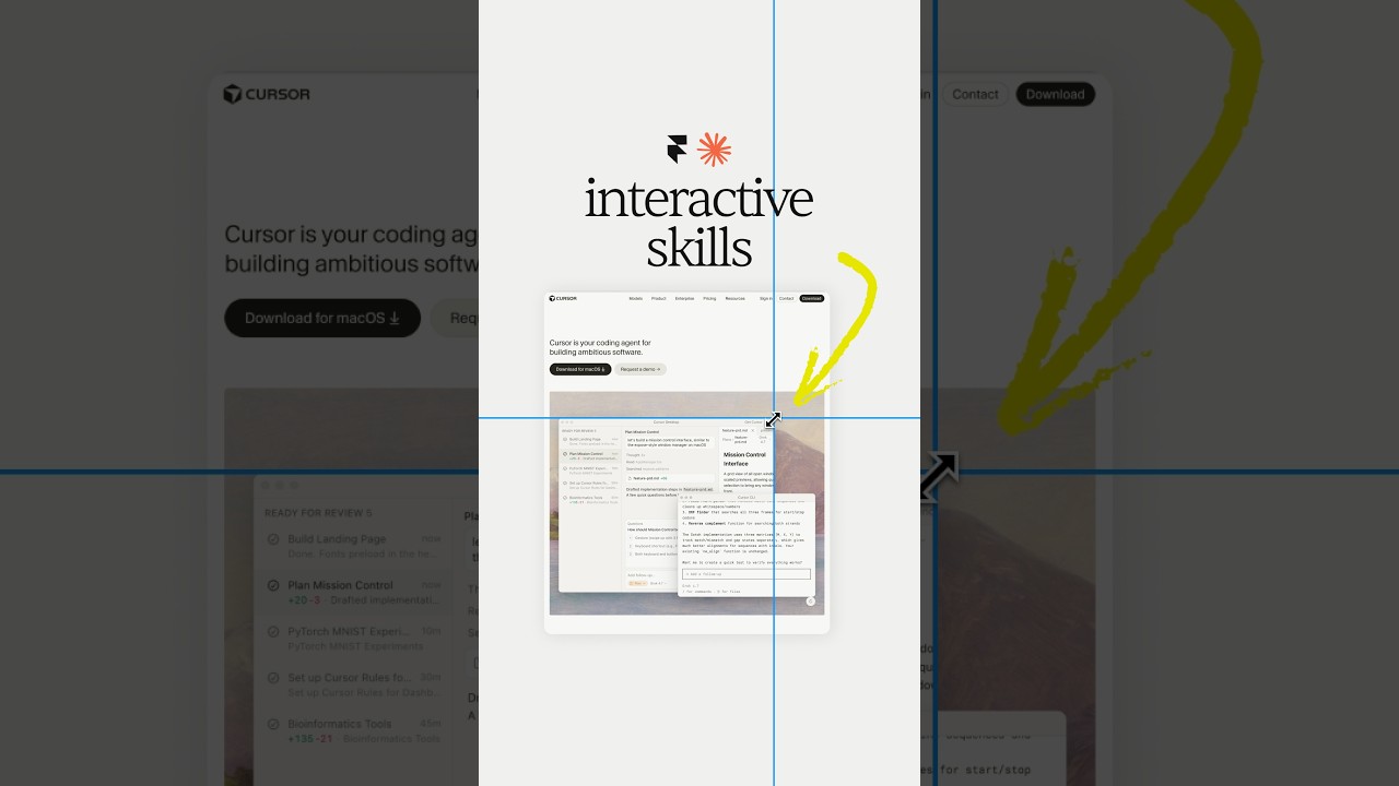

Claude Design, meet Aqua Chat (anyone else obsessed with Aqua UI 👀) #claude #design @claude #ad
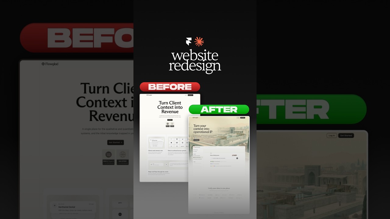
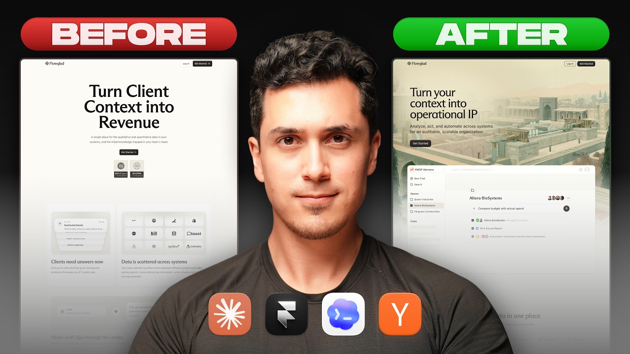
Website redesign for the coolest Y-Combinator startup everrrrr 😏#framer #webdesign #ad



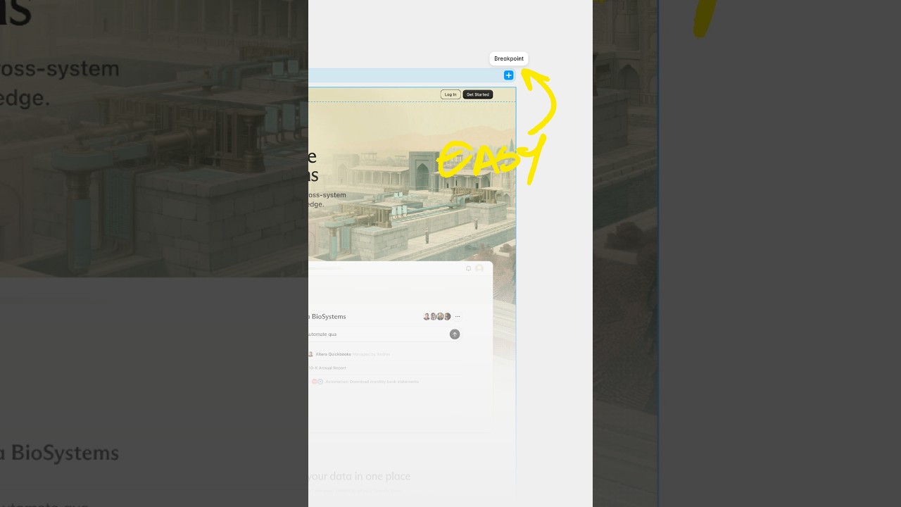
Break barriers by letting Framer agents' break points 😏 #webdesign #framer #framerpartner