Web design inspiration, but ✨ pretty ✨
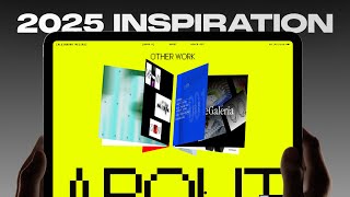
A walkthrough of visually striking websites built in Framer, featuring draggable letters, glitchy hovers, 3D typography, and scroll-driven interactions. Sites include D Studio, UX Tools by Tommy Gioko, Alejandro's portfolio, and Helena's design with Phosphor Icons. All examples showcase the kind of micro-interactions and spacing details that make designers obsess over websites.
Chapters
I know why you clicked on this video. You want some sick websites because you're weird. You're kind of weird like me. Today we're going to go through some websites for the weirdos who appreciate a good hover state or a good scrolling interaction or just good typography and spacing. This video isn't a recommendation of what your website should look like. It's mainly just some websites that I think look super dope, made by people who I think are also super dope. And each website gets better than the next. And for the real ones who make it to the end of this video, I got a special gift just for you. So we're starting off with D Studio, and right in this hero section, as I just move my cursor, I'm introduced to these really creative letters that represent the brand. And I can actually drag these letters around, which is like super playful and very creative, which I I personally really appreciate and I love what they have here. Rooted in deep thinking, we push past the expected, challenge conventions, and provoke curiosity. That is a line. And I really appreciate that. And they actually have really solid work as well that I really, really like. Like this is really, really well polished and well done. They have like a just super great just branding and style. And I'm a fan of dark mode as well. And look at that. Wow. With this really cool scrolling interaction. That's really dope. Oh, and that's really cool too. Nostalgia there. 1997. All right. This is really, really cool. I love this. And if you actually go check out one of these case studies, they're all really, really well put together. Like sometimes the work just really stands out and I, and I love that as well. This is UX Tools and I'm going to refresh again and we got this like glitch effect for UX, which I really like. And as you hover over each letter, What is that? That is a video with this color grain effect and a nostalgic interface on X. This is incredible. Really well put together. And it's not just like the U and X, it's like the art direction is just so good. This interaction is also really, really cool. Read manifesto. So this website was led by Tommy Gioko. He is a super sick designer. If you don't know him, you should. He has even a better voice than I do, which is saying something because I get a lot of comments about my voice. But this guy, you'll want to listen to him. He's a real optimist for the future, which is something that I subscribe to. I just love the art direction. Like every single piece of content here was meticulously crafted to fit the overall aesthetic of the brand. And I love all the subtle interactions and like everything is just so solid. I recommend just go to this website. You'll find something that I didn't even mention here in this video with a really delightful interaction. All right. We're going to check out Alejandro's portfolio. And he has this like really cool 3D letter of the first letter in his name, Alejandro. And I really like the art direction. Of this portfolio. It's really sick, really well put together. I love the typography and also like these little hover interactions as well. It's like sticky. I love that. And then as you scroll here is one of my favorite sections, actually. You can scroll through like almost a vintage album cover sort of thing and then you can click on an item. Okay, now you don't— that would be super sick though. Like if you can click on like an individual item and it'll actually navigate you to that specific project, that would be sick. And even this like change in typography That is very hard to execute and I think he did it tastefully well. So really great job, Alejandro. You are a phenomenal designer. And even like this transition between the gray and the yellow here is really, really good. Yeah, just phenomenal job, dude. Just phenomenal job. And then, uh, let's see if I can actually click on this. Read full case study. Here we go. Yeah, this is really, really cool. So every single website that you just saw was actually built on Framer, one of my favorite ways of building websites. 90% of my client and my personal projects are built with Framer because they do a really good job of balancing a simple and intuitive interface for designers, but making it powerful enough to see those like really cool interactions that we just saw and like a really complex CMS that I imagine UX Tools had to implement. Check out Framer if you haven't already. I'm going to link some free templates for you in the description down below for you just to test it out for yourself. So this is one of the most incredible websites I've ever seen. This is a typography agency. They create typefaces for clients and it's incredible. And this entire thing is a scrolling-based experience and you're going to see just how Look at that. Look, look at that. That is incredible. And like how each letter, like, it's spaced differently at each portion of the scroll. That is amazing. And, and then as you're scrolling, it just, it feels like it's telling a story. And it's, it's just really good. And you think it's done. Okay, you know, we're probably done by now. You know, you got You got these like hover states. Okay, cool. Maybe all the fancy stuff is over, right? No, there's another one. That is— this is incredible. Oh my, this is incredible. And like, you could just play around with this, right? So it's like left aligned and then center aligned. Oh, this is incredible. Just so creative. Oh, that's, that's crazy. Um, man, this is, this is one of the best websites I've ever reviewed. Seriously, like, I could just, can I could just do this forever. I don't know about you guys, but I could stay here forever just loving this. This is incredible. This is absolutely unbelievably good. This is too good. This is too good. Is this— is this a self-plug? So check this out. Have you ever wondered if Batman was a designer? You know, what would his portfolio look like? This is exactly that. As we kind of scroll through here, we can see like some really cool interactions. I wanted to make this like obviously dark mode, but like tastefully so. And, uh, if you go to like one of these, um, sections, the case study actually breaks from the dark mode. And, uh, we got this like sticky, uh, card view here. And one thing that I've learned as a product designer is if you have a case study, you got to mention results. And so in my case study, I made sure in my design that we include a place for their impact on any project that they worked on. The role, the team, the timeline. All this sort of stuff is like really important. You can also highlight your tech stack, which is really sick. And check out this contact page. And like, as you hover over some of these fields, like, look how that— look at that button, like the hover state. I really, really love it. Has like this glow to it. And then the about page, it's my boy Harrison and Agree. They're super sick too. They're super sick guys. Oh, that's a really, really cool intro. Oh, I love those interactions. Another really great scrolling experience. I'm not sure if you could tell, but like as I'm scrolling, it changes. Oh my gosh, that's really sick. It's really, really sick. Wow. Wow. And there's even music. Whoa, that's really cool too. That's super sick. Wow, man, this— ah! I'm like honestly speechless. Like, I don't even know what to say to this. Incredible. Absolutely jaw-dropping incredible work. These scroll-based experiences are just king. They're just king. They're really, really good. Oh man, and like amazing art direction too. Wow. Thoroughly impressed. You guys are going to love this one. Once upon a time, we pressed Enter. Boom. Clicking Enter. And our computers came to life. cd, rm, ping. Commands we memorized translate our desires into actions if you chose to learn them. So we made a computer to look more like our world, to make their immense power accessible to everyone. That is really, really cool. Like, this entire design here, how like this screen looks like a vintage computer screen, is absolutely Insane. Like, this is so good. Design feedback made simple. So I've just shared really, really highly interactive experiences. This one is beautifully simple, and that's kind of part of the message. And, uh, we got tasteful animations here, and it's by a really phenomenal designer and builder and now founder Michael Ridd. If you haven't already, you got to follow this guy. As we kind of scroll through, through here, it's like very simple to understand what's going on. Yeah, yeah, Inflight is like a mix between Loom and Granola for product teams. That's hilarious. That's by Tommy. So check it out. So let me tell you about Helena. First off, we got to pay homage to this profile icon that is like Simpsons inspired. That's really, really cool and creative. Um, but what I really love is that she actually is the creator and, uh, or collaborator, um, with Phosphor Icons, which I use all the time. Uh, they have one of the largest libraries of icons. I love it. It's really, really good. She also did a talk at Config that I thought was amazing. She just has like a really creative website As I hover over things, it like changes color, which I think is really nice. She's a phenomenal writer. She's a great, amazing designer. And she's just like one of those talented people that you also got to follow. Because she produces really great work. And she inspired me to think about design differently, which not a lot of designers do. Now we got 3tools. Do I know what this website is about? Not really. I think it's about 3 tools. No, it's a beautiful Three.js editor that works on every project. So it looks like it's like a 3D design developer tool, which is kind of interesting. That's really, really cool. It's a Chrome extension that allows you to inspect scenes. Yeah, that's, that's actually really interesting, huh? That's really, really cool. But, uh, yeah, I just, I love this like hero interaction, so I just wanted to share it. For those of you that actually made it to the end of this video, first off, thank you I love you, I appreciate you. And as promised, I'm putting this exclusive discount code here that gives you 50% off my Vengeance Portfolio template. It's only available for 50 people, which goes against, by the way, everything that I've learned about marketing to never discount your stuff. Uh, but I, I just really wanted to show my appreciation to anyone who like watches my videos until the end. Until next time, God bless you in everything that you do. Batman out.
More from Andres

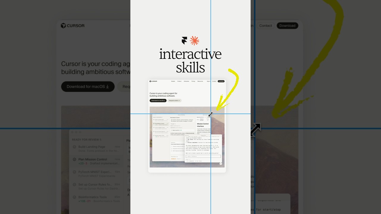

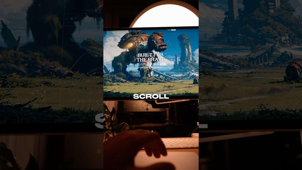
Claude Design, meet Aqua Chat (anyone else obsessed with Aqua UI 👀) #claude #design @claude #ad
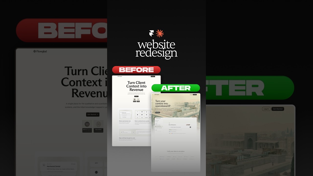
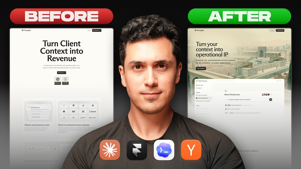
Website redesign for the coolest Y-Combinator startup everrrrr 😏#framer #webdesign #ad
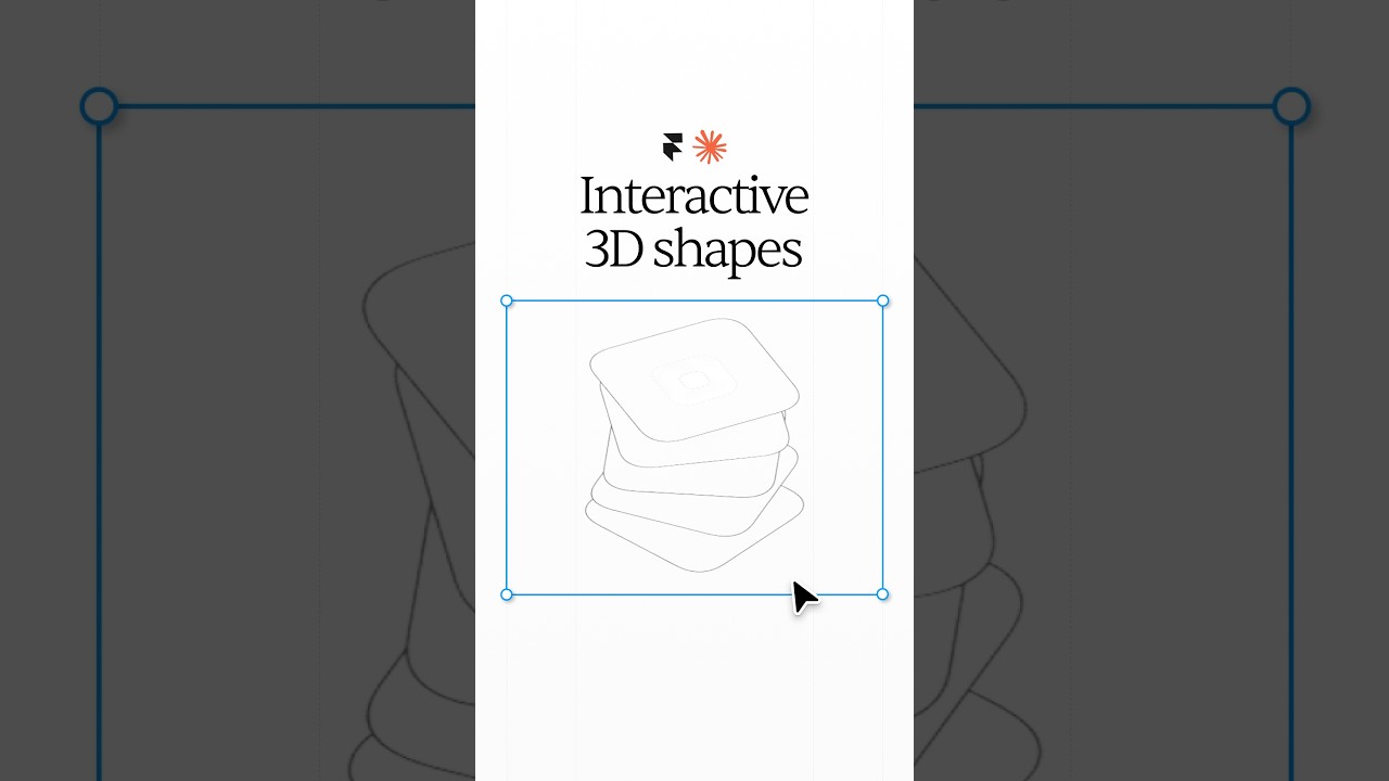


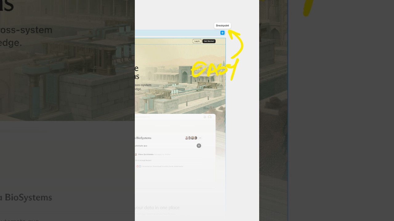
Break barriers by letting Framer agents' break points 😏 #webdesign #framer #framerpartner