In this video, designer Andres Gonzalez walks through his decade‑long portfolio evolution, starting with an ugly Wix site built during the 2020 COVID lockdown that sparked his departure from a corporate analyst role and the launch of his design agency, Start Here Studio. He recounts how a $3,000 Google Ads spend generated $175,000 across three client projects (Winger, Watering Can, Seed Market) built with a development partner, Noah. Dissatisfied with Wix’s limited mobile control, he migrated to Webflow, initially attracted by its visual design freedom but soon frustrated by nested class names, cumbersome component structures, and difficulty managing dark‑mode, video backgrounds, and complex interactions. Over several Webflow iterations he experimented with hover effects, scroll‑based animations, sidebars, and a “Batman” theme, each iteration exposing new technical debt and unfinished work. Discovering Framer, he highlights its streamlined styling system (global color and text styles), component reuse without class‑naming headaches, built‑in light/dark mode, easy page transitions, and superior viewport previewing. He praises Framer as the simplest yet most powerful website builder, notes his partnership with the platform, and shares free portfolio templates. The video ends with a call to subscribe for AI‑driven portfolio creation tutorials, a notification link for his upcoming Framer portfolio launch, and a request for viewer feedback.
Chapters
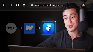
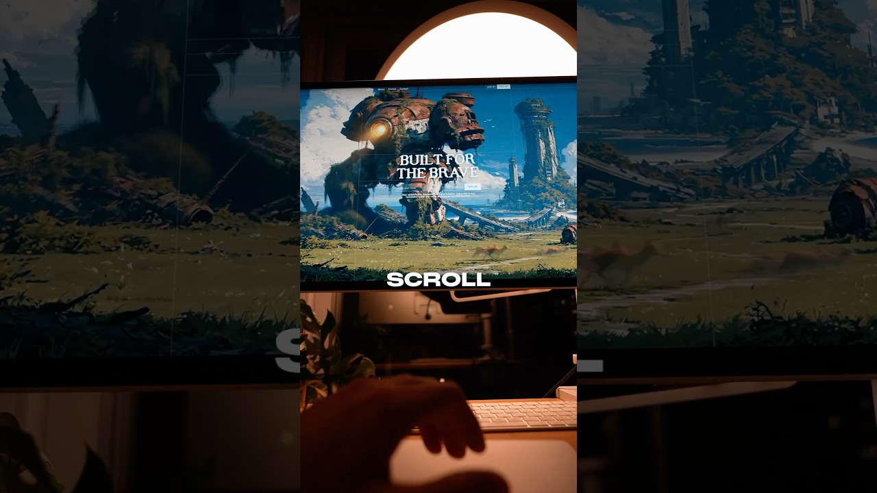
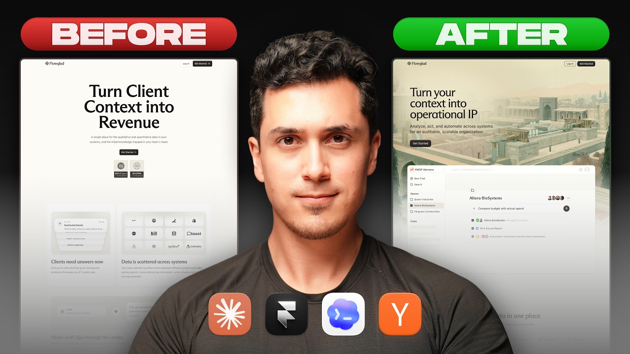
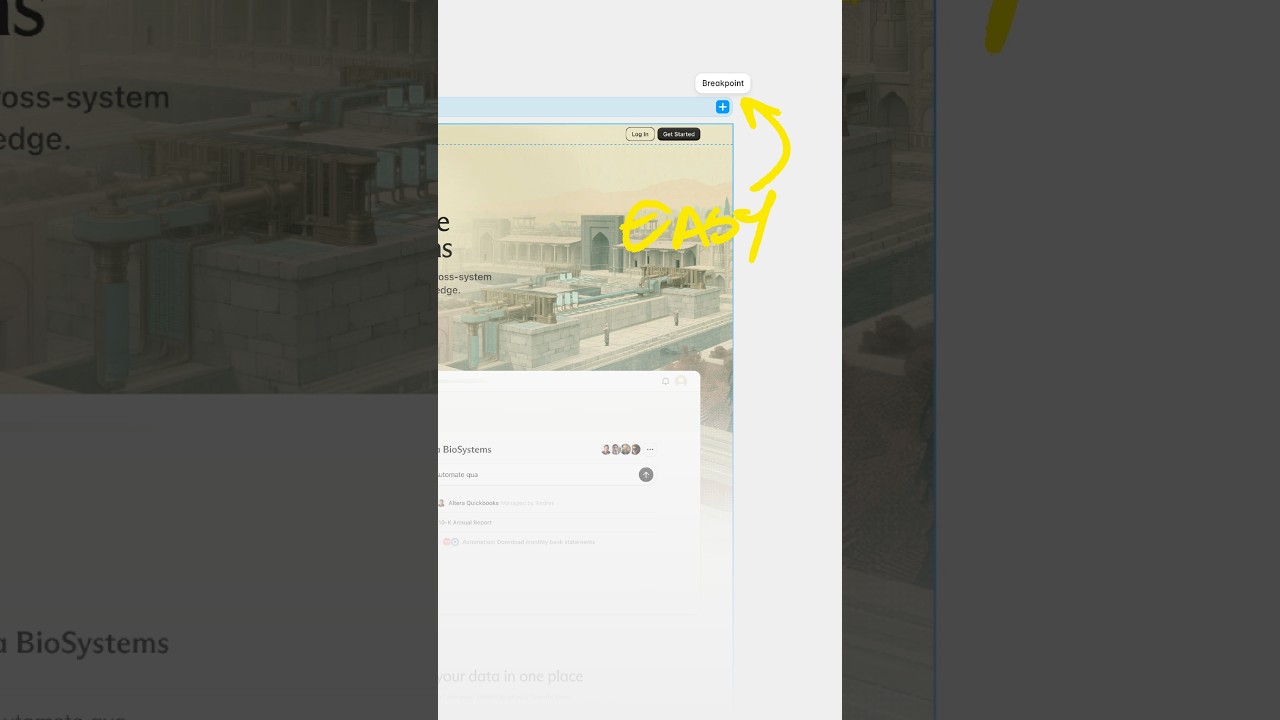
Get ready because I'm going to be exposing myself. Yeah, you heard that right. Yeah, I'm gonna be taking off my— by that I mean I'll be exposing some of the earliest, most embarrassing portfolios I've ever made. Portfolios that only my mother has called handsome. And I'll be sharing exactly why I'm moving my portfolio to Framer after 4 years of using Webflow. So it's gonna be a good one. Buckle in. This is my first portfolio I've ever made. It's ugly. It was built on Wix, but it holds a special place in my heart because in 2020, during the COVID lockdowns, I realized I was miserable in my 9-to-5 corporate job as an analyst. I had a come-to-Jesus moment and I realized that I was made to be a designer. And this agency portfolio website was the first step and being true to myself. So with only 3 months of savings, I quit my job and went all in on my design agency where I'd help founders launch their app ideas. Specifically, I would design and prototype their app ideas, and my friend Noel would turn my designs into code and onto the App Store. This portfolio website made me over $175,000 with 3 client projects by spending $3,000 on my Google ad marketing campaign, which was crazy to think about now because I had no idea what I was doing. I got really lucky and I credit God for guiding me and bringing bringing me these opportunities. But if I had no experience, what are these projects showcased on my website? Well, they were actually my friend Noah's projects. He let me use his, and in return, he became an exclusive development partner. We'd split revenue for each project. In the end, it all worked out, and we did end up successfully launching Winger, Watering Can, and Seed Market. And then I was introduced to this tool called Webflow. See, as a designer, I hated the limited control I had Wix. I could never get my designs to look right on mobile, and that really frustrated me. But with Webflow, I felt like I had limitless design control over my websites without needing to code. So I decided to move my design agency website to Webflow, and this was my first try. Clearly unfinished, but not bad considering Webflow was really difficult to learn. And I was obsessed with all these new interactions I could create, but I never finished because I got lost with all the class names. I had to create divs and component types. It was a whole new world, and I I realized I had an agency website already, but I didn't have a personal portfolio. So I decided to build one on Webflow. And man, this portfolio is so bad, but it's so good too. I was just a young designer with a mustache and an obsession with hover interactions, scroll effects, and lots of color. I felt like I was actually getting better at using Webflow, but I still faced the same problems as before. Nested class names made things really difficult to update, and that would snowball into like feeling overwhelmed, and it was taking me forever to get this done. And by the time I was about 90% complete with this portfolio, I decided to rebrand my agency to Start Here Studio, where great ideas start here. So learning from my mistakes, I decided to keep things simple with my next portfolio. This was the phase where I was in love with dark mode and video backgrounds, and this is what I ended up with. And I actually completed this one, or at least the homepage and the about page. Uh, the case studies were a whole nother can of worms and you could start seeing a theme here with my experience using Webflow for my portfolio. Which brings us to why I'm moving to Framer. I'm currently working on my best portfolio yet, and I'm loving my experience with Framer so far. I don't have to worry about the complexities of class naming and nesting, but I could still set color and text styles that apply dynamically across my site. I could still create and reuse components, and Framer has light mode and dark mode color styles built in, so I don't have to use custom code for something as simple as that. I can easily do page transitions in Framer, which I couldn't easily do with Webflow. And small details like how I preview my websites are just so much better on Framer. On Webflow, I could never change the height easily, which became a pain in the butt when I was testing sections with viewport height. But with Framer, it was easy and simple. And there were so many other little things that just made my experience so much easier. Framer is the simplest yet most powerful website builder right now, which is why I've partnered with them on my channel. I've linked some awesome free portfolio templates for you to check out and test for yourself. So this was actually my next portfolio. My dark mode phase was still going strong with big bold typography and this cool video scrolling effect, but I ended up ditching this version for a video background instead. And this time I actually completed one case study. You would, you would be proud. Well, I still added some cool effects and interactions, I also spent a good amount of time sharing my process and my thinking behind certain design decisions with these callouts, user flow diagrams, and prototype recordings. And then I started to hate dark mode. So I went back to my roots and created this portfolio. And it's crazy. You can actually see my design skills improve and mature through each iteration of my portfolio website. Still obsessed with interaction. but with better spacing and typography, better presentation and color choices. This website was the ultimate scroll-based experience I've ever created, and I still like it now. Like, I actually might create this into a Framer template. So let me know if you want to see that in the comments down below. But then I decided to become Batman and my portfolio needed to represent that. So I created this back to dark mode. I know I can't make up my mind, but it was really fun creating this portfolio. I started to get really advance with my interaction work with page loading, scroll-based effects, and custom code to get this navbar to dynamically move as someone navigates different pages. You can probably guess what happened. I never actually finished it. Well, because I learned about using client-first naming structure, which I thought would solve my Webflow problems of class nesting complexity, but it just gave me a structured way to manage the complexity. It didn't actually remove remove the complexity, you know? It just— which finally led me to create this portfolio where I really wanted to double down on giving it a software-like feeling with that cool loading transition. I also wanted to show my interaction and prototyping work, so I created this really cool hover-to-play effect on my homepage. It's still one of my proudest works, and this is also when I started to fall in love with like the sidebar menus. I'm still kind of in love with sidebar menus, to be honest. But then I wanted more. I wanted my portfolio to be a place where I could share resources, templates, and courses, which led me to create this portfolio, my current portfolio. But as you can see, it has Aura, a dark mode switch, Batman, but unfinished because everything I wanted to update just took forever and I, I didn't really realize how much work it would be to create all the content that I wanted to fill for this website. And then I finally decided to give Framer a try and I fell in love with it. I recently decided to move my portfolio onto Framer and like I mentioned before, I was able to have the design control and precision that I wanted without the complexity of using tools like Webflow. I was still able to do Batman mode, custom hover interactions, nice easing effects, and so much more. See, it's still in progress and I'm still working through the actual content of my portfolio, which is the hardest part actually. If you actually want to get notified when I'm launching this new portfolio, there's a link down below where you can get notified via email. I'm curious to know which one was your favorite. Let me know in the comments down below. And if you're currently building your portfolio, you're going to probably want to watch this video where I do a complete guide on how to use AI to actually help you create your portfolio and fill it with the content that you need using AI. God bless and Batman out.