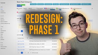
Phase 1 redesigns the customer and location pages with side navigation, a scroll-to-top button, and a searchable Notes area with pinned items. Jobs and Appointments tables now sort, filter, and group; a Book a job button links directly to booking. Users can switch back to the old design and leave feedback.
Release notes highlights. All right, next, we have updated customer and location records, and this is definitely the biggest, most obvious change for this release. So once this release is live in your account, the first time you go to a location or customer page, you might notice things look a little bit different. Now, before we dive too far in, I do want to point out that the changes to the customer and location pages for this release are a phase one, so there are even more improvements coming in the near future anyway. So we have now this side navigation panel here, and with that we can quickly jump to different sections without having to scroll. So obviously when you first open up the page, you start at the top, but if I know that I'm looking for the photos and videos, then I can just click right here instead of scrolling all the way down. You've also got this handy scroll to top button to take you back to the top. So here at the very top we have the note section. You'll notice that now we have a search bar, very handy in order to search for specific notes that we might be looking for. And if you click here, you've also got additional filters. You can filter by the user who left the note or by a date range when the note was left. And we've got our handy add note button right here, which will bring this fly out where we can quickly leave a new note. And boom, there it is. Pinned notes are highlighted in yellow to make them more prominent. Then we have the jobs table here. Now, all of the tables are now more consistent with the tables that you see in the rest of Service Titan, like in reporting, for example, which is good not just for consistency sake, but because those tables are much more powerful. So every column can now be sorted and filtered. So, like, for example, if I knew the job number that I was looking for, I could put that in there, say, filter. Now I'm narrowed down to just that one job and I don't have to flip through a bunch of pages. Just clear that out here and the columns can be sorted as well. So you see this blue arrow here next to last appointment? That's telling us that we are currently sorted by that column in descending order, meaning jobs with the most recent appointments are showing up first. But maybe I want to go the other way and have the oldest appointment show up first. I would just click right here and then click one more time until I see the blue arrow pointing up. And now I'm going the other direction. So oldest appointments first. And we've got a handy button right here to go ahead and book A job that will take you to the job booking page. Under that is the appointments table. And you'll notice this purple bar here that indicates that this table supports grouping. So you see here, by default, the appointments are grouped by job number. So. So you see this job here has two appointments nested under it, but there are some other columns that support grouping as well. So maybe I wanted to group this by job type instead. So you just drag that header up to the purple bar, just like you do in reporting. And now it is grouped by job type. Of course, all of the tables are paginated so you can flip through different pages and you can adjust how many items are shown per page. Overall, just more powerful, more capabilities than before and more efficient with how you navigate it. Now, you'll notice up here at the header, this pretty much looks the same as it did with the old design, but we will be making some updates to the way that this information is displayed in phase two. Phase two also includes a graphic in the header that makes it a lot easier to know whether or not you're on the location page or the customer page just at a glance. So look forward to those changes as well. I know I am. Now, I do want to point out that there is a way, okay, to switch back to the old design if you need to. But look, look here. Look, look Papa Nerd in the eyes. Don't you do that just because this one's different and you don't want to get used to it. Okay, I understand you have muscle memory. Like, you know how to get to everything that you need immediately with the old design. So for a few days, maybe a week, a new design might slow you down a little bit. I understand. I hear you. I feel you. But the new design is more powerful and the Switch to old design button, it's not going to be there forever. You have to learn to let go. Anyways, if you click the Switch to the old design button, you'll get this dialog box that asks you why you're switching back. You don't have to fill it out, but please, please do, because the product team is going to see that feedback. So if there's some actual reason that you're having to switch back all the time, then you want them to know about that. That way the problem can be addressed. And if you leave it blank, I'm just going to assume that you were just avoiding change. And I won't be mad, but I will be disappointed. Hey, thanks so much for watching. Mighty kind of ya. If you want to check out the full release notes video. Here's a link to it right around here. Or if not, here's another video I think you might enjoy. I'm just going to sit here and stare at you until you pick one. That's right. Go on. Okay. Interesting choice.