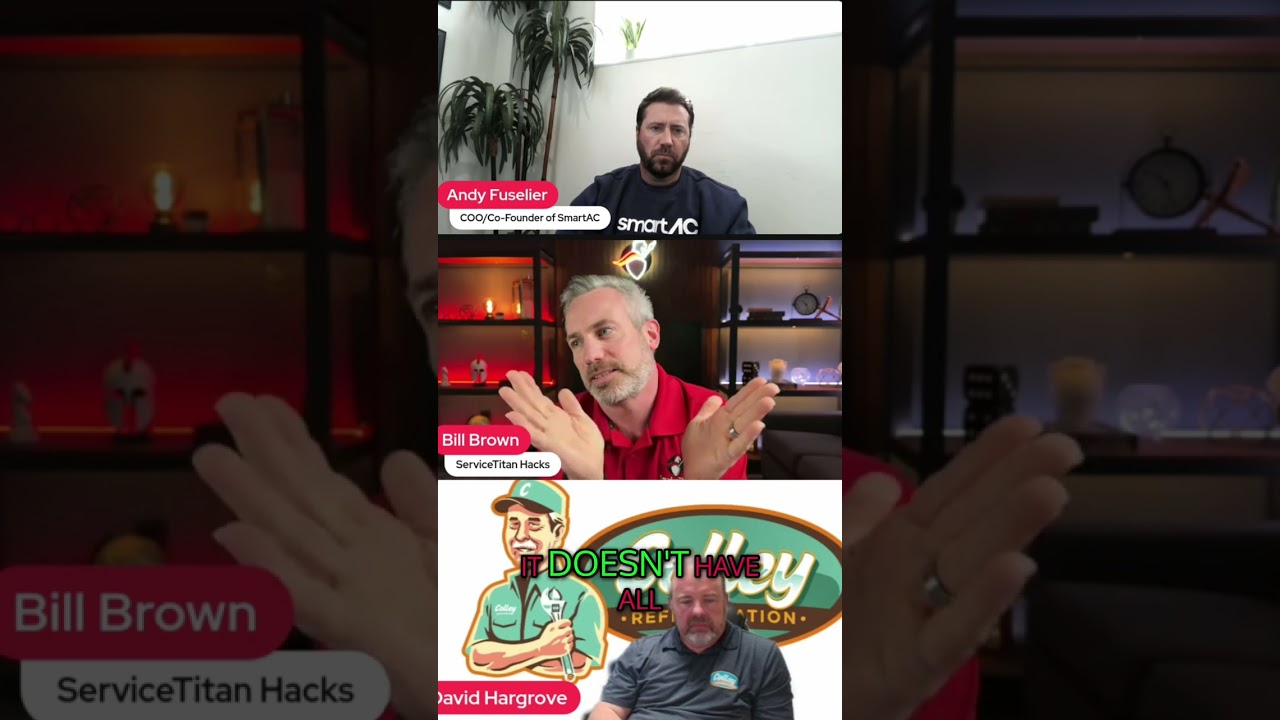
Bill (speaker) critiques typical dashboards as overloaded and non-actionable, recounts his own experience building visually impressive but confusing dashboards, and recommends simpler, role-focused dashboards. He introduces the "walk-by test": a dashboard should be interpretable at a glance to indicate whether action is needed.
Hey, what's going on? This is Bill. I'm going to talk about dashboards. So dashboards were supposed to help you make decisions, but too often they're so overloaded with charts and graphs and metrics that they lead to analysis paralysis. So here's how I approach dashboards differently. You know, most dashboards are beautiful but overly complicated. They try to show everything at once. And while that might look impressive, it's not actionable. If your team can't quickly understand what's important, then the dashboard is not doing its job. When I started creating dashboards, they were visually stunning but too complex. I'd watch my staff stare at them trying to figure out what mattered. Over time I learned that less was really more. It was better to have multiple focus dashboards tailored to specific departments or even individual roles. I developed what I call the walk by test. If I could walk past the dashboard and instantly understand whether action was needed, it passed.