UX Insider: Product Hunt Roundup - E. 07
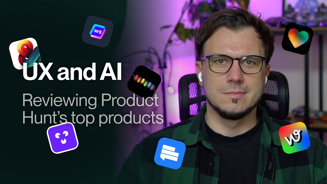
Daniel Andor reviews seven Product Hunt tools, testing their onboarding, design, and usability. He finds recurring problems: missing hover states, unclear navigation, slow loading, and poor guidance for new users. He suggests fixes like better feedback, clearer steps, and responsive indicators.
Chapters
Hi, Daniel here from Duran, and together we will review some of the top voted products on Product Hunt from the last couple of weeks. Unfortunately, I didn't have enough time to actually do the weekly video, so it's kind of like a summary. Let's jump straight in. Inlovable Visual Edits, faster and more precise edits. This is the whole page basically, there is nothing else. We have sign in and sign up. On sign in there is a bit of hover, like it's, it's actually visible hover state. Sign up is less visible and there is Just the area to prompt. You can attach an image, you can import a Figma document, and there are a couple of prompt ideas. Let's go with this one, music player. Here you can change if you want public or private. Here's the prompt to actually sign up or sign in. Assume it's kind of the same here if we go like this. So we have the sign up options on the side. I'm not sure what's this on the other side. Definitely interesting that it's still changing around. You can sign up with GitHub or Google. Let's go with Google. Okay, and we are back to this page, right? The homepage. And now things changed a bit. We have My Projects, Latest, Featured, and Templates. There are a couple of templates that you can start with. And Featured, I assume it's somewhat similar to Templates. What's a bit weird is the layout because it's here at the bottom instead of having it on the side. But yeah, otherwise it's interesting, I would say. What if we change this to this one? So once it's prompted, it starts generating, I assume. But here it comes pre-generated because we just selected the template. Go back to dashboard. That's the one. And just see how this goes with the Spotify-inspired music player. So things start to generate here. There is the chat, there is the history as well. This is the link. Takes a while to load everything up and starts to write the code. Something changed now, doesn't write the code anymore. I assume it will output something. And here it goes. This is it. Yep, looks very much like Spotify actually. Things are moving a bit here and there. I clicked on something. Even the sidebar, you can collapse it. These are animated as well. Looks nice. Not bad, not bad at all. And there is this edit option. Oh, you can select very specific parts. Okay, that's nice. And now if I want to go back to the dashboard, I just have to come here and go to the dashboard. And I assume it should be here. Yeah, here it is. Latest. These are not mine. I thought that these are mine, but they are not mine. They're probably just like latest projects or something like that. Beethoven AI, AI composer for crafting the perfect background music. Let's close this one down. Create unique background music that can call your own. Again, we have the Create for Free button. This one has a hover state, the Product Hunt badge here. Now we have the navigation as well and a bit of a preview of the product, I assume, here. Let's just create an account. We have email or Google. This is very small. These are quite large compared to the input field. Let's go with Google for now. Okay, what do you need music for? Let's go with, I don't know, YouTube video. I understand and I agree. Get started. And here we are. You can add the audio and a video, but like you're kind of just dropped here. What should I do next? You can create projects or some kind of projects here. What I see. And there are a couple of prompt examples. Now we can maybe pick one. Okay, let's just go compose music. It starts creating. There are a couple of things happening now. We have 4 different tracks. Yeah, it looks like it. Yeah, so you can edit, you can download, share, and another edit button. This thing does— you can cut and probably make some changes. Okay, and Oh, and if you click on this edit, it's kind of the same, I assume. Or this doesn't work, so you can't click on this. Oh, you can click just on these, and basically then you have to apply the changes. You can edit the prompt and go back. And this is the project. So, if I go to projects now, yeah, it's there. Simple, I would say. It would be great maybe to, I don't know, add a bit of an onboarding or something. Also, the design is not that polished, as you can see here and here. The background that just blends into the model. Same here. There are some aspects that can be improved, at least on the design side. Also, as I mentioned, the onboarding, it would be nice to maybe have a bit of a guidance. Like, you just, you are just somehow left into the dashboard, but not real guidance on what you should do next or how you should prompt it. It's just like you have the prompts here, you can try it out, but Kind of that's it. See, it's nice that you can actually edit the sounds and tracks after that. Let's go with Tenka. AI messenger with smart reply and long-term memory for teams. Already a lot of stuff happening, a bit too much. Okay, we have join beta and Product Hunt logo as usual. There are a bunch of videos. This looks a bit weird that it's cut down like this. You can't scroll it, so. I'm not sure why it's like that. And this is basically showing all the features and capabilities, and kind of that's it. I assume same here. Yeah, same here. You can— oh, it's somehow you can scroll it, but it's definitely not easy. And the design looks a bit unpolished. So we have this one here, this looks different, this is rounded, This is not that rounded. Then we have these which are in a way confusing because they look somewhat similar to the join button, but they are just some tabs. Same here. And the main CTA which would be join the beta, it's like, it's just a link as you can see here and here as well. Yeah, so it can be improved. It's very generic illustrations. I'm not sure about this one, like what this button would do if I click on it. And yeah, kind of that's it. Okay, let's join the beta, see how it goes. We don't want notifications. We can log in through email, phone number. Phone number is a weird, weird choice. Let's go with Google. And here we are. Okay, we have to create a team or join a team. So these are the 2 options. This doesn't really look clickable, so It's not very bad, but it would be nice to have like a hover state or something. Let's click on Create a Theme. Let's leave it as it is. Continue. And we are in the product. And now what? Because there isn't anything. So there are a couple of messages already here and this and some chats. Kind of that's it. Would be again nice to have a bit of a guidance of like what I should do next. So I, I'm in the product now. There is this memory thing. Should I connect these. I assume yes, so probably it helps, but there is nothing regarding that, so there is no prompting to actually do that. And then you can write a new memo. Testing this out. It's saved. Okay, and if I have to close it, I assume. Okay, but where does it show up? Oh, it shows up here. I write something here, but it shows up in another place. I'm kind of lost a bit through this whole stuff that's happening on the screen. You can create an event, but I assume it's kind of the same thing if you synchronize. Yeah, so it's like that. Create a new chat. These are settings. Well, the icon is a bit misleading, and we have another settings here, so this should be account settings. And we have another settings here. So we have 1, 2, 3 settings for some reason. There are a bunch of stuff happening here which are not very tight together. So it looks like there's a lot of stuff happening around, but they are not really tight together in a coherent flow or interface. So yeah, that's, that's something that should be worked on, I would say, mapping out these flows and the onboarding process and how people should experience the value of the product. That would be definitely helpful. Okay. Let's try another product. We have WebDraw Beta, the number one AI app network. Okay, let's see what this can do. So there are a bunch of AI apps. What we can do with them? You can use an app, you can sign in here, you can browse. Don't have a profile yet. Takes quite some time to load. This just hides that one. Okay, let's click on this. Save, share, and remix. Remix being like the main thing from what I see here. So let's click on remix. Now I have to create an account. Okay, so I created the account. If I go to profile, do I see something different now? Oh yeah, I have an account. Just come here to the home page. Let's go with this and let's try to remix this one and see what happens. It's stuck on remixing, but— oh, I can upload an image. Okay, and if I just go back to home and come here. Okay, so this is by default here, but then what this button does? Because there isn't anything regarding this button. I assume you should do this first and then click on Remix, probably, but then it should be tied to this part, not to this part. Okay, so let's try the AI video generator. These are the videos that are here. We have Save, Share, Remix. Here you can prompt the whole thing. We can actually go with— are going really fast. See how it Looks— these are some examples. Now it starts generating on top. Besides the actually generating the video, you can remix somehow the whole thing. So we'll try that in a second once we have the video. Yeah, it looks like a Mercedes. From what I see here in the comments, it just doesn't really work. But yeah, let's see. Clicked remixing and now we are waiting. No loading screen, no anything. So I actually don't know how much time this will take or if it's working or it's stuck, which it's a bit annoying honestly. And we have, I assume, the app here and the Remix here, but I have no idea what I should do or how this thing works. I can select the divs here. I'm not sure how this should work. Some— there is a code as well. Some guidance might be very helpful actually, but yeah, it is what it is. You have, you have the projects here. You can create a new app or create canvas. Again, I'm not sure what's that. So let's see what, what's the first one. And shuffle ideas. Basically, you can describe what kind of app you want. AI task scheduler that predicts optimal work sequence. That would be actually nice. Okay, let's go to continue. Let's create the app. And that's the whole thing. Okay. And if we go to create canvas, we have a canvas. What we should do with the canvas? You can put all kinds of stuff here, but there is not a lot of guidance on how you should operate, work with these things. It should definitely help. Let's try the next one. AntSend, a relationship agent, no other CRM. As you can see, there are no hover states on, on the buttons. There is at least for this one and also for the links on top. It's nice to have like a preview of the app to get an idea of what's happening and how it looks. Some logos, another preview. I'm not a big fan of these. Usually hard to make any sense of them. And then a bunch of stuff here and get started again. Let's try this out. It's a simple and clean signup page. I honestly didn't saw this exit option on any other products. Usually there is a back button or maybe an X here or something like that. Hey, let's register. We have the onboarding. It's great that you can just type in and select from a list. Instead of like scrolling through the whole stuff. Not sure how the country is used or how important it is for the onboarding process. You have to install the Chrome extension, that's the first thing. Then you have to log into LinkedIn. Okay, let's see how this thing works. Add this to Chrome. It starts to connect to LinkedIn and I don't have any option to actually stop this or cancel it or skip or something like that. Continue. To use. Okay, nurture. Cool, we have that as well. And now it starts connecting my LinkedIn and fetching the conversation. So we'll see what they can extract. This looks like it takes quite a lot of time actually. Yeah, I'm still here, nothing happened. Would be great to just like have an option to maybe skip this, import the first 10, 15, 20 conversations maybe to just get an idea about what's happening and how the product works. If I have to wait to import like all of my conversations, that will take quite a lot of time actually. Just the time that you need as a customer/user to understand the value of the product becomes very, very long. Okay, now they set up some stuff. I don't know WhatsApp label, but they set that up. We have analyzing the website. We don't have anything on the URL. There might be a redirect actually to our website and then picking some conversations, generating feed and researching. And we are in the product straight starting with this. I will just close it. Honestly, I just arrived, so I usually don't like to read messages and guides and so on when I'm just getting into the product, especially not after like waiting quite some time. So we have the first action here and then I can just send this, I assume. I cannot send it because they are still syncing my LinkedIn messages. I have a playbook. I assume this is where actually I should define the messaging or how you communicate with your contacts. Okay. This is the playbook. There are conversations, but nothing here. Contacts. Again, nothing here. Just this one, which is a demo. So I'm not sure why I had to wait so long. This one just opens LinkedIn and statistics. And we have this, which is still syncing. So definitely an interesting promise, but I don't know, it either takes a lot to actually make it work or I don't know what's happening. So let's try out SEO AI Agent. Say goodbye to $5K agency fees. Okay, let's see how this works. So this is from Writesonic. Outsmart your competition and so on. There is like a comparison between the old way and the new way. Yeah, kind of. That's the website. Not a lot of CTAs actually. There are some hover states. At least we have hover states. There is a video showing how the tool works. So let's try this out. Join your friends. That's a weird way to start something. And I don't know if I assume something is missing here. So let's try to refresh. No, it's not working. So name added, business email added, and now let's just sign up. This place here. Looks like there was a social login button that went missing. Okay, and we have this alert. Yeah, I'm using an ad blocker, but still. One more time. So, this is the message to verify the email and just copy this and put it in the other place. And that's it. We have an onboarding survey. Again, I'm not sure what's this, but we have an option to skip. So, let's say I am a business owner. Oh, I have to click continue. That's the progress bar. Okay. Supercharge your work. Let's go with those 3. Do you hear about us? Let's go with Blogger Oracle and done. And we have an onboarding process here. You can run a site audit. That would be the first step. Let's do that. Our website. In the meantime, I assume here basically it's really hard to make sense that, that this is not part of this content. It might work to like put like a line in between or separate it somehow. It would make more sense. And we already done. Okay, so SEO ranking, not the best, I would say. There are a couple of things: missing H1, title too short, And you can fix them with AI. Okay, see how it goes. So we can like generate the new titles with AI. Yeah, they don't have access to the websites, but yeah, we have step 1. Then we can use this though. This was selected for research and plan content. You can also use the AI SEO agent to fetch insights and then to Plan the content, generate content, and optimize. Not bad actually. There are a bunch of interesting stuff here. They have the content workflow. Also not sure what's this, but they explain it in the video. Let's remind me later about this one. Oh, and now as you can see, this thing changed. So how I can go back? Can I go back at least, or? Let's go back here. That's weird because it changes the whole, the whole sidebar, the whole app basically changed. Then you can define writing styles and so on. This looks actually interesting. They have a bunch of very useful stuff around. The product has an onboarding which guides you through, it guides you through the steps that you have to take to understand the value. And actually the audit was like, was super fast. It didn't took a lot of time. And it's nice that you have all the actions that you can take straight here so you can go through them. Yeah, nice stuff. So I really like this one. And the last one for today is Tool Finder, shortcut to better software. So, this is as it looks. It's a place to go through different software, right? And you can search here, you can filter. I went straight to Granola somehow. I just want to go back now. Yeah, you have filters here on top. You can submit a tool and sign up. Though, I'm not very sure why you would sign up. Yeah, let's go with one, whatever. Visit this one and just opens their website. And what this thing does, it's a YouTube video. Hopefully you found some interesting tools and some interesting insights that you can use in your own product. And yeah, let's catch up next time. Thanks.
More from Daniel


UX Insider: Product Hunt Roundup - E.19 - The Demo Account Is the Best Onboarding?


UX Insider: Product Hunt Roundup - E.16 - Too Many Features, No Idea What To Do Next