UX Insider: Product Hunt's Weekly Roundup - Episode #3 (2 - 8 Dec.)
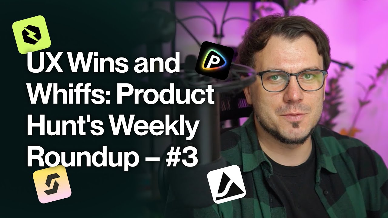
Daniel from Duran reviews four AI tools from Product Hunt: StackFix, Coval, Oopsie, and Polo AI. He spots recurring problems like disabled-looking dropdowns, missing trust signals, and broken demos, while praising Oopsie's clear next steps and Polo AI's video previews. Most need tighter UI polish and better onboarding to work.
Chapters
Hey, Daniel here from Duran, and together we will go through the top voted products from Product Hunt for this week. Let's start with StackFix, compare software in seconds. So, we have a website, as you can see, Home, Products, and About. Basically, there are a bunch of categories that you can select from. Same here, though these look a bit, in my opinion, faded. I'm not a big fan of gray dropdowns and input fields because a lot of times they look almost like they would be disabled. Like this one and this one. Though you have to click on them and actually interact with them. That's the thing. So, yeah, I usually prefer either, yeah, the standard, I would say, stroke and white interior and leave these type of input fields and dropdowns for disabled ones. And we have this thing here, which I'm not sure what's supposed to be. And yeah, kind of that's it. So it's not a lot of stuff on the website. You can subscribe, but yeah, there is definitely not a lot of stuff on the website. Would be great to see maybe, I don't know, some trust builders or proof or whatever, maybe some more content. And like, this looks a bit weird with this button just floating here in nothingness. Okay, let's go with, let's go with like AI note-taking for 2. And here I have next, here I don't have next. Let's say next, and here I have to select one. Okay, let's go with this one and maybe this one. And here again, I don't have next. So here I have next, here I don't have next. It's a bit confusing, I would say. And also like this, it's very blank. So we click on this one and we have Fireflies, Granola, Blue Dot, and Tactic. And they basically just compare the tools and they have a rating. Do we know how they rate these? So here you have— they have this our product rating, but okay. Oh, they have somehow their own rating and here it's kind of explained how it works and the pricing, and then they compare it to other ones. They have this one. Okay, it's interesting, I would say, but yeah, I'm not sure. I know that there are a bunch of similar tools out there, so I— and I didn't went through the Product Hunt post, so I'm not sure how this one is different, but yeah, otherwise Website looks a bit like it would need a bit of care, I would say. It would be great to have a bit more context and some kind of trust builders, I would say. That would help a lot. But yeah, otherwise I assume they kind of build on SEO, so probably they have a bunch of content that leads to pages like this one to capture as much traffic as possible and then Yeah, they compare them, but even here, this go, it's not that visible, that the action button there. Okay, and they have questions or questionnaires that you can answer, and I assume based on this they will give you pricing. It looks like pricing. Yeah, who doesn't want to be easy to use? Responses. Now I'm just putting in some, some crazy stuff to see what comes out. On the add-on of this. And so skip and skip and finish. So we have this, and yeah, kind of that's it, I would say. So they have this questionnaire, which I assume this is the, the thing that's there compared to the competition that's out there. So you answer some questions and they will give you the suggestions they think will fit you the best. Yeah, so kind of that's it. Let's check out eventually the Product Hunt post as well. So you have, yeah, instantly compare software prices. We saw that one. No more endless reviews or sales calls. Yeah, it might. I'm not sure about sales calls. Like usually companies, tech companies, they don't just give that up that easily. So even if you onboard on a free plan and eventually at one point if you hit an enterprise level, kind of pricing, someone will contact you in one form or the other. And I'm not sure about this AI testing as well. So yeah, so if you click on find software, who we are, how we— okay, let's see how they do it. So they create, yeah, they have some kind of proprietary testing methodology which we don't necessarily know what's that. Interview user, this is nice actually. And yeah, they probably review it From time to time, and they estimate. Okay, interesting. Let's go to the next one. Coval simulation and evals to ship delightful voice and chat AI agents. Okay, we have the website dark, looks nice. Again, we have this product hunt badge which, which people like to, to put on the website, but here you have it right near the book a free demo button. And this grabs a lot more attention than this one. A preview of the app built by experts in autonomous testing. I'm not sure what's, what's with the logos actually. So they have AI agents. Yeah, they, they test the product. Oh, and they are from Y Combinator. Okay, let's see how it goes. If we can test it out without paying. Okay, email, simple email. Let's set this up. I have to upload the logo. We should have somewhere some logos. Okay, we have some here, so let's go with this one and Duran. We create the organization, invite new members. We can skip this for now. And we got here. Okay, now what? So there is a lot of stuff, but I would say there is— oh, okay, that's not that important. No, there is not guidance on how or what we should do next. So there is just like a lot of stuff put right into the middle of the screen. They have documentation, nobody really reads those. They have book a demo. Again, I suppose not a lot of people will do this at this stage. Or you can explore. Okay, we have a transcript. Now let's update the transcript. Hopefully it's Working. Oh, it's not because— oh, they have a demo transcript. Okay, let's go with a demo transcript, but I'm not sure if they ask for a very— oh, it should be a CSV. It looks like that's working, or a JSON, but they say a transcript. So yeah, transcript can be a lot of other things, not just the JSON or CSV. So they should at least highlight, I assume, what format they need the transcript to be if it's not SRT and DOC and whatever other versions they can be out there. After that, there's just like a lot of stuff right here. It would be great if you would have like almost like a guidance of, oh, you should do this first and this second. So somehow to guide you a bit through the product, but let's go with this one. So we upload the demo transcript that's here. It's still uploading, and then you have— okay, we have analysis. Okay, where we should— so I clicked on that, but nothing happened. That's a bit weird. We can try again. Analysis results, and nothing happens. So something is not really working there, and nothing here from what I see. Oh, there is something on the monitoring side, so it might be one of these 2, but it's a bit weird that you have you have that thing there and it's not working. So yeah, let's check simulate your voice agent. Okay, we have create a test case and then describe your user. You just add anything, that's for the demo testing now, and launch a simulation. And then we have view runs and the same thing, as you can see, I click on view the results and the results are not showing up. So probably if I start going through these things, it will show up. But yeah, it looks a bit buggy. It looks a bit buggy for me. Okay, never mind. It's interesting. I might not be— most probably I'm not the target audience, but it would be great to at least have some kind of guidance or onboarding or something like that to help new customers go through these steps and set up whatever they need to set up. Okay, let's try another product. We have Oopsie, debug Flutter and React Native apps with AI and session replays. Okay, open the page and we have— there is a lot of stuff happening here on the top and these things looks quite, quite large, I would say. And also this opens on top, new mobile offering. Okay. Let's just close this one. Here's a preview. Looks nice, but it takes quite a lot of space, especially because it's tilted like this. And it's also, I don't know, it doesn't, it looks nice, but I wouldn't say it delivers a lot of, a lot of value. It might be a better idea if it would be just like the normal positioning and maybe some, some text or something on the side that might help. Okay, trust builders here, which is nice. There's also a video from Loom, as you can see here. Easy before mobile feature highlights with session replace. That's, that's nice when we use Hotjar and tools like that, how helpful it is to see what's actually happening on the screen, what the customers are doing. Okay, Firebase integration. So basically a bunch of feature highlights. Okay, let's try this out. Okay, work email, yes, password. Let's save this. Sign up with work email. Okay, so straight on the onboarding, you have to pick if you have a mobile app or a web app. Let's say web app for now. Next. To kick things off, which of these describe you best? Let's go with— oh, okay, that was a bit weird. I didn't expect to just like go to the next Next page. What would you like to achieve? Let's go with this one. And this is funny, provide better— oh, so here you can select just one. It's a bit weird because like on the other side it worked exactly like this, but you could select just one and you shouldn't— you don't have the option to click next. Here it's the same thing. I thought that you can select multiple ones, but no, you can't. It's just still just one. You select one and you click Next. And basically you don't know that you are here, I assume, because this isn't highlighted, or at least now it doesn't look highlighted. This looks highlighted. Now this opened. Okay, let's click on next. And we are here. Okay, let's go with a sample project for now. Again, the bar. Let's close this one. Let's close this one. And here we have a sample project. And we have session replays. Okay, so we can take a look into what's happening on the screen, I guess. Yep, similar to Hotjar and other tools like that. Performance and so on. Okay, and here we have the dashboard. Okay, and user sessions by customers, user sessions, user sessions by location, by browser, errors replaced. Heatmaps. They also track heatmaps. Oh, it's loading or something like that. Cart landing page. Let's go with the landing page. Might have better review than what was on that page. Yep, somewhat better. And here you have basically what you should do as next steps, as you can see, which is, which is quite nice. So we already signed up. The next step would be to install this tool. And then test the installation. Obviously we won't do that. And yeah, we have all the stuff here. Yeah, we have problems with the installation because we didn't install it. And we have the sample project here. It looks interesting. I would say design-wise there, there is room for improvement, but otherwise they're interesting tool. Okay. Okay. Let's try Polo AI. Unbound AI video generator that visualizes your creative GPT. Let's see how that goes. Okay, let's see what Polo AI can do. So we have the home page. I can say that, yeah, it's not quite my style. Something is off, I'm not sure what, either the fonts or sizes. It just looks a bit unpolished, probably that's the proper word. This, at least this part, looks a bit unpolished. As you start scrolling down, kind of the same thing here, like spacing-wise. You have a lot of space here. This is a bit weird. And then here things start to be like a lot of stuff, or somehow, somehow too much in, in a very small space, a bit crowded. It's nice that you have previews. You can take a look at what, what are some of the outputs of the product, which, yeah, they look nice. And images to videos, I think we saw a lot of these lately. And yep, some more previews here. Video generation, high quality, blah blah, high quality, and that's it. Yeah, let's give it a try. As I mentioned, I think the website can be a lot more polished and then improved, but let's give it a try. Start for free. Even these, I'm— I prefer the standard separate page than overlay. This leaves the noise around here. And, and usually when it's a separate page, you can use the sidebar in, in various ways, from highlighting stuff to adding testimonials and so on, or maybe showcasing— in this specific case, maybe showcasing some videos. Let's go with Google, and we are in but still on the page. Yeah, that's a bit weird. So we are basically in the product, but if you don't check this area up top, you barely can say that. Image to video, text to video, templates, and so on. You can create your stuff. Image to video. So you can upload an image and they will create a video out of it. You can also prompt it. You have templates for different things. And there is also text to video. Okay. For tech builders. And yeah, let's create. Oh, so this is paid already. Okay, you can control the camera and so on. It's an interesting tool for me. What's, uh, what's a bit weird is that they keep you here instead of like moving you into a tool. And though I'm signed in, they say to sign in. I'm not sure what's this. Okay, so I signed in. Whatever. This thing looks a bit confusing for me. Yeah, there is a bunch of stuff, but somehow the product doesn't really look put together, or I can't find the proper flows. Otherwise, yeah, it's an interesting tool, but there is a bunch of these nowadays. Would be nice maybe to see some use cases or something specific to them. And there is something called professional mode and standard mode. Yeah, kind of that's it. Hope you found some, some interesting stuff in, in the video. As you can saw, there was a bunch of AI tools, which makes sense. Some of them, I would say, need to be a bit more polished in order to deliver value for both the customer and the business in the end. But interesting takes, interesting new stuff out there. Definitely worth checking how they evolve over the time. Thanks.
More from Daniel


UX Insider: Product Hunt Roundup - E.19 - The Demo Account Is the Best Onboarding?


UX Insider: Product Hunt Roundup - E.16 - Too Many Features, No Idea What To Do Next