Learn to build a Tableau dashboard by combining worksheets and adding interactivity. The presenter drags sheets into a dashboard, sets one worksheet as a filter so clicking states updates all views, and creates a year filter that applies across the whole dashboard.
Chapters
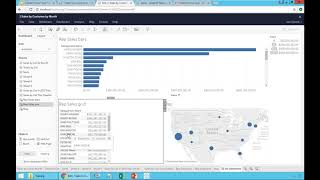
Now let me duplicate this report and also show this on a grid approach. So I have two reports by rep. I have rep sales grid. So these two reports, one is showing information on a chart using bars. This is showing grid. And right now I'm starting to go towards what eventually going to become our first dashboard. But before I build a dashboard, I also want to see some geography analysis. So for geography, sort of instead of duplicating some existing report, I'm going to click a new sheet. So this is the icon for new sheet, a new report from scratch. And what I'm going to do now is I'm going to select the customer state. I'm going to press and hold my control button in my keyboard. I'm going to press sales. So I have both fields selected. I go to the show me button here, click on it and I choose one of these map representations. What I get is a map showing sales by state. I can click the size button to make the bubbles bigger. So feel free to do that and okay, hey, I just built this nice map and the bars and guess what my next step is? I want to put this together in a dashboard. Let's build my first dashboard. So to build a new dashboard, you don't use this button, you use the second one which is a new dashboard. Click on it. So now I'm in the new dashboard mode. And as a beginner I recommend setting the size here. So click the arrow point down and instead of choosing fixed size at the beginning, choose automatic. So it will always take the whole space off your screen. Eventually you learn how to use fixed. That is usually better once you know what you're doing. But the beginning, the automatic, it's a better way to go, believe me. It's start with this automatic to make it easier your life. And now what I want to do is by the way, let me just go back to my sheet. 11 Double click and call map. So I know this sheet is about the map. I go back to my dashboard and what I want to see in this report is take my wrap sales bar. So all the sheets that I created in this exercise are listed here. I want to take the wrap sales bar, just drag and drop anywhere. My first query, just drag and drop anywhere. I have the whole report right here. I'm going to take the wrap sales grid. I'm going to drag and drop and put it on the left, top, right or bottom. You have four quadrants I'm going to put at the bottom. So I have visually the bars and the numbers at the bottom. In case I want to see both of them and I want to take the map and drag and drop. Now if I drag and drop, I can put in different quadrants. So just kind of exploring the mouse until you find a quadrant that will be convenient. In my case, I think it will be awesome here. And that's my first dashboard. So I'm going to click my first, first dashboard. Dashboard. There it is. And I can come here. And for instance, usually when you're building dashboards, you want to make it a little interactive. I mean, right now, each of these dashboards, they are completely independent from each other. You know, you can do things like, in this case, I'm going to go to the map, put my mouse over this icon and select this lasso approach. I'm going to select a few states and nothing happens. I mean, the dashboard is completely independent. But if I go to this area here, I have these icons on the side of this box and I click this filter that is used as filter. So I'm going to click this little icon. Now, this particular quadrant in my dashboard is a filter to everything else. So if I do again a lasso of my report, what happens is it's controlling the rest of my dashboard. It's very cool. Right. Now, what if also I want to apply some filters, other filters to this dashboard? How can I go about that? Well, let me go back to one of these source queries that I have. Let's say this one here. Let me take the actual, the grid one, and I'm going to take the invoice date and add my filters. And I want to have this one as year. So I have those years here. So I just added a filter to this particular grid. Now when I go to the dashboard and I go to this particular report, I just added a filter. I can click the arrow pointing down now and say filters and select the filter that I just created, which is year of invoice. Now, I have the filter here right now if I change the filter, I'm only affecting that particular part of my dashboard. So as I click, I'm only changing this one so far. Right. And by the way, just to prove you a little better, what I'm doing here, let me just add the invoice date as part of my column so you can tell what's going on and how the filter is working. So what I just did is I added the year in my columns and so far this filter is only applying to this particular report here, so it's not affecting the rest of them. Most of the time. You want filters to work across all segments of your dashboard. How can I do that? Well, you come to the filter, you click the arrow pointing down and you have the apply to worksheets, usually as a starting point. I recommend saying if you want to control the rest of your dashboard, click all using this data source. Because right now I have all of these, all of these reports coming from the sales data source. So If I unclick 20, 16 and 18, guess what? My whole dashboard now, the map and the grease, is all controlled by this filter. It's very interactive.