2 DataSelf Analytics: Rapid-Fire Analytics Demo
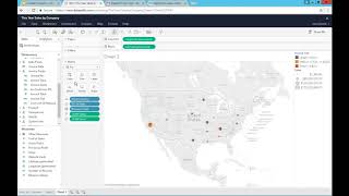
A power user builds a multi-sheet dashboard from scratch in DataSelf Analytics, combining sales data by customer, product, and invoice with a trend chart and state map. The platform blends data from multiple sources, runs reports in under 10 seconds, and lets you control who sees what.
Questions this video answers
About 31 million records.
Seven years.
The "10 second rule": aim to run all reports under 10 seconds.
Chapters
Okay, so let's get started with a rapid fire analytics. So I'm going to go to Data Self and actually let me sign out first. Suppose I'm going to log in into the Data Self framework. There's a web portal. It can be behind your firewall, it can be on the open Internet, it can use our hosted services. Anyhow, suppose I'm logging to this portal as a user. When I log into the portal I can decide the landing page of Data Self. It can be any report or it can be any dashboard. In this case it's just showing this year sales by company in the sample database. I have a multi company system. I'm consolidating three different organizations together and I'm looking sales this year by company. Well, what if as a user, as a power user, I actually want to see a new dashboard that is not available. I want to be able to just go here, start with any query that I'm looking at and completely change it to something different and save it for later use for myself and for other people. I'm going to show you how easy that is. Right now I'm going to go into the power user mode. This is not for everyone. Many users, they will not want to learn how to create reports from scratch. What I'm going to show you right now is for those who want to do it, I want to show you how easy and how fast things are. So I'm going to change this report. I'm going to create a new one from scratch. I have the edit button that is only available for power users. I click the edit button and then I go into the edit mode. So now I can actually change this report extensively or I can create something from scratch. And what I'm going to do in my example is I'm going to create a new dashboard from scratch where I want to show sales this month by customer and product. I want to see, you know, actual sales numbers by the penny. I also want to see a trend of sales and website visitors side by side in the course of the whole business history. And then I want to see sales by geography, how much I'm selling by state across US and Canada, input these three views together in a dashboard. So I want to show how easy that is. And what I show is if you know how to do it, if you want to do this kind of things, it's easy, it's fairly straightforward. So I'm going to start from scratch. I don't want to see multi company is already consolidated. I want to clear this sheet so I'm going to say clear sheet. So I got a blank page. Just before I start showing you, I want to show how much data I'm going to be querying on the fly right now. So I'm going to take number of records, double click and it's showing here that I'm working with 31 million records. Everything I'm going to do right now in my ad hoc analysis and build this dashboard from scratch. I'm hitting a 31 million record revenues system. I mean there's a lot of sales transactions behind these numbers and things will still run fast even though we're running this large database. All right, so actually let me rename this. I'm going to call sales by customer. So my first part of my exercise is I want to see sales by customer this month. I want to break down by product and also show invoice number. So I'm going to bring all of this information together. How can I do it? Well, I come here to this dimensions. I find customer which is right here. I expand it and I want to use customer name. So I double click customer name. Right there I see all the customers in my database. I want to see sales by customer. So I double click sales and right there I see total sales by customer in the whole company history. Again, this is a multi company. I'm already consolidated three companies together and I'm seeing customers across all of these organizations in my database. Who's my top customer by the way? I can just sort very quickly and there it is. That's my top customer in the whole company history. Well, I want to see sales, let's say this week. Well if I want to add time I can double click invoice date and by default I'm adding all the years in my database. So I have in my sample database seven years worth of data. Well, I want to see more details. I want to see a quick quarter, let's say so expand from year to quarter. There it is. I can spend from quarter to months. There it is. Very easy. Very quickly I'm seeing my whole company history, all the sales by month, by customer across 31 million records. Actually I want to see by, let's say by week instead. So when I see instead week number, suppose you know my business, we're looking on a weekly basis. There it is in the whole company history, all sales for all customers on a weekly basis now. But I only want to see let's say this week's sales. I don't care the past there was just too much information Here I want to filter it. No problem. I take invoice, date, drag and drop into my filters. So now I have a filter that I can change in slice and dice my data. I can select the periods or if I always want to see this week, I can choose relative date. Right now it's showing only today sales and actually I want to change to weeks. So there it is. Now I have sales this week very easily. And if in the future I want to change this to quarters, months, years, weeks, I just change here. Maybe I want to see three weeks instead. Maybe I want to see two weeks instead. Whatever it is, it's point and click very easy, very fast to change what my report do you want to see this week? So right now I'm seeing sales by customer. This week I also want to see sales by customer, by product and invoice number. How can I add them? It's pretty much drag and drop. If you know how to drag and drop, you can do it. So, so if I want to see product, I come here, I find product description and I drag and drop and I put into my rows. So there it is. By customer, by product I have sales. What if I want to see the invoice number? Same thing, drag and drop. I find the field which is right here and I drag and drop, let's say between customer and product, just drag and drop. And right there you have by customer, by invoice number, by product, sales. Very easy, very fast. Okay, so this is the first part of my report of my dashboard. The second part is I want to see sales in website visitors together in the course of my company history by month. So I'm going to create a new sheet. So now I'm going to create a new sheet. I want to see sales. So double click sales. I'm going to double click invoice date. So I have the sales by year so far and I want to see by month. So I select by month and right now I see sales in the whole company history by month. I also want to see website visitors. I double click website visits. So I have website visitors in the bottom and sales in the top. And I want to put them together so it's easy to see the trends. I'm going to say, hey, change this into a bar in line types together. There it is. And let's just make this sales a little smaller bar so it's a little visually nicer to see. There it is. So now sales are the blue bars and website visits are yellow. The orange lines. You might be asking how can I see website visitors that come from Google Analytics along with my sales. Well in data self, we can combine data from any data source, from your ERP system, from your CRM system, from your payroll, from your Excel sheets, from your Google Analytics, from your social media. We can bring all of the data together. We blend it in a data warehouse or in this analytics platform. And once we do that kind of setup, which is a little bit more technical, but it's a one time setup. Once we do that. Now users, regular users, business people with little training, they'll be able to do things like this just by dragging, dropping. So it becomes really easy and really fast. Okay, so that's the second part of the dashboard. The last part is I want to see sales by state and how big my deals are. So I want to see sales by customer state. This could be shipped to state, could be any address. I want to see invoice sizes, I want to see sales and I want to see everything on a map. So I asked the tool, show me those on a map. There it is. And I want to make the bubbles a little bigger. Bigger bubbles, bigger sales. And the slices of each of these bubbles is the aggregation of my large, medium and invoice deal. So in a few clicks I have this nice insight of how much I'm selling for each state and how much I have for each of the small, medium, large invoices. Cool. So I just created those three reports and now I want to bring them together in a dashboard. So now I'm going to create a dashboard instead. And I wanted this dashboard to automatically adapt to the size of my screen. If it's a mobile device, if it's a big screen, doesn't matter. And I want to see the geography analysis, I want to see the trend analysis at the bottom and I want to see the detail report on the left. As you can tell is drag and drop. If you know how to drag and drop, you can do it. It's very straightforward, it's very intuitive and it's very fast. Again, I'm querying a large data set, but it's still things takes pretty much seconds to run. Okay, now once I build this, I can save this dashboard for future, for my own use or for everyone else. I can come here and say, hey, I want to save it as when I call one my dashboard. So just save it as one my dashboard. And I click save. Now the dashboard being published on this web server. Now I can close it and let's say this dashboard is for all my salespeople. I Can call and tell, hey guys, can you Please now open Dashboard 1? And they'll find Dashboard 1 they're going to be looking at just like this. And let's say suppose I'm on the west coast, I want to see how I'm doing the west coast. I select those months, those states on the west coast and by default the tool would automatically filter to show sales by customer on the west coast and how is the historical sales and website visits. If I choose east coast or if I choose any combination of files right there, I get the answer. I'm doing this with a mouse, but I could be using an iPad or a tablet or even a smartphone and I could be using my fingers to select things in any shape or form. Very easy, very fast. Remember, I'm hitting 31 million records and still the reports and dashboards run really, really fast. And that's the beauty of data self analytics. Easy and fast. Let me just show you here on the next slide with data self analytics. First of all, you can give access to your users and you can segment which users will have access to what and when and how. You define that. You have policies, but you can give access to anyone to be able to access anytime, in kind of anywhere using desktop, web and mobile devices as well as by email. So you give them access, you give users access to access information anytime, anywhere. And for users, you can define how much they can change in a report. Maybe some users, they cannot change anything. Maybe some users can change filters. Some users can change everything, or they can change everything, but they cannot save back. The security framework is very comprehensive and will allow you to control what each user can do in the framework. So very easy to use, very easy to set up from an IT standpoint, very importantly, it runs super fast. It does not matter how much data you have, it doesn't, it doesn't matter how many data sources you have. You might have multi company, multi currency, you might be bringing your erp, your CRM, a lot of data together, it doesn't matter. We have found in our client base the 10 second rule. What is the 10 second rule? Most business people today, they are busy and not very patient. So if you have reports that take longer than 10 seconds to run, guess what? Most business people will not wait. And those reports are kind of a waste of time for everyone. So we have designed our system and we can fine tune it to pretty much guarantee that all reports will run under 10 seconds. Sometimes it's impossible, but it's more like an exception. And usually it's because you're not. The user is not doing what they're supposed to. But overall, all reports and dashboard and Data Self will run in seconds, regardless of how much data you have. It's really impressive. The 10 second rule is really impressive because again, if business people will have to wait, they'll now use it. It is a waste of everyone's time. And with Data Self we guarantee that.










