2 Financial Analytics: CFO Dashboard
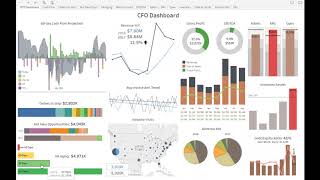
A CFO built an interactive dashboard in six months without IT help, combining cash-flow projections, receivables, payroll, and revenue data with drill-downs and what-if scenarios for cash planning.
Chapters
So let's take a look at the CFO dashboard. I'm going to now switch into the Data Self analytics Tableau framework. I'm going to log in as this CFO of one of our clients. And when he logs into this portal every morning, he got into this dashboard and it's busy. Yes, this dashboard is busy. But let me tell you the story behind it to see how it important this dashboard is working for this cfo. So this company is growing significantly. This CFO told me that he's not only a CFO per se, he is responsible for also the IT department and he's all over the company. He works with the operations people, sales, inventory. So when he decided, when they decided to invest in Data Self, one of his visions was I need to have a way to see on my screen a view of the whole business. You know, when you see my financials, sales, cash flow and see all of this information, an easy way that I can drill down into more details, make interactive, make decisions and move on with my day. He told me, I'm not an IT person even though I'm responsible for the IT department, but I'm not it. I'm, you know, cfo, but I'm a smart person and I can actually use tools if you give me tools that are actually easy to use. Making long story short, in the course of six months they got the tool Data Self with Tableau and all the templates, he started to get some training using the tool in six months after we started the project, he decided to build this dashboard from scratch all by himself. So not it and he decided to do it. Many pieces of this dashboard were available out of the box so he just had to plug and play to the dashboard. But some of them he built completely from scratch. Now again, this looks like a busy dashboard, but since he looks at this every day now, it usually takes a few seconds for him to take a glimpse at this dashboard and have important insights for should I do something about it. So let me go very quickly and give you a tour of this dashboard. On the left column he has what is called the lead metrics. Lead metrics are for things that are going to happen in the future and you can still influence the future. For instance, this whole thing, this whole left is about kind of 60 day projection into the next 60 days. In the top left is a 60 day cash flow projection. He has here open receivables, open payables, payroll, you know, the amount of money supposed to go out on payroll and how much money he has today. In the bank and then adding all of these metrics together. He has a projected cash on hand for the next 60 days. And as long as the negative doesn't pass this line of credit that he has, he's fine. He doesn't need to do anything about cash flow management. But he might have a scenario where a client calls, you know, they're not going to be paying a major payment that is coming, let's say on this day he can come here and do what if scenarios. He click on this bar, he says, I'm going to exclude this major payment. And right there, you know, cash flow is going to go over 1500 $1.5 million and then he has to do something about it. So a very simple way to look into the future, Place some what if scenarios in this dashboard and act on as needed. The next section here is about orders to ship in the next 60 days by customer. And as he put the mouse over each one of these color bars, he sees how much is the open amount. So that will also influence eventually his cash flow. Hot new opportunities to be closed in the next 60 days. This information comes from the CRM system is just part of the out of the box from Data Self. And he just added as part of the dashboard, the bottom is AR aging. Things that are going to be paid current or not. In this whole dashboard he built in a way that if he needs to click and see more detail, he, he can. So let's say if he clicks on the AR aging, he goes into a second section of this dashboard that shows again the main metrics at the top. And then he sees for all customers the aging buckets and how much each customer owns them as well as all the open invoices, amounts due dates in total. And here if he selects all invoices on time, 30 days late, 60 days late and over 60 days, he just clicks and the whole dashboard changes accordingly. Now he can do even more. Let's say now I only selected invoices that are really late. And one of the clients has a lot of late invoices. He can click on this client and then this whole section will gonna change to only show the invoices of this particular client. And from here we connected the software in a way that he could right here email to this customer. He could view the customer in their CRM system or he could pick an invoice and look at the invoice or again email the customer or viewing the CRM. So a very interactive dashboard that allows him to slice and dice the data to have actions that can make a difference in whatever that is needs his attention. So as I was showing, the left is about lead metrics. The whole right section of the dashboard is about lag metrics. Lag metrics is about what already has happened today or in the past, showing your past performance. This section here shows this year and last year, using the colors as a way to represent. Blue is last year, black is this year. So he has revenues side by side this year and last year to see if the business growing or not. At the bottom, he has information coming from Google Analytics. So he can see website visits last year and this year and you know, hey, let's see how we're doing on the east coast. He selects east coast. And then let's say I can zoom into more detail to see this on a bigger chart. So now I can see 20, 16, 17 by those states. And darker blue means bigger number of visits. So Florida, New York and some other states are growing significantly since last year. Again, as I mentioned, the cfo, he's all over the business and he's using this dashboard to really understand marketing, sales and everyone else to do their jobs more efficiently. This section is more about financial metrics, gross profit, revenues, revenue mix and whatnot. The top section has actually he color coded to be brown. Okay. And red not okay. So these are three different kind of expense accounts that he has to look closely. The bar is the actual posted this year in the line is the budget. So marketing is over budget. So it's red. You need to work on something about it. The same idea of with inventory assets in here, let's say we're over the maximum he clicks on this red bar, he can go into this other inventory assets subsection of the dashboard that he can see from the financial information, all of those details, but also from the inventory on hand system which are the top products by cost on hand today that are affecting this big increase in my on hand today. And at the bottom, you know how much I have of these items in different warehouses. And as he puts the mouse over this, all of these dashboards are interactive. You see what's going on. Like my top product, most of the inventory is in the China warehouse as I can see in the bottom. So a very interactive dashboard. He told me that now that he's using this every day is being very helpful and quite often he needs to make adjustments. He goes here, he clicks on things, tweak it, add new components. I actually have a video on our YouTube channel that shows how the CFO sometimes go into this dashboard and change sections and. And add new pieces to it, like adding a new P and L inside of this dashboard. So if you're interested, you can check out in our YouTube channel. All right, so that was a little overview of the CFO dashboard.










