4 DataSelf Analytics: 360-degree View Demo
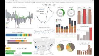
DataSelf Analytics consolidates 11 data sources into interactive dashboards. A CFO-built financial dashboard drills from AR aging to invoices to CRM, runs what-if scenarios on cash flow, and lets users set alerts like gross profit thresholds with one-click subscribe options.
Chapters
So let's take a look at the second part of the product presentation. Now I'm going to show you some examples of a 360 degree view of your business using dataself. And the idea is as a business person, you know, maybe you are a salesperson, a VP of sales, you know you are in a department of your business and typically even as a salesperson, quite often you need to see information across different of your systems. Maybe in your ERP you need to see actual sales, open sales orders, you need to see opportunities from your CRM information and maybe accounts receivables, who has late receivables past due. Maybe you are in the financial. You might want to see information coming from your financial system, from your inventory, from everything. The idea is business people, decision makers, quite often they need to have a view of their own function across different data sources. And without a solution like Data Self, usually those things are complicated or time consuming and require Excel copy and paste and wait until someone puts together information and sends by email or by sharing a PDF file. I want to show you how that works with Data Self. I'm going to switch back to Data Self here. As the Data Self user, when I created this dashboard from scratch. Now I want to start jumping into other reports and dashboards that are unique to my needs. My first example I'm going to show is actually a financial dashboard. And as a user of the system, there are many ways that I can consume information from Data Self. One of them is going to my favorites, which reports and dashboards I'm looking at all the time. So I come here and say, hey, I'm the cfo. I want to see my CFO dashboard. So I click the CFO dashboard. Let me put in full screen because it's kind of busy dashboard, but it's very insightful. This particular dashboard was actually created by one of my client, the CFO of one of my clients, the cfo, which is not a IT person, he's a cfo. He actually built this dashboard from scratch about six months after they started using Data Self. Six months into the project he was comfortable with a lot of the drag and dropping capabilities and charting capabilities and he decided to start from scratch. His dashboard. It took him hours to build, but he told me, Johnny, I want to do it myself. I know what my needs are and if I have to explain to someone else, it's going to take a lot of time to talk and go back and forth. I know that itself is easy, it's intuitive, I want to do it. Let's see how it gets together. Anyhow, he built his dashboard from scratch. This dashboard has that has 11 different data sources together. There is AR, AP, payroll, money in the bank today, sales orders, CRM information, receivables, invoices, Google Analytics, financial information, inventory information. There is a ton of different data sources all coming together in a single dashboard, all consolidated. When he built his dashboard, he organized things in a very natural way for his own eyes. So he has on the left side what is called lead metrics. Lead metrics are looking into future transactions like cash flow. Cash flow is future transactions. He's looking at open receivables, open payables, payroll for the next 60 days, and how much money he has on cash today. So he has all of these four pieces of information together on this chart. And by adding these metrics, he has the projected cash flow for the next 60 days. And he has this line which is his line of credit. So as long as the projected cash flow doesn't cross the line of credit limit, he doesn't have to worry about cash flow. He goes about his other things. If one day he gets a notification that a client will not pay a big invoice or something like that that might affect cash flow, he can do what if scenarios right here. Hey, this payment is no longer coming. Let me extract out of my view right there. Now I crossed my line of credit and I need to do something about it. So very quickly, very easily, on this dashboard he can place this what if scenarios and based on the scenario, he can decide if he needs to do something about it or not. But the idea is to be easy, to be insightful. Every day when he logs into data self, he takes a look at this dashboard. He makes decisions and he moves on depending on what he's seeing. This whole dashboard is very interactive. Let's say I come to AR aging and I click on any of these bars. This dashboard will drill down into a specific tab. You know, we have several tabs now I'm looking into the A or aging tab where it shows all customers with aggregation of aging by age buckets. And then if I choose a particular customer here, the report will narrow down which invoices are open for this particular customer. The way this dashboard works is if he clicks on any of this information, he can actually email the customer from inside the dashboard, he can open the actual invoice or even seeing this customer in CRM. So from this dashboard he can point or he can jump into different sections and different systems in his organization to see more details or let's say he wants to see a geography analysis from Google Analytics. He can come here, hey, how am I doing on the east coast? He select east coast. He sees how many hits he's having on the east coast. And hey, I actually want to see more details. He can drill down and go into a much more detailed insight that shows last year, this year in number of visits. Darker is more visits. And he can tell New York in Florida growing a lot in number of visits since last year. Very easily, very intuitively he can get that insight. Or let's say I see that red overall is something that is not good, that is above my budgets. In this example, I cross my maximum on hand. I click on this red bar on my inventory assets. I go into a different report that shows me the financial side of the of the inventory assets, but also actual the quantity, the top products by cost on hand in different warehouses. So if I choose my top product by cost on hand, I see at the bottom that most of my cost is on the China warehouse and I can just keep on putting my mouse over and seeing the other items and everything else. Very interactive and very insightful. This kind of dashboard can be created and customized for any user or any group of users. It can allow people to drill down into different pieces. Very controlled, very secured, and there is no way to break it. A secured framework for different users. Let me show some other examples. Let me go now to see some service analysis. Some organizations also look closely at services. They have people doing maintenance for their clients. So this is a kind of a dashboard, similar to the CFO that brings together information from different systems in plots on an easy way. So you can start focusing on metrics that make sense. And again, you can have several tabs to look at different particular metrics of those initiatives. You can have heat maps. This is kind of a popular thing for organizations that need to manage resources based on demand. So in this example, this heat map is showing by week. The current week would be 22. What is the expected demand of resources based on past history and current orders on my pipeline. So I have a kind of a view for the next few weeks. And if I'm going to be running out of resources because I'm going to be super busy, maybe I need to hire some additional people, augment my resources, schedule things around to be able to meet demand. Anyhow, the tool allows you to analyze less and less data. So these kind of decisions can become much more intuitive. Now what if I want to find a report that is not part of my Favorites. How do I go about finding reports out of my 5,000 plus? Well, I can go to home and now I'm going to search for a report. Suppose I want to see sales by customer, right? So I type sales by customer in data self. There are 684 reports showing sales by customer, including all sorts of different perspectives. There are charts, there are grids, there's a lot of reports. It's too much. Yeah, it's a lot. So maybe you need to filter this a little further. Maybe you want to see sales by top customers. Ah, okay. Sales by top customer. Now there's 246. Let's make top customers. There you go. Now I have 15 reports showing sales by top customers. And that's one that I was looking for. Top customer by sales change since last year to date. I click it and I see these are my top customers that grew the most in sales since last year to date. And the size of the bar relates to how much they grew. And these are the ones who declined the most since last year to date and how much they declined. The same information showing here on this grid. So that's another way of finding reports. Just search by keywords and you get narrow down the list and then you can find them. You can also do alerts. So let's say I'm going to show an alerts example. So I have here a simple dashboard showing revenues and gross profit. Revenues are the blue bars, gross profit are the circles. What if I only care about this report when the gross profit goes above 55%? Otherwise I really don't care. Well, I come here, I click gross profit, I click alert, I select the criteria only above or equal to 55. I want to receive an email saying gross profit percentage and I want to receive this only when it happens. And who should receive Me and famous Joe Doe. And that's it. I click alert and that's it. Now I forget about this perspective until I get an email telling that something went over the 55%. And here's an example. This would be an email that I would receive when that happens, showing me something crossed the line. And if I email this, if I forward this email to someone else, let's say to Mary, Mary can open the email, say, wow, that's awesome. I want to be part of this alerts distribution list. She simply clicks, add me to this alert. That's it. No need to call Johnny, no need to call it. She just clicks and adds herself. Maybe I want to be removed. I click remove, I get out of the list just I do it by myself. Maybe I want to change it. I want to change this alert to be 60%, not 55. I click edit alert, it goes right back into it. I change to 60, I click save and that's it. Self service. Give your users the ability to decide what's important for them, and at the same time, you can decide what's important for everyone. So you can control what's important for everyone, for a team of people, and also let individuals decide what they want to do by themselves, and you control what each user can do. So very self service, and in a very controlled environment.










