5 Analytics for Services: DataSelf for Services - DataSelf / Tableau
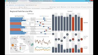
DataSelf combines SQL Server data warehousing with Tableau to build dashboards for service companies. The demo shows technician KPIs, response times, and profitability metrics, plus how to create calculated fields like average sales per job in minutes across desktop, web, and mobile.
Questions this video answers
SQL Server
Their own extraction-transformation-loading (in-house ETL) tool
More than 12 years; more than 5,000 reports, dashboards and KPIs
82% uptime threshold
Average sales per job = sum(actual sales) ÷ job count
Chapters
So let's talk a little bit about Data Self now and how we actually have been helping service organizations with all of the things we talked so far. So we just talked about the main features of analytics to make it really successful. And the way we do that is we have a data warehouse in analytics platform to combine data from all the different data sources. The ERP system, the fsm, the pmis, CRM, whatever your data sources are. We use data warehousing to bring the data together. We use SQL Server for that purpose and also we use our own extraction transformation loading tool. So blending the data is easy and fast. Then on the analytics platform we have chosen for six years now, tableau, because it has proven to be one of the easiest analytics platform to empower users with different ways to consume data. They can consume data if they're in a desktop, using mobile devices, using web browsers, using email. So very easy, very intuitive and very fast. And we've been building solutions like this for more than 12 years and we have more than 5,000 reports, dashboards and KPIs looking at metrics all over the organization. Not only services, but you know, everything. You know, payables, receivables, financial sales, inventory, purchasing services, CRM, information opportunities, tech support. There's a lot of metrics as a starting point. So we can dramatically help clients to figure out what will be making the biggest impact from an actionable standpoint, sooner than later. So that's a lot of the things out of the box. All right, so let's take a look at some examples of service dashboards and metrics in Data Self. I'm going to switch to the Data Self analytics server and I'm going to log in. Right now I'm playing the role of a services team manager. So when I log into the Data Self portal, it goes right into my landing page. In this case is a regional field service, KPIs. Some KPIs that I use to manage my team and this regional field service, KPIs are target for every regional manager. So in my case that I'm playing this role is for my North Bay area here in San Francisco, how my teams are doing. If I were, let's say the South Bay area or the New York manager, I would see overall the same dashboard, but then you'll be only focused on my specific teams. These things, how these dashboards will work for every service manager can be just by security, let's say it is the same dashboard for everyone. And then by looking at my credentials, it only gives me My own information by default. Or it can be specific because sometimes different regions have different requirements or different KPIs and then this whole dashboard can be customized by different region. So Data Self provides this whole functionality of being based on credentials or based on functionality, whatever that you want. In this example, this dashboard has three main segments. This top left is about technician and it's showing first time fixed rate as well as the average time to fix. And for all the technicians that are not meeting their first time fixed rate, they show as in this orange color, both, you know, the fixed rate as well as the average time. The bottom section is for team allocation and this is kind of showing kind of life. The team allocation throughout the North Bay area in this quadrant is showing the 90 day average response time. And pretty much for the enterprise has been pretty stable because it's being awesome. You know, we pretty much have on site people all the time. So it's been overall very good. But for the industrial and for the commercial, you know, we're trying to lower the average response time. And overall as you can tell in this sample dashboard, the organization is doing better than the last 90 days. The right section is this organization is heavily focused on servicing products they have installed. Then one of the main metrics is the uptime of the product if it's not meeting the target of 82%. It also shows in this brown color. So everything that is in this color here in the stop section in right session is because it's not meeting our goals. And then at the bottom we have the average time to fix in the first time fix rate. So this is an example of a dashboard showing KPIs for an organization. In this dashboard it's pretty interactive. Let's say suppose as the service manager now I want to see Derek. I click on Derek and actually I want to see let's say maybe the realization of this technician or sorry, the top customers that he's servicing. So let me go to top customers. When I click that now I go into this other dashboard is already filtered specific for the person that I selected in the first dashboard and it's showing the top customers being serviced and then a bunch of more specific information. So I have the customers, they are sorting a descending order by the contract sales amount. It shows how much we have delivered in sales and are we above or not the actual contract sale? This dashboard is for an organization where one of the main goals is to upsell contracts. So actually the technicians, one of their goals as they do their services is try to upsell more service for the organization and that's why they are so focused on the variances. The same information I'm seeing the numbers, I can also see here on these charts where the bars are the actual the lines or what is the contract value is. And if I have upsold is in blue. If I have not upsold is in brown color. Now on the far right we have how profitable each of these clients are looking from a low target and high profitability range for the organization. At the bottom I have the details of all the contracts and also a projected six week job demand. Right now this is week 22 and red means usually these days are super busy black as you know, we have enough resources to take care of them. So, so this kind of gives me a projection of how I should allocate my resources to take care of the needs. Because for this business they are very seasonal and they can expect what kind of demand they should be serving based on the same season last year. Now this whole dashboard is also pretty interactive. Let's say if I look at this particular customer where I have a very low profitability and I have not been able to upsell pretty much to this customer, if I click on it on this dashboard automatically it drills down and it shows all the job numbers that I sold to this particular client, the actual sales, the contract, the various of the GP and what's going on. From a projection standpoint, let's say that this organization decides to fire this client is not so profitable. We're not upselling. This client is really hard to work with. Suppose we don't want to deal with them. You know, people can do that. So hey, I'm going to remove this client from my list here. I'm going to click here and say I'm going to click and I'm going to exclude from my list. So right now I can exclude every single client or a bunch of clients. I can add more than back right there is out of the list. And now I got another one that was spit from the bottom and I can keep going to my analysis. So these dashboards are very interactive, very intuitive and very fast. And the idea is for you to come up with a dashboard like this to your own team, to your managers, for your upper management, for your dispatchers, for your service people if they need to and make them interactive and make them easy to go from one point to another without learning how to use complex analytics. Now it's also very important that some of your people, they want to be able to change things beyond what's available. In this framework and we call those people the power users. The power users are usually the more data driven people that want to explore what else can I learn from my data to make things better? I'm going to make an example how a power user can take a dashboard like this and change it completely based on their own curiosity of their data. As a power user I can come I have this edit button because I'm a power user, otherwise I would not have it. I click the edit button and I suppose I want to change this dashboard. I will make later a dashboard exclusively for the projection. I'm going to do more analysis on that. So for now I no longer need to see this component on this dashboard. Instead what I wanted to this dashboard is a new section on the bottom right that shows me by company. By the way, in my dashboard I have a multi company system for different organizations that bring the data together in different systems. So I want to see by company the actual sales, the number of jobs and the average amount per job. And I want to put this information in this corner here. So a completely different report from scratch. I'm going to create a new report to show that information. And when I do so that I have in this edit mode, I have here the data panel that is plugged to your systems. And here I see customer information, job information, salesperson, service team. All the data that you need related to your service can be blended into this data panel. And here I have different metrics that you can see your data. We have actuals and contract information. So there's a bunch of metrics looking at the actuals, build contract information, profitability metrics, ratios, rates of your KPIs, time metrics, variances and a bunch of other things. Anyhow, so what I want to see is let's put first of all contract date. So when I see by contract date I want to see the actual sales. So I'm going to see actual sales right there. I want to see job count. So I'm adding job count, actual sales and the average sales per job. Now right now I don't have average sales per job in this part of these pre configured metrics. How can I find that out? How can I come up with it? Do I need to call it? No, I can build it by myself. I just say I want to create right now a new metric. So a new calculated field I'm going to call average sales per job. And what it does is the sum of actual sale divided by. Oops, actual sale divided by job count. That's it. I just created a new metric from scratch, just like kind of Excel. And now I have this average sales per job. I double click it. It goes to my report is right here. I want to see in dollar amount. So I'm going to say that this average sales per job. I'm going to change the format. Format number. I want to see as currency and actually see as thousands with only one decimal. That's it. Pretty cool. I only want to see for this year. So let's filter this report to only show for this year. I'm going to drag and drop contract date to my filters and I want to say that this field is going to be a relative date based on years and showing only this year information. There it is. So right now I have sales, actual average sales and job count this year. And I want to see by company out of my four organizations I can take company, I drag and drop my report. So right there by company, by measure I have all those metrics. And since it's always this year, I don't need to see the header. I'm going to remove the header. That's it. Just in about a minute or so I created from scratch this new metric and now I want to attach this new sheet right there where I removed the prior projection. So right here I just edited. Let's just resize it. I don't need to name to see the name of the sheet. So remove the title and that's it. In a couple of minutes I was able to change this dashboard to fulfill my own specific needs. I saved it, I closed it. This is only for myself and that's it. Now I have the new section and now it's all interactive. If I only want to see, let's say for this particular customer, when I click on it, I can see among my companies is the AB company that is selling for this customer. This is the actual which matches with this number. This is the average sales per job and this is how many jobs I have sold in this year. The point is by using a framework like Dataself you allow your people to easily and quickly the people who are curious and data driven. If you give them the right, you'll be able to make these changes slice and dice their data to be more effective. So this is just a quick presentation of how data self can help service organizations with easy access anytime, anywhere. By the way, everything that I did here, you can do this on desktop, on web browsers and also on mobile devices. I mean you could take let's say a tablet and do this change just like I did in a tablet by using drag and dropping with your fingers. So Data Self enables that kind of functionality. Folks, we're running a little bit out of time here so let me go back to my PowerPoint. So for all the things we talk here today, what Data Self can assist you? Well we have the best in class enterprise grade BI analytics solution. We use data warehousing, we use tableau as the analytics tool. So all of these components can really help get the most value out of your data silos out of the box. We already have covered a lot of different ERP systems, CRM systems or other systems to do the job and we have BI expertise to tackle those problems. So we're not only providing you with the products and templates but expertise to get the job done. I hope you found this explanation in Webinar Informatives. I'm going to open a Q and A and because we're a little behind schedule I'm just going to take a couple of questions.










