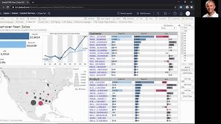
A short product-demo video (YouTube) by DataSelf AI showing an advanced analytics tool. The speaker demonstrates natural-language query capabilities (examples: "Sales by salesperson in 2019", top-10 customers for April 2019, gross profit by state map), switching visualizations (line chart, text table), exporting data points to Excel, and a pre-configured "Sales year-over-year" dashboard with filters, sorting, drilldowns and detailed transaction-level views.
Chapters
When you get the landing page, go to the far left tab. Natural language and this is where the demo script starts. Natural language query is like searching on the Internet. You ask a question Sales by salesperson in 2019 press Enter and the tool will create an instant accurate report. Entering the question by Salesperson sales in 2019 what if we want to see this broken down by month by month? Press enter. The tool will show in 2019 by month a line chart by salesperson. What if I want to see this as a text table? I just press s text press enter instant accurate answer to my question. What if I want to see a data point in Excel? I select the data point, I click the view data icon, I choose full data all columns and download to Excel. Open Excel and here is all the data behind that data point. Let's see another example. Top 10 customers by sales in April 2019 Enter Here are my customers with sales in a descending order in April 2019. In blue they are part of the top 10. In gray they are outside of the top 10. And if I press s text enter the tool shows be only the top 10 and now using a text table instead. Last example Gross profit by state by year as a map press enter. The tool will show by year a map where the gross profit uses the color legend. Let me show an example of a pre configured dashboard that cannot be built with natural language. It is very powerful. Now let's go to the tab number two. Sales year over year. This dashboard is showing for this fiscal year the total. The total for last year. I see the variance in dollar and percentage. I can also see by period in the current period is October 8th. Well what if I want to compare a year to data analysis through the period 9? I can go to this filter, remove those three periods that I don't want to see now right now and press apply. And now this report is showing year to day comparison through period nine and I'm growing about almost 11%. I can see from a ship to and I can see my customers top customer by sales this year. I can see sales last year, the variances last year and the same information by product. Now look my top customer by sales this year is declining a lot since last year to date. Who else is declining a lot? I can put the mouse over and click the sort icon once it shows top sales growth. Click again. I see top sales decline since last year to date. Let me select the top two by sales decline and by doing so the whole dashboard will only show data around these top two customer by sales decline total this year, last year, variance trend analysis, geography analysis and products driving the decline. I'm going to sort the product to see that. Click once to see growth. Click once to see decline. These products are driving the biggest decline. And if I choose, let's say the top three now the whole dashboard changes again. Only for these two customers. Only these three products. And I see the whole analysis. Finally, if I choose, let's say month, September. And then I click sales details. It will bring at the bottom of this report all the details sold in the month, in the period nine in those two years for those customers and those products. All the details, invoice number, product quantity, sales, everything. I hope you found the script informative. Thanks for watching.