This content was created by DataSelf AI. This content was uploaded by DataSelf AI. This is a YouTube video titled "Acumatica: 360 degree View Dashboard" created on January 27, 2019. It features a presentation demonstrating the functionalities of a 360-degree view dashboard, including cash flow projections, inventory management, and decision-making tools for business operations.
Chapters
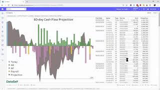
A 360 degree view dashboard like this one can show key performance indicators across the organization. In this example we have cash flow projection orders to ship CRM information, receivables, revenues, website visitors and other financial metrics. I just been informed that a big invoice is being disputed. So I want to see the impact in my cash flow projection. I'm going to click on the chart to go to another section of this dashboard that has more information about my cash flow. Here I can see for the next 60 days the money coming from receivables, the money going out through payroll payables, how much money I have in the bank today, and if I add up all of these measures, I get the projected cash flow for the next 60 days. As long as the most negative amount doesn't cross the line of credit, I do not have a cash flow issue. Now in this dashboard I see a red alert for this amount. It's showing here that this customer is disputing this invoice. I have the customer information, the contact information, the phone number and if I want to call the customer I just click on this amount and I have this pop up that allows me to call, email the contact and also open the invoice right from the dashboard. And if I want to exclude this payment to see the impact in my cash flow projection, I just click exclude and now it's gone from my projection and oh, I'm going to cross the line of credit and this will create a cash flow issue. So allowing decision makers to easily do what if scenarios can help them be on top of the initiatives and more quickly take action. I'm going to go back to the main tab and look at the red alerts like this one in the inventory assets it just cross the maximum on hand. I'm going to click the red bar. It goes to this other tab that has more details about inventory, focusing on the top 10 products by cost on hand today. Each block here is represented by a single product id and if it's red it means I have too much on hand. And right here I have the aha moment. Most of my access inventory is in the west warehouse here as well. If I need to call the warehouse manager I just click the label and I can place a call or email from here. If I'm looking at these dashboards from a mobile device, clicking Call warehouse manager will place a call right off the bat. Thanks for watching.