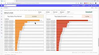
Acumatica's Salesperson Dashboard gives reps a single view of their day: KPIs like sales velocity and commissions on the left, tasks and opportunities to act on in the center, and trend charts showing which customers, products, and locations are growing or declining on the right. Filter by year, quarter, month, or to-date.
Chapters
A salesperson dashboard like this one will help salespeople start their day having a good perspective into what's important. On the left side we can have metrics that each account manager is accountable for. We're showing sales velocity metrics, which are a CRM metric, but we can add any kind of metric like commissions, profitability, and whatnot. Front and center we can add information about things to be done today. If you have CRM, we could have open opportunities to see what the sales part is going to be working throughout the day, have an overview of the tasks, and perhaps prioritize them early in the morning. Top right we have information showing the accumulated sales for the last two months by day. If we're crossing if the salesperson has crossed the sales goal for the past month, how close they are for the current month, and also looking at commission accumulated so far. This usually keeps salespeople highly incentivized to cross the goal and increase their commissions. This section shows the hot and getting cold performers. The idea is who's hot, what products are hot, where is hot? By the same token, who's getting cold, what's getting cold and what is getting cold? I just click the who's hot button. I go to a different section that shows me who's hot. Two ways that we show who's hot out of the box Customers with the top sales this period and they are sorted in a descending order. We can easily change the period to show by year, quarter, month and moving windows can be full periods or to date. On the right side we have the top sales growth since last period. In this case growth since last year. Year to date these customers might not be big enough to be part of the top customers by sales, but because they're growing the most since the last period, we call them who's hot? We also have the same perspective of what's hot by product. We have similar perspective looking at location. We can look at country level, state, cities and other territories. And we also have who's getting cold. And here there are two ways to show out of the box who's getting called. The first one is top sales decline since last period. In this case again showing since last year to date who has declined the most. And if you put the mouse over the name of these customers, it will pop in the center area which products are driving the biggest decline. On the far right we have the no sales. In this case, customers were buying last period but not at all in this period. And again, if you put the mouse over, you'll see in the center area the products that were buying last period, but not this period. I hope this helped. Thanks for watching.