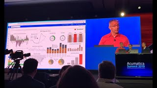
DataSelf connects Acumatica data to Tableau dashboards that let you drill down and act instantly. A customer spotted a loyalty dip caused by commission changes. Thousands of dashboards went live in hours.
Chapters
Login Threatenedica. What ESR has done is, has built an integration to that book and pull a lot of data that comes automatically from Tableau into dashboards. We do have a data warehouse within data. For instance in this case Cash flow Projection or the Sushi CR information that use Google Analytics data is another database in several financial metrics. Now, like John says, typically when you see information, you have insights and take an action. Like cash flow is usually a big deal. So let me click on the cash flow section. This is a big view of cash flow. And here I can see for the next 60 days the money carrying from receivables going out for payables, payroll for payables, in the minute, in the bank today. So when I add all of this cash flow, I have the deduction, right? And as long as the losing number doesn't cross that credit, we do not. Sometimes we are on, you know, looking at even the details and they see a red flag. There's a big invoice being secured and I look at the customer and the contact. John Doe, I think you guys know John Doe. There's a phone number here. Sometimes when I call someone, you know the person you don't know and you know their phone number. So in Tableau, the data set, you can read this information from Natica, from Excel, other data sources to help decision makers get inside the interaction by calling the customer in this example, maybe you know what, if this customer doesn't pay right? I can click and say exclude this payment from my cash flow and just remove it. So let's try again. I'm going to click the number, let's see, exclude it, look what happens in the actual problem. I have to deal with it. So having dashboard like this, that you can see information, make a decision, make an action. Let's say red, red bar. Red bar is usually something is not good. I can click on the red bar and I go into another separate dashboard, receive more details about my email inventory assets, like in this case, my top 10 products I cost on hand. Red means too much on hand. Aha. The aha moment. Less warehouse, too much inventory. I need to call warehouse manager. I can click and I click call manager and then from the cell phone it gets the call right off the bat. So the idea is from insight to action, like John said, super quick. So we have a lot of these reports and dashboards actually more than 5,000 covering financials, sales, inventory, receivables, payables, CRM. There was a lot of things that plug and play this dashboard, custom loyalty Customer loyalty was an interesting story. One of our customers look at this customer loyalty. They notice this dip in loyalty. Videos two and three like the one. Exactly. Discussions why they're leaving in years two. And they found out that the buyer VP of sales changed the commission structure a few years ago to focus on new customer acquisition. What happened was new customers were coming to the door, but they're not taking care of that. They came in and then they saw this problem. They fixed the commission and they reversed the trend. So let me show one more. We have financials and insurance services. This concerns them. Again, you can gather analytics all over the place. This is showing open projects, many feature metrics for technicians for a good enough time. You can see location where the people. Where people are, where they're driving. My department can also train this over time. Awesome, awesome. If you want to know more about the study, which data. So we have booth here right close to getting America. And one of the very interesting things is clients that go to our platform, they typically give us the URL a username password. In a few hours we get live thousands of dash was like this in a few hours. So it's really quite all right. Awesome, awesome, awesome stuff. So.