Advanced Analytics by DataSelf - 5-min Demo Script (Tableau)
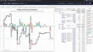
DataSelf's Tableau integration lets you query sales data in plain language, build dashboards showing cash flow and P&L, drill into aging receivables, run what-if scenarios on vendor exclusions, and compare year-over-year sales with variance analysis.
Chapters
When you log in you'll get into this landing page. But the first example that is very powerful is to go to the natural language tab. Here we'll show decision makers how easy it is for them to build their own reports without assistance. Let's analyze sales by salesperson and we just have to type in this box our questions. So we just type sales by salesperson and type enter and right there we get instant accurate answer to the question. It's just like searching on the Internet. Now just like searching on the Internet might get the incorrect answer if you don't articulate your question correctly. In this example I see that the sales is too high. What's wrong? Well, by default the tool is showing me the sales by salesperson in the whole company history. And usually you just want to see for a certain period like in 2019. So what I do now I type in 2019 and I press enter. But when I do that I get an expected answer. What's wrong? Let's click the undo button. This time I'm going to Press in 2019 but I'm going to wait and not press just enter. What I want is invoice date in 2019. So I select this option and now the tool will filter the report to show me instant invoice accurate information to that question. Let's go further and see by month. Here I'm seeing in 2018 by month sales by salesperson using the line approach. What if I want to see a different graphical representation? I can come to the drop down list here like bar chart. Or maybe I am a numbers person. I just choose tax table. It's that easy. Let's see another example. I'm going to clear this query now. I want to see the top 10 customers by sales in 2019. And there it is. Instant accurate answer to my question. Another example I'm going to clear again and let's analyze geographical sales trends, sales by state. And there it is. A beautiful map where sales is represented by the color legend. Let's go now Back to the 360View tab. In here we see cash flow projection, P and L summary receivables, open sales orders, product by cost on hand and sales in a given period. So here I see the total to be shipped today and also late sales orders. And I can see the details by customer and by product using the same color legend as these two bars. Let's focus on only today's shipments. I'm going to click on the today bar to learn more about customers that I'm shipping orders today I'm going to select all of them right here. I see for the last period I shipped $411,000 and today I'm going to be shipping more than that. So pat on my back. That's great. Now look at this. On the open receivables, teal is on time and yellow and orange is late invoices. And I can see a customer with a lot of late invoices. Will that cause delay in my shipment? It might. Right. So let me select this customer name. But now I'm going to go to this pop up and select go to AR aging and clicking on it by doing so. Now I go to the other tab, the AR agent tab that gives me great insights into AR aging trends. In this example is pre filtered only for that customer that I selected. In the prior tab it shows me the totals by different aging bucket. This customer has different locations and this is where the money is coming from and how late or on time the invoices are. Based on the legend, the same information by due date and this is today's date, the document numbers, who the salesperson is and all the details. Now let's go Back to the 360 review dashboard and let's analyze our cash flow projection. In this example, this is showing today's date, this is showing the line of credit. Bars going up is inbound money, bars going down is outbound money. And this line is the cash flow projection. And I can see that on this date October 19th, the cash flow goes negative across the line of credit. So let me click on this cash flow line. By doing so it goes straight into this other tab where I see a bigger picture of the cash flow projection in all the details, all the ar, AP and transactions affecting my cash flow in detail. Well, my issue is on the October 19th and I'm going to click that bar and by doing so it will filter the right side to only show me details for the particular data point that I selected. So in this case October 19th and when I look at the details I might realize that this vendor that I have about a million dollars in bills, it was not approved to be paid yet. So I want to do a what if scenario to remove this vendor from my cash flow and see the impact in the cash flow projection. I just click on the vendor and select exclude from the pop up. And that will recalculate in my cash flow will no longer cross the line of credit. So come back with a positive cash flow projection. Now let's analyze year over year sales by clicking on the Tab number two, we're seeing for a given year in certain periods, the total in that year, the total in the prior year in the variance we're seeing by period that year in a faded blue, the prior year by geography, bigger bubbles, bigger sales that year. And if it's black is growing, if it's red is declining from the year over year change. And then I see customers with the prior this year in the variance in the same information by product. Now let's focus on only the first six periods of the year. So. So I just unselect and then press apply. And now the dashboard changed to only show those six periods and the totals and variances. And let's see that I would like to see customers with the biggest declining sales in that period. I come to the customer table, I go to the variance column and right here when I hover over, it shows the icon. On the far right is a sort icon. I click once. Sort descending. So these are the customers with the biggest variance or sales growth since last year. If I click again on the sort icon, it does ascending meaning these are the top customers by sales declining last year. This example, two of them, over a million dollars. What's going on? So I can select those two bars and by doing so the whole dashboard will change to show only data for those two customers. The totals, the variances, the trend analysis, the geographical information in products that those two customers have been buying last year and this year. And if I want to know which products are driving the biggest decline, I do the same thing. I put the mouse over the varp column. I click the sort icon twice to see the biggest decline. And there it is. These are the products with the biggest decline since last year. And if you want to see details, invoice number and whatnot, I can just select those, let's say three of the products and then on the pop up select sales details. Now I see all the sales details on this bottom section. For instance, if you were to select a document number and click on it. Now the pop up, you could click Open Document. And if you were in a production system, this would open the Acumena page specifically for that invoice. I hope you have found this script informative. Thanks for watching.










