Advanced Analytics by DataSelf 5-min Intro
17 Aug 2020 · 5 min
5:13
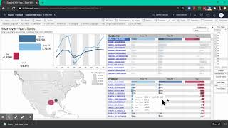
DataSelf AI walks through its Advanced Analytics portal, showing how to query sales data in plain language, generate reports automatically, and customize dashboards without coding.
DataSelf AI walks through its Advanced Analytics portal, showing how to query sales data in plain language, generate reports automatically, and customize dashboards without coding.
When you log in to the Data Self Advanced analytics portal, you might see a dashboard like this. But first go to the Natural language tab. Natural language is like searching on the Internet, but the source is your data sources like your ERP system and the results are reports. And here is an example. Click inside of the Ask data box and type in source Sales by salesperson in 2019. Wait to see the hits, choose the one that meets your criteria. Just click on it and in in an instant accurate report is built by salesperson Sales in the year 2019. What if you want to break down by month? Just type in by month, choose the right hit and again kind of Magic happens in 2019 by month Sales by salesperson. What if I want to see this on a text table format or any other graphical representation? I can choose a drop down, select something else like tax table and now this looks like an Excel file on Excel kind of table. And to export to Excel you can choose data points. I'm going to choose Generate data points. Leave the mouse over this bluish area, wait for the pop up show up and then select the last icon which is View data. When you click it you see a summary of the data. Usually people want to see the full data. So click full data. Choose for all columns. Is this is all the underlying data behind the data points selected in the prior page. Click to download and there it is. You get an Excel file with all the data that you want. That's Excel file. Another example I'm going to click Clear all and you want to See Now Top 10 customers by sales in April 2019. Choose the right hit and again buy salesperson sales in a descending order in April 2019. And the blue bars are in the top 10. The the other bars, gray bars are not in the top 10. Super Easy Natural language again like search of the Internet will enter many questions but not all questions will be answered. And for more elaborate questions you will need people who know how to design reports and dashboards. What I'm going to show next is once the solution has been customized to a client or even the out of the box how powerful these reports and dashboards are. So now let's click tab number two Sales year over year. A very popular dashboard. It shows sales this year dark blue, light blue last year in the variance in dollar in percentage I can see by month trend analysis again dark blue this year and today my sample database is August 8th. So right now I'm not comparing two full years. What if I want to make a comparison on a year to day basis? Well I can easily change the years and the periods on the right. I'm going to unselect the non complete periods so I have a full year to date comparison. Press Apply now the dashboard shows year to date comparison and now I'm growing about 11%. But guess what? My top customer by sales this year is declining a lot. What's going on? Why I can select any data point in this case my top customer. The whole dashboard is filtered only to show data for this customer. The totals, the trend analysis, geography and products. Which products are driving the decline? Right now I can put the mouse over and sort of by these columns I'm going to click on the variance and click on this sort icon. The first click sorts descending. So some products are actually growing since last year to date for this customer. But click the sort icon again to reveal the top products by sales decline Indeed. Here they are. Now this is high level information. Aggregate information. What it want to see details. I can select data points. I'm going to select the top 3 products by sales decline. Leave the mouse sitting there to see this pop up. And now I click sales details and it shows at the bottom a report showing every single invoice and details associated to those data points. I hope you have found this video informative. Thanks for watching.










