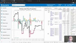
This is a product-demo video by DataSelf AI showing a pre-configured, interactive Tableau dashboard tailored for distribution companies. The demo highlights KPIs and reports including cash flow projection, A/P and A/R summaries, aging open sales orders, and top products by cost on hand and sales. The presenter demonstrates interactive filtering (e.g., show orders shipping today), drilling into cash-flow details (40-day projection) and running a what-if scenario to exclude a vendor to avoid a projected cash shortfall (example given: run out of cash on October 19th). The video also shows year-over-year sales analysis for 2019 through period 9, with sorting and filtering by customer and product to identify top declines.
Questions this video answers
February 9, 2020.
October 19th.
40 days (next 40 days).
2019 through period 9.
Chapters
In this video, we're going to show you some pre configured key performance indicators in reports and dashboards. Let's check them out. This particular dashboard is for distribution companies. The idea here is to gather different metrics across your organization such as cash flow projection, A, P and L summary, aging open sales order, top products by cost on hand and sales. And this dashboard is highly interactive. For instance, if I want to see only what I'm shipping today, so I click on this teal color which represents my open sales orders to be shipped today. When I do so, it changes this section of my dashboard to only show customers in products that I'm supposed to ship today. And let's say I want to analyze a little further the top three customers by orders to ship today. When I select them, the whole dashboard changes again to show my sales in the prior period for those three customers. In this example, only two of them I had sales last month. And I have open receivables for the three of them. And I can tell that this customer actually has quite a bit of this yellow receivables, which means it's old receivables. And maybe this shipment is not going to go out of the door because the client is late with some invoices. As a decision maker, I might want to be proactive to try to fix the problem and be sure the orders get out of the door by calling the customer and hopefully figuring out what's holding the payment. Or if I look at my cash flow projection and I see this line which is the cash flow projection for the next 40 days and when it crosses my line of credit, that means I'm going to run out of cash. In this example, I'm going to run out of cash on October 19th. So maybe I want to analyze in more detail what's causing that potential issue. I'm going to click on the cash flow projection line and the dashboard will go into this other section that gives me a bigger view of what's going on with my cash flow in all the details. Payables, receivables on the right side. Now my problem is on this data point, October 19th, when I click on it, it will filter all the details on the right to show what's happening on that day. In this example, let's say that I see this vendor that have about a million dollars in payables and I realize that this vendor has not been approved yet and this was a mistake. So I want to do a what if scenario and remove this vendor from my cash flow projection. I can quickly do the what if scenario by clicking on the data point and saying exclude. And once I do so, my whole cash flow projection is going to be recalculated. In this case I no longer going to have the cash flow issue. Let me show some more examples. Many organizations do extensive year over year sales analysis. Right now I'm looking sales in 2019 through the period nine and I see the total for that year. The total for the prior year variances the trend analysis by both year in the prior year, by ship to location, by customer and by product. And it's highly interactive. Let's say that I only want to see the first six months of the year to make a comparison year to date. So there it is now only looking the first six months and let's say I want to see who declined the most in sales since the prior year. I just sort the customer table by the variance. First time that I click here I see top growth. When I click again I see the top decline. Let's say I want to choose the top two customer by decline which is huge. And when I do that it will filter the whole dashboard to show only for those two customers my totals, trend analysis ship to and products being sold. And maybe when I see what products are driving the biggest decline I can sort also the bottom section and just make the biggest decline. And these are the products driving the major decline. This is just a simple example of a lot of the reports, dashboards and key performance indicators available on day one. Once you deploy your data self advanced analytics, please watch the next video to learn more.