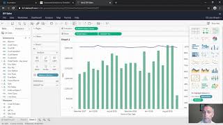
A short demo by DataSelf AI showing how to convert an Excel report into interactive dashboards using DataSelf Analytics. The presenter builds three widgets—a sales-by-customer-by-product table filtered to June 2019, a dual-axis sales and gross-profit-% trend by month, and a map of sales by ship-to state with warehouse breakdown—then combines them into an interactive dashboard with cross-filtering.
Chapters
In this video we're going to show how easy it is to create more elaborate report and dashboards from scratch. For this exercise we're going to start with a report in Excel and the idea is to convert this Excel report into data self analytics. Let me show you how easy it is to create a dashboard showing this information graphically accurately in a lot more interactive than an Excel spreadsheet. Let's check it out. So here I am in the edit mode of data self analytics. Let me build the first part of this report or dashboard which is the sales by customer by product in June 2019. So I'm going to pick from my sales product data panel the customer information drag and drop into my rows. I'm going to take the sales measure and drag into my column and right there I have in the whole company history sales by customer. I'm going to take document date putting my columns so I see sales by year. I'm going to expand to go to the next level which is quarter. I'm going to expand again the next level which shows month. I'm going to make a filter for my years. Now the filters is on the right. I'm unchecking 2018 and now I'm going to create a filter for my months and only select June and that's it. Sales by customer in June 2019. Let me remove quarter because I don't care the quarter information. Now I need to make this report broken down by product. Pretty much I find the product on this list and drag into my report. It's that easy. Let's build the second one that is showing sales and gross profit trends over time. So I'm going to create a new sheet going to double click my sales, double click my document date and choose for my document date. I want to see things by month. So right now I'm seeing my sales trend by sales in my whole company history. I want to see also gross profit percentage. I drag and drop into my report the top gross profit percentage. The bottom is sales. And I want to use a dual axis approach to show this visually in a better format. And right there I can see green bars my sales and my profitability as this purple line. It's that easy. The last piece of my dashboard will be showing by ship to which is my geostate. I want to see also warehouse. Also pick warehouse and I want to pick again sales and tell the tool to show me on a map. And on a map it is. I'm going to make the bubbles bigger. So bigger bubbles, bigger sales and they have slices represented by the amount that was sold from which warehouse. And now I'm going to combine all of these three widgets into a single dashboard pretty much by dragging and dropping the sheets that I just created into this dashboarding area. And it's that easy. Point and click. Drag and drop. I created a dashboard that represents the information was in the Excel file that's going to be automatically calculated. And there is more. For instance, let me go to the map and select the west coast states right there. It changes the whole dashboard to show the trend analysis for sales and gross profit only in the states selected in whatever I sold to those states in June 2019. Or let me select a few other states. It's that interactive. I hope you found this exercise insightful. Don't miss the next videos. Thanks for watching.