Advanced Analytics for Acumatica by DataSelf
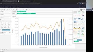
Johnny Girardi demos DataSelf's Advanced Analytics for Acumatica, which lets decision-makers query data in plain language and build dashboards without IT help. The platform pulls Acumatica data via OData, uses AI to answer questions on demand, and deploys in days instead of months.
Questions this video answers
$299 per month.
10 named users.
An expanded offer for 40 users (at the same price) through June 30 (year of webinar).
About 15 minutes to deploy.
Chapters
My name is Johnny Girardi, Data Sales Founder and CEO and thanks for joining us. We know we are in unique times. Kind of crazy here in the Bay Area. We are under a shelter in place rule unless we have basic essential needs, do not leave home. So many people, many companies out there are struggling with this time. So thank you for making your time to learn more about Data Self and as I go towards the end of the session, we're going to also be talking about what we're doing to make it easier for companies out there to also deal with these tough times and hopefully make it easier. So today we're talking about analytics in Artificial Intelligence for Ecumerika and let's discuss what challenges are being addressed by Data Self. The most important one is decision makers usually struggle to have easy access to their reports, dashboards and key performance indicators. Especially right now with this whole crazy things going on. They really need to focus on things that are critical and they need to make those decisions based on facts, not only gut feeling. And having easy access to the reports and dashboards anytime, anywhere, being able to change slice and dice, have ad hoc questions answers is critical now more than ever. But even when we get over this hump, those needs are usually reasons why people come to dataself help decision makers with easier access to their KPIs. Second major challenges, IT people, consultants, business analysts are usually busy trying to come up with reports, dashboards and frameworks and exporting data to excel. Manipulating, checking, security and distribute reports is usually a lot of work for the IT people to support decision makers to be, you know, to come up with their answers, to come up with their reports and dashboards. So very time consuming and Data self usually dramatically reduces that time. At the end of the day people go to Data Cell because they complain that reports network APIs are slow, inexpensive and nowadays especially right now, they cannot afford it. They have to be more self sufficient and they have to free IT people to focus on things that only humans can do, not the mechanical parts associated to reports and dashboard maintenance. So let's see in practical terms the front end of Data Self and how we address many of those issues. I'm going to get out of the PowerPoint, go into an acumatica sandbox and show the natural language functionality available in Data Self and how empowering it is for decision makers. Natural language is like searching on the Internet. You ask a question, you press enter and hopefully you get an answer. Let's see it sales by sales person in 2019 enter simple question. It happens on the fly an instant accurate report is created from scratch by salesperson. I see sales and when they put the mouse over each bar, it shows me more details like the actual sales in 2019 for that particular salesperson. It's that easy. Questions? English, Plain English maybe. When I break down this by month, press enter. What happens is the tool which has artificial intelligence in machine learning behind the scenes, tries to understand what I typed and come up with an answer in a format it believes. It works for me. This example in 2019, by month, by salesperson, it gave me a line chart. Instant accurate answer to my question. Now I might not like line charts. I might not like charts at all. I might be in the accounting department. Want numbers by the penny. How can I get them? Easy. On the right here is showing there's a line chart. I'm going to tell you to show me this on a text table instead or another chart format. And by choosing text table, there it is exactly the way that I want it. Now, some people want to export the data into Excel to do more manipulation. Absolutely. Let's say I want to get this data point here and I want to export this data to Excel. I click view data, then it will give me access to all the data behind the scenes with every single line. Detail, all, everything behind the data point. I click download and then I'll get an Excel file that will let me manipulate in Excel all of the data that I was behind that particular data point. Super easy to go from high level aggregated data to slice and dice it using natural language export into Excel if you want to and do whatever you want in Excel. Super empowering for decision makers. Let me by the way, if I had logged with the right credentials, which I did not, I would have a save button. So if I want to save this report for later use or for sharing with other people, I could. Unfortunately, I didn't log with the right credentials, so I cannot save right now. But you yes, you can save reports and dashboards. Let me clear and build another query. Top 10 customers by sales in April 2019. A more elaborate question and just to show you this time I did not press Enter yet and the tool popped two different options at the bottom. Just like in Google or Bing, when you ask a question, you press Enter. It lists the options that match your question. Again, what's happening is artificial intelligence. Look at the words, come up with an answer to what you're asking and then list the options. Sometimes it can't find an option because it didn't understand you. Just like, you know, searching on the Internet. But sometimes, by the way, if I just press enter by default, it chooses the first option and sometimes it's not the right one. Sometimes you have to actually choose the second, the third, the fifth, the tenth one. Anyhow, that's how natural language works behind the scene. It's giving options and in executing I'm going to press enter because again, the engine got exactly what I meant in the first option. In this example, again instant echoed. Enter my customers sales in April. Blue means in meaning inside of my top 10 customers. And somehow for some reason it decided to give me out, which is customers that are not part of the top 10. Okay, you know, it's okay. Maybe I didn't want to see, but it gave me. But I can clearly see the top 10. And yes, if you want to see in a text format, absolutely, you come back to this dropdown, choose tax table and you go back to seeing this information on a text table format. And in this case, because it's textable, the engine decided to not give me anything but the top 10. Thank you. Sometimes computers understand me great. Now when they look at the report, actually it's listing customers alphabetically. Ah, no, I actually want to see sort of descending computer. Come on, you should know me well the way I can change the sort, I could just type in sort by sales or if I put the mouse over the customer, there's this sort icon. I can come over here and say sort by sales and then it's going to sort descending order by sales. The point is easy empowering natural language, very simple techniques will enable decision makers to be a lot more self sufficient. Last example, I'm going to type gross profit by state, press enter and a beautiful map shows up. Because I chose a state where the gross profit is the color legend and I can see how I'm doing by state the gross profit. And if I choose by year as a map, then what happens that it will break down into my sample database. I have two years worth of data is going to show for two years how I'm doing by state with the gross profitability. And yes, you can see as a table. Sorry, I'm showing this again because so many times people say hey, can I see on a table? Hey, can I see on the table? So yes, any point in data self you can easily convert something that is in a chart format into text or vice versa. It's usually a click or a couple of clicks away. So what I showed is focused on decision makers. Easy, empowering, anytime, anywhere. But many reports and dashboards they can be very complex in natural language, cannot answer all the questions. Just like searching the Internet, you gotta sometimes and quite often call the expert for more complex requirements. That's what I'm gonna show now. I'm gonna go into the report and dashboard editor in data self to show the mechanics of how to build more complex reports and dashboards. I want to build a simple one but show the mechanics that the foundation where you can build very complex ones. I'm looking at sales and I'm going to build a report in a dashboard showing sales by customer by year, broken them by product and then do some trend analysis around product classes. So let's start. I want to see customer, I want to see sales just drag and drop. So by customer sales I want to see by year I'm going to drag and drop invoice date to my columns. So I see by year and I want to break down by product just drag and drop, point and click. And I built a simple yet powerful report showing by customer by product sales the past two years there's a lot more things you can do, filtering, change over time. There's can do a lot but drag and drop, you can do a lot of the basics. Next I want to show how to build a trend analysis. I want to see sales double click sales double click invoice date, show this over by month. So seeing sales by month in the whole company history. My kids are making noise here. Sorry if this is distracting you. You know, as I mentioned, I have my kids at home, so sales by month in the whole company history. I also want to see quantity sold. So I'm adding quantity sold to the report. Top sales, bottom quantity sold. And I want to show this on a dual X approach. So everything on a dual axis bars quantity sold, sales, the trend line. And finally I want to add product class as part of my analysis. So just drag and drop product class in the report. So I will have a section for each product class in the trend analysis. In my example, core line is so much bigger than anything else. And let's say I don't care the core line because I only care about the other, you know, product classes. I'm going to click product line and say exclude is not my area. And by doing so now I see all the other product classes in a better format and that's it. I build those two reports from scratch, point and click, drag and drop, no programming involved to do a lot of the things. And now I'm going to create a new dashboard where I can see both information side by side. So I'll put the grid analysis on the left, I'll put the trend analysis on the right. I'll get a little bit more room in the report and finally once you build it now I have all the grid report here, the trend analysis here. And if I pick a product class on the right, it will automatically filter the details on the left to just show customers and products associated this particular product class. And of course you can use Windows standards. I'm going to press and hold the control Button to select 2, 3 different product classes and automatically it filters on the left customers and product sales associated only to those three product classes. So this is the basic functionality to create new reports and dashboards. You can build very complex ones by using the report and dashboard editor. Still the basics. With a few hours of training, you can do a lot with little training involved. This tool is really helpful and easier to use even for IT and consulting people. Much easier than the built in functionality in ERP systems. All right, so I just showed the natural language as well as the report and dashboard editor. Now I'm going to show a little bit of what's included available out of the box for acumatica with advanced analytics. And I'm going to show the sales year over year dashboard. So this is a dashboard available out of the box. You know, once we deploy in a few hours it's up and running with your data. What it shows is in the current fiscal year in my sample database, 2019 I see for all periods. So sales is for this year is in dark blue, fade away blue sales last year and the variance I'm declining. However, in my sample database today is October 8th. So as you can see also the trend line the dark blue this year. Right now October sales is slow and of course no sales for the future. While last year the fading away blue is across the whole year. So common you want to analyze year to date analysis or a few months last year versus this year, the second quarter, the third quarter, maybe a single month. Super easy. With this dashboard. I want to see let's say year to day comparison to the period nine, you know, nine full periods. I just unselect periods 10 through 12. Press apply. Now the dashboard changes to only show the full periods. And now actually I am growing about 11% pat on the back analysis by location. Bigger bubbles, bigger sales this year. And black is growing since last year. Red is declining since last year. So Texas is nicely growing since last year by 30, 38%. Pretty good. And then I see customers sales last year, this year and is sorted in a descending order by this year. And what has changed since last year? Same information for product. Now when they look at this report, my top customer has a major decline in sales. Huh? What about it? Do I have more customers that are in declining sales? Well, maybe. I want to see that. It's very easy to put the mouse over these columns to sort. Using this sort icon I go to the var and I click once to see the variance. Now I'm sorting in a descending order meaning these customers are growing the most in sales since last year. Cool. I'm going to sort. Click again the sort icon. And now I see in an ascending order meaning these customers are declining the most in sales since last year. Pretty critical information. And my top two customers by sales decline is over a million dollars. I'm going to select them to see why. What's going on. When I select those two bars, the whole dashboard changes. These are the totals for these two customers. I have a drop of 33% in sales since last year to date. Trend analysis, you know this year below by far last year. What's happening from a location standpoint in products that are being driving these trends. And maybe you want to see decline by product. I can sort here as well. Click once. Some products are actually growing since last year to date. Click again. These products are driving the biggest decline in sales with these customers. And let's say if I select these three products again, the dashboard is filtered by these three products. And in a production system, if I click sales details now, it will pop at the bottom of this report all the details like in a GI but in a better way to look at information. Periods, salespeople, customer document dates, document number, product quantities, all the details. And yes, you can export Excel if you want to do manipulation outside of this. The point is these dashboards are highly interactive like in Ecumenica. If you click something you always go to the GI to go to the underlying data. And sometimes that's too much information. People want to analyze first the big trends before they drill down to the details and data. Self provides a kind of framework. We have a lot more. We have ar, aging, AP Aging, Cash Flow Projection, sales order product on hand, P and L. We have a lot more to cover, but I just gave you an overview of what the solution can do from a customization standpoint as well as some of the out of the box reports and dashboards included. Let me switch back to my PowerPoint to wrap up this in a few minutes. How the solution works. We pull data from acumatica through odata so the data comes into Data Self Analytics Server. We use natural language, artificial intelligence, machine learning, a transparent data warehouse to deliver reports and dashboards. The tool the platform is powered by tools like Tableau, Power, BI SQL Server in our own extraction tool. At the end of the day it returns back to acumatica Business intelligence. It allows users to be a lot more independent, a lot more self sufficient and it allows the IT people to be a lot more productive supporting the decision makers with their data analysis needs. That's how the solution works. Behind the Scenes Pricing the solution is $299 per month and this pricing includes AP and AR, aging Arkansas sales, catch a projection financials which is pretty much P and L and some GL anal analytics and it also includes 10 named users. For additional costs you can add more users or you can also add what we call the Distribution edition which includes sales order, purchase order and inventory analysis. We're also adding Construction Edition and some others. So keep an eye as we evolve and roll out more editions. Since we are in unique times, we are extending a special promotion of this price for 40 users, not 1040 users through June 30th. We believe that by then we're going to be getting over this hump and our lives will be back to normal. So we're counting on that. And we have inventory of user license that we can provide to our clients. So you guys can hopefully as you are addressing all of these changes at least you can get better reporting for a lot more users for a very low cost and hopefully get back to our normal lives sooner than later. So we're kind of trying to do our contribution. When June 30 comes then you can just drop the additional users, no question asked, no extra money required or you can just license additional users as needed, you know, on top of 10. So after June 30th you know, drop or pay users as needed. This is a month to month contract so if it doesn't work for you you can cut it anytime. But I can tell you if you start with Data self you will love it and your salespeople, your decision is going to say oh my God. Thank thank God we have a tool now that we can run with it without calling for assistance all the time. The promotion as I mentioned has limited availability. If you want to take advantage of it, please contact us quickly so we can get the ball rolling. How can you get the ball rolling? Let me just go back to our website. If you go to dataself.com click acumatica icon and then click Advanced analytics button right here in the middle. This page has a lot of information around Advanced analytics, including this video that has actually there are four videos covering what I covered here today in a more concise way. If you scroll down there's a lot of additional information. Technical information, business information, more details about how pricing works. So take a look to see how it works. And again, right now we are not charging an extra $200 for 40 users through June 30th. Scroll down further, you have more information and you also have this page where if you click here Core Financials it will give you a screenshot of many of the out of the box reports available with the Core Financials solution. So feel free to explore and if or when you're ready to move forward, click the Deploy analytics now button. In about 15 minutes later you'll be done with it. 1515 minutes is the time it takes to deploy Advanced Analytics. There are two technical steps is creating a user for data self and uploading GI's generic inquiries. The form provides instructions on how to do it, but we highly encourage you to involve your VAR acumatica var to assist you in the process. But anyhow, 15 minutes is the time it takes to deploy Data self Analytics and you get it up and running. We do also have data self. Enterprise analytics is a product that can do a lot more than what I covered today. Today it's already a lot. But yes, we have Enterprise Analytics. We can do even a lot more Multi company, multi tenant. If you want to bring more data sources together, maybe you have a point of sale system, maybe have a different E commerce platform, maybe you have salesforce.com, maybe Google Analytics, whatever it is, Enterprise can bring all of your data together. I hope you have found this webinar informative. We're running out of time so we're going to be skipping questions, but if you do have questions, please contact us and here you'll have my phone number and email address. Feel free to contact us to explain the situation that you're going through and see how we can help. Thank you again for investing your time in these challenging times. We're doing our best to assist our clients to navigate and hopefully take the burden out of your team and empowering your decision makers so they can focus on factors facts on where your company must be putting resources to weather this challenges time. So we hope we can help you and we're doing our best to facilitate that. Thanks for joining us. I hope you have a great day. Thank you.










