Advanced Analytics for Sage 300 by DataSelf
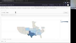
Johnny Girardi demos DataSelf's analytics tool for Sage 300, showing natural-language queries, drag-and-drop dashboards, and prebuilt sales reports. The platform lets business users ask questions of their data without SQL, while IT teams spend less time on custom reporting.
Questions this video answers
$299 per month.
10 named user licenses (with a temporary promotion to increase this).
Promotion extends access to 40 users through June 30 (promotion limited availability).
Month-to-month (cancel at any time).
About a couple of hours to install the data extractor and get initial data pushed; system may be live within hours or by the next day.
Chapters
All righty, everyone. Thanks for joining us. My name is Johnny Girardi. I'm Data Sales founder and CEO. First of all, I'd like to thank you for joining us. I know we are in unique times. It's kind of crazy out there for many people here in the Bay Area. We are under shelter. What's this special shelter in place or something? We're not supposed to leave home unless it's for basic necessities like, you know, food, medications, fuel and whatnot. So I have my kids at home and it's been challenging for me, even though I'm used to work from home. But many companies are struggling. So thank you for making yourself available. What we're going to be talking about today is analytics in artificial intelligence for Sage 300 and the new product that we're just releasing. So let's talk first about the challenges that we are addressing. The most important one is many decision makers of companies using Sage 300 complain that accessing their key performance indicators, their reports, their dashboards, it's not easy and it's complex. It takes a long time to get them. They're not timely. When management have ad hoc questions, good luck, you know, the answer is not easily available. So one of the most important challenges we address is exactly that. Make it easy, make it available anytime, anywhere, and allowing them to find answers to their questions without calling anyone else. So that's one of the major benefits of data self or pain points we address. Second is for the IT people, the consultants, the business analysts that support decision makers. Usually they spend a huge amount of time with reports and dashboards and KPIs, you know, extracting data, manipulating data, exporting to Excel, going through data prep, cleaning, security, distributing reports is usually a lot of work. So that's the second problem we address is making much easier for these people to do their jobs, which is the more IT focused job. And at the end of the day, you know, overall the challenges are access to KPIs, reports and dashboards. It's slow and expensive and we're going to show how we make it easier, faster, empowering, and much more affordable to take care of those problems. So let's jump right into the product to take a look at how users access the system. So I'm going to switch gears now to data self analytics for Sage 300. And the first thing I want to show which is the most empowering is natural language query. This is like Google or, you know, searching the Internet for your data sources. I'm going to be showing for Sage 300 but we can do for out of any data silo. So out of Sage 300. Right now I'm looking at sales information coming from Sage 300. And as a business person I just have to know how to search. Just like on the Internet for instance, sales by sales person person in 2019. So I asked a question, sales by salesperson in 2019. And I press enter and magic happens. It's not magic, but an instant accurate report is created from scratch. In this example by salesperson, I have sales in every bar. If we put the mouse over it tells me more details including the sales amount in 2019. Very empowering. Ask the question, get the answer and let's say hey, I want to break this down by month, press enter. A new report from scratch is created in this case in 2019 by month, by salesperson. I have trend lines. What is happening here? Well, behind the scenes there is artificial intelligence and machine learning trying to understand what the human typed and coming up with an answer and showing in a format that the engine believes the human wants. And sometimes it doesn't do a good job, sometimes it doesn't have the job at all. Just like the Internet doesn't have all the answers. And sometimes you have to do a little bit of homework to find exactly the right angle. Like in this example. Suppose I'm an accountant. Charts don't work for me. I want to see numbers by the penny. How can I see it? This example right now is showing a line chart. I can choose this drop down list and choose text, table or any other chart format. In this case I'm not going to count them. I want to see numbers by the penny. So I chose tax table and ah, now I like it. I can see for every salesperson for every month, sales by the penny. It's that easy. And hey, maybe you want to export the data to Excel and manipulate outside. Absolutely. Let's say you can choose the whole report or let's say a data point like this one. I'm going to click View data. View data means I want to see the underlying data behind that data point and I see the full data with all the rows. All the rows be anything behind the data point, invoice date, invoice number, quantity, sold, product, salespeople, anything is all included. And now I click download this data and I get a file in Excel that will allow me to then in Excel do further manipulation. Slice and dice it. Whatever that you want is right here in Excel. So very powerful, very easy to manipulate in the web browser anytime, anywhere. If you want to export to other tools. Excel, PDF, PowerPoint is very straightforward. Let me show a couple more examples. If I would like to save this query for later, there is a save button that right now I logged with a user that cannot save. But if I had the rights to save, I would have a button here to click and save and then this report will be created. It would be saved. I don't need to search for the query, it was just pre saved. I just pull it and it gets the answer. So yes, you can easily save your natural queries that you create. Let me clear and build another one. I want to see top 10 customers by sales in April 2019. A more elaborate question. And this time I did not press enter just to show you that the artificial intelligence, when you read the words, it gave me two options to choose from. Sometimes you have no options, sometimes you have 10 options. So the artificial intelligence engine came up with options to interpret my question. And the first one in this example is the one that gives me the right answer. But sometimes it's not the first one. I would have to choose another one. Just like in searching the Internet in Google or Bing, you know, you type it in, you got a list of things, you click the one that you like, and then you think that you like, and then you see the results. When you know the answer, the option will be the first one, you just press Enter, which I'm going to do right now. So I'm pressing Enter and the tool takes the first option and builds a report from scratch beautifully, instantly and accurately. So right here by customer, I have sales in April 2019. And in blue means in the group of 10 top customers. If it's great, it's outside. So the tool thought that I want to see all of them and just highlighted in blue the top 10 customers. And again put the mouse over, I can see the numbers. Very powerful now. Yes. You can also make this information on a tabular form. You just go back here to the dropdown and choose tax table and the tool will convert that chart into a text table. And sometimes it does more. Sometimes you love it, sometimes you hate it. Just like searching the Internet. In this case, I loved it because instead of show me all customers in and out, which to me was like, no, I didn't ask for out, I just asked for in. In this example, when I chose the tax table, it actually eliminate the other, eliminated the other ones. It's only showing my top 10 customers by sales in April 2019. Love it, simple. But when I look at it, it's Sorting by alphabetical order. Ah, dude, why, why didn't it keep it in a descending order? I don't know. Who knows computers, right? Why? They have a personality perhaps? Anyhow, jokes aside, I can come over here, put the mouse over the header and I have this icon sort icon. I can click and say sort by sum of sales. And now I put right back into sorting in a descending order. So overall very easy to modify to customize the tool usually within five. I mean many users learn how to do this with zero training because it's just like searching the Internet and if you give an extra 510 minutes to show the dropdown and how you can kind of sort things and export Excel, then they run with it. Last example. So I cleared the sheet again. I'm going to say gross profit by state, press enter and a beautiful map pops up where gross profit is represented by the color legend. So I can see by state how much the gross profit is and let me say by year as a map just to show that I can also do analysis over years. This example in my sample database I have two years worth of data. So 20, 18 and 19 and now also using the color legend I can see how things are changing over time. Easy. And by the way, yes of course you can see as a text table, sorry that I'm showing so many times that you know, I have many demos where people ask me hey, can you export can you show in text? So yes, yes, you can expand show as a text and you can also easily show as a map or as other representations. It's usually a click away, a few clicks away. Alrighty, so this tool here is designed for business people. They can ask questions, ad hoc questions and a lot of the times find answers to those questions without having to call anyone else. They can do this anytime, anywhere, as long as they have a device connected to the Internet. Amazingly powerful. This is for sage 300 already that is available out of the box. But natural language is available for all data we bring to data self. If we bring data from your payroll, from your Google Analytics, no matter what, natural language would be available for any data source. Now natural language is not a sophisticated. It's not designed to consultants to address more sophisticated reporting needs. That's what I'm going to show you now I'm going to go to the data self report and dashboard editor where people who go through more training, usually hours of training can build very simple to very complex reports and dashboards. And I'm going to show a simple example of a new report in A dashboard built from scratch. So this is the actual report dashboard designer more designed for business analysts and consultants to do the more complex requirements. So I want to build a quick dashboard showing sales by customer by product and trend analysis. So here, this is my. By doing my sales information out of Sage 300, I want to see customer drag and drop. I want to see sales by customer drag and drop. So this is sales in the company history by customer. Let me put top customers at the top. So descending order, these are my top customers. I want to see sales by year. I can take invoice date inputting my column. So by default it shows sales by year. And I want to break it down by product. I take product drag and drop. There it is. By customer by product sales. Those two years I can make this way more sophisticated. The point that I'm trying to say is if you know how to drag and drop, point and click, you can make a lot of reports quickly and easily. Is just a drag and drop away in a way. Okay, this part of my report, I also want to do a trend analysis. I want to see sales and gross profit and quantity sold trends. I'm going to double click sales. I want to double click invoice date and I want to see this over my months. So right now I'm seeing sales amount by month in the whole company history. I also want to see quantity sold. So I'm going to put quantity sold in my rows. So sales here, quantity sold is here. And in this example I want to see these two different metrics in what is called a dual axis. What I see now is quantity sold shows as bars, sales amount as a trend line in orange. And finally, suppose I want to see this trend analysis by product category so I can do product category drag into my report. Now for every product category in my database, I have the trend analysis. And let's say that I don't want to see a few of them. I'm going to select a few of these product categories. Let's say they don't care for my particular analysis. Right now I just selected all of them using the press control, press and hold the control button in windows and I'm going to exclude them out of the way. So right now I'm just focusing on these three product categories and see what's going on with my trend analysis. Very intuitive. Point and click, get to this data set. And finally I want to put these two different views into what is called a dashboard, an interactive dashboard. I'm going to drag and drop my sheet one and my Sheet two side by side in a dashboard. Just going to change the layout a little bit. And let me just make this. And now when I look at this very simple dashboard I just created from scratch and I see all the details here, if I choose, let's say this particular product category, when I click on it here, it will change the report on the left to only show customers and products that purchase this product line. So as I, as I interact with my dashboard, it changes the left. Very easy, very intuitive. So I just showed you two ways to build reports in dashboards from scratch. Natural language for business users so they become more independent. In the report and dashboard editor I showed a very simple example. Yes, but if you compare what I did and you try to do the same using your current reporting platform, if you can do better than what I just did, easier let me know because this is supposed to be the top, the very empowering and amazingly easier and faster to get the job done. What I'm going to show you next is some sophisticated reports and dashboards built from scratch available on day one. Once you go with advanced analytics for Sage 300 and this is one out of many reports and dashboards available on day one. This is a very popular request around sales is the ability to extensively analyze year over year sales trends. In this example, this year is 2019. I have all periods selected. This year is almost $35 million in sales, last year 40 and there's a big decline. However, in my sample database today is 10-8-2019. And as you can see on the trend lines through period 9 full months in period 10, the current year is still just starting and for the next two periods I have zero. Well, what if I want to analyze year to date sales through period nine, which is a full period? Sure. I come over here, I uncheck the period that I don't want to see press apply and now I'm doing a year to day comparison through the period nine. And now guess what, it's growing about 11% since last year to date. I can see the trend analysis where darker blue is this year fading away. Blue is last year. I can see my customers top this year, how they were doing last year and the variance since last year to date or year over year, same perspective by products and by geography. Bigger bubbles, bigger sales, black bubbles. I'm growing that state red bubble. I'm declining since last year, year over year. Now when I look at a dashboard like this, I might want to interact with the data. You know, I see my top customer by sales. This year has A major decline. Hmm. What about it? Do we have more clients having major declines? Try to answer that question easily. If you don't have this report ready in data self, I can come over here and mouse over these columns and when I mouse over there, this icon which is a sort icon. If I click once, I'm sorting this ending. So these customers are growing the most in sales since last year to date. I click the icon sort icon again. Now it's ascending order meaning these customers are declining the most since last year to date. Two of my customers with more than a million dollars in sales decline. Why? What's going on? Well, I can select the two customers and by doing so the whole dashboard will change to only focus on data around these two customers total this year. Last year 33% dropping sales where I'm shipping to trend analysis. And the products that are being sold, they were sold last year and this year. And what products are affecting these transactions? These two customers I can sort, let's say by variance, so some products I'm actually selling more. But if I sort this ending, it shows me products that I'm selling less, a lot less. And maybe I want to select those products that I'm selling a lot less and do some further analysis in a production environment. If I click this sales details, it pops from the bottom of the report all the sales transactions just like in Excel, invoice number, invoice date, customer quantity sold, all the details affected around those three products. And then I can export Excel and do my analysis if that I choose to do. But the point is this is highly interactive and would allow decision makers to extensively analyze these different trends using more sophisticated reports and dashboards. And as I mentioned before, we can teach your more tech users how to use the report in dashboard editor to build more elaborate reports and dashboards like this one. This platform can replace pretty much Excel crystal reporting services in an easier better for it so they can do their job more quickly, be more efficient while empowering decision makers to be more independent, being able to make changes to make, be able to use natural language to get their answers, their questions answers without calling it over and over and over. These are unique times we're running through and sometimes it is critical for decision makers to know which initiative they should be focusing on so they can weather this crisis and more quickly get out of it or hopefully even focus on areas that might be growing and people might not be knowing until they see the trends. So hopefully this will help your company get over this hump. All right, I hope you have found the demo informative. Going to go back to the PowerPoint to talk about some additional information. The way the system works is we install a small application on premises that will extract data from Sage 300. It sends the data to the cloud. There is all of this natural language, artificial intelligence, data warehousing, reports and dashboards, Tableau Power bi There's a bunch of tools behind the scenes doing the magic. At the end of the day, what you get back from Data Self is business Intelligence, a tool that will empower decision makers in a tool that will make it easier for IT and consultants to do their jobs more quickly because boy, there's a lot of problems out there to be solved beyond the basics and hopefully reports is something we can alleviate out of your to do list. Another great news, Pricing. The Pricing starts at 299 per month. This includes AR. This actually is OE sales, not AR is OE sales and AR aging and includes 10 named user licenses. Because we are in unique times and many people are having a lot of struggles moving some of their workforce to work from home and all of this change going on, we decided to extend this promotion to 40 users through June 30th. We hope that by June 30th life will be back to normal. So we decided to allow more users to be taking advantage of Data Self through the end of June 30 for the same amount of price per month. This is a month month contract. So if it doesn't work for you, you can pull the plug at any time and you have invested little money. This promotion has limited availability, so if you think it can help you, please contact us quickly because as soon as we run out of our inventory of users, this promotion will be back to what the regular pricing is comes June 30 assuming everything is back to normal. Hopefully that's going to be the situation if you don't need more users than 10. Just the commission, the extra no questions asked, no charge. Good to go if you decide to keep some users, all users, more users, you just pay the regular monthly subscription and you're good to go. So please contact us in case this can help take care of the reporting side of your business in the long run and even the short period of time before I open for questions and answers, which we're running a little bit out of time. I also want to show you in our website. So if you go to dataself.com press sage icon, you come to this page here and you press sage 300 button and then you click Advanced analytics which is a new inexpensive product. This page will have more information videos that can give you more insight into this technical information descriptions, pricing in more detail, how things work, more technical information architecture and also at the bottom, if you click this dashboards for Sage 300 you go to a page where you have screenshots of the dashboards or some of the dashboards available out of the box from Advanced Analytics. Final comment is Advanced analytics is a new product, it's very inexpensive, is designed to work with a single Sage 300 database. If you have more than one. If you have multi company then we have Enterprise analytics which is a big broader product that can bring multi company multi currency. It can bring data from other data sources, from point of sale systems, from Google Analytics, from whatever data sources you have in your company. We can consolidate them together using similar technology of Advanced analytics, but using a more robust and actually a full fledged data warehouse, completely customizable. So all of these things are available out of our system. All right, questions and answers. So if you have questions, please type in in the zoom panel. Going to open the questions and answers to see if there's anything to be addressed. And yes we have questions. Question from Karen how long does it take to deploy data self from my sage 300? Karen, thanks for your question. So the deployment of what I showed, which is Advanced analytics for Sage 300 it takes about a couple of hours my team or your reseller sage 300 and the reseller will work with your IT people to install a simple data extractor. Actually let me show the architecture here again. A data extractor? Yeah, a data extractor into your network where Sage 300 is, can be on premises, can be in the private cloud, no matter. So we'll be installing this extractor, we'll be scheduling a procedure that will automatically refresh the data on schedule and push into the cloud. So typically within two hours of our team or your Sage 300 reseller VAR with your IT people, this process is deployed, then the system will come alive in a few hours or by tomorrow. And then about 40% of our clients would be ready to run. The out of the box usually works perfectly for about 40% of our clients. The other 60% might need more, might need training, might need additional customizations and then typically those services can be a flat fee additionally or they can be also based on the requirement, we can assess what kind of additional support you might require. But again, 40% of the clients, no additional service required, out of the box deployed, off you go. Others depend on their needs and how much customization they might require. We're running out of time so let me just close here with the last slide. I understand we at Data Self, we understand the unique times we are in would make an extra effort to assist our clients and resellers to help this transition, to help with the tools that we have so you don't have to spend so much effort with reports and dashboards. And we do have clients telling that, you know, right now is one of the most critical times to look at their trends, to find exactly based on facts, not on gut feeling only, but based on facts where they should be focusing on their time to be sure they take advantage of opportunities that might be right in front of their eyes if they don't look at it, as well as threats that might be causing major business disruption. So reports and dashboards now can be super critical to get decision makers to make informed and proper decisions. If you have a question or comments by the way, we are recording the session we're going to be making available later today or tomorrow, but if you have question, comments, feel free to contact us. This is my email and phone number and hopefully we'll be here to help. Stay safe. Good luck with this whole situation and hopefully we'll get out of it in a few weeks to come. Thanks for joining guys. Have a great day.










