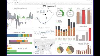
Johnny Girardi (DataSelf founder/CEO) demos a CFO dashboard built with DataSelf + Tableau that consolidates 11 data sources (AR, AP, payroll, cash, sales orders, historical sales, CRM opportunities, AR aging, GL financials, inventory, website visitors) into an interactive landing page used daily by a CFO. Key features include a 60-day cash-flow projection (configurable window), a $1.5M sample line-of-credit threshold, lead KPIs (future-focused: cash projection, orders-to-ship, hot CRM opportunities) and lag KPIs (year-over-year revenue, website visits, EBITDA), interactive drilldowns (AR aging → email/customer/ invoice PDF; inventory top-10 by cost = $207,000 with warehouse breakdown), and budget vs. actual expense tracking by account. The dashboard was built by the client’s CFO roughly six months after DataSelf deployment, completed in about a month.
Questions this video answers
11 data sources.
60-day cash-flow projection (configurable).
$1.5 million.
$207,000.
Built by the client CFO about six months after DataSelf deployment; development took roughly a month.
Chapters
For joining us, this is Johnny Girardi, Data Self founder and CEO. And today we'll talk about financial analytics with Data Self in tableau. So what we're going to be covering is first of all I want to start from the, from the end of the process how one of our clients, the CFO of one of our clients is usually using our out of the box in our financial analytics out of the box to come up with very insightful and very interactive dashboard. So I want to show you that first, get a glimpse of possibilities. Then I'll talk a little bit about the pieces, balance sheet and property losses. A lot of people ask us about it, so I'll talk about it. I'll talk a little bit about budgeting, what if scenarios and forecast. Focus a little bit more on the financial analytics components that quite often I don't see many people taking advantage of good financial analytics. And we have a varied solution right now. At the end of the session we'll have a Q and A. So let's switch gears and I'm going to go now and switch to Data Self analytics. Show me the dashboard put in full screen. This is an example of a CFO dashboard built by one of our clients. The idea of the CFO is he needs to be on top of several financial metrics as well as operational metrics. He goes beyond the financials. He's really looking at the whole operation and he's managing many of the KPIs. This dashboard alone, when he logs to every morning and he opens the data analytics, he logs into data analytics. This dashboard pops right off the bat. It's the first page that he sees. This dashboard combines 11 different data sources. It has receivables, information, payables, payroll cash on hand, open sales orders, historical sales, CRM opportunity information, AR, aging, GL financials, many pieces of the GL financial metrics, inventory on hand and also website visitors. All this information comes into the Data Self data warehouse, then comes into the CFO dashboard. He actually built this dashboard himself. But let me give you how insightful and interactive this dashboard is. One of the most important pieces is the 60 day cash flow projection. This could be 30 days, 90 days a year, doesn't matter. In this case was a six day cash flow projection. What he has here is he has the receivables with a due date for next 60 days, the payables as negative amount of money, what is supposed to be paid as payroll and also how much cash he has on hand today. When you add all of these metrics Together there is this projection cash on hand for the next 60 days. And he has a line of credit available. In this case, it's just a sample data, it's not his data, but has a line of credit that covers, in this case, $1.5 million. So as long as he's projected on hand is below this threshold, no worries. Now, sometimes they're doing what if scenarios and let's say, hey, you know, this customer here is, has a major payment on this day and is not coming because of some problems. And then he removes this payment, this inbound money. And what happens is now the cash flow is going to go over the line of credit and he'll have to deal with that. So this is a very simple but very interactive way to look at cash flow projection and allow them to be on top of things and work proactively before they hit issues. This whole left column has what is called lead KPIs. Lead KPIs is looking into the future. And the idea is to allow decision makers to come up with decisions to influence the process that's going to come in the future. Like I said, cash flow projection. If we're going to run out of money at some point, what should I do? So before it happens. This is another example of lead KPI is orders to be shipped in the next 60 days. And as he puts the mouse over each one of these, it shows the customers and how much money is supposed to be shipped in the next 60 days. This section is open opportunities from their CRM system. And it's just showing hot opportunities expected to be closed in the next 60 days. By hot is above 75% probability. So by clicking here, he can see how much is probable from each of these opportunities. All of these segments, they are interactive in a way. Let's say in the AR aging. If I click on, let's say on the dashboard here, it goes into a more detailed tab of this whole segment. In this case, it's showing detailed AR aging information. So by customer and what's on time in the other AR aging buckets. And then let's say, hey, this client has very late invoices. What's going on? I click on it and by clicking on it, I could right off the bat email the customer. I click here, I go into my email and I can send a message to the customer or I can view the customer in another application like their CRM or when I clicked here, when you click on the left, it shows what invoices are for this particular customer. So for this One before I actually email the client, I want to see what's going on. And this invoice here is big and maybe I want to take a look at the invoice and I click on it. Their system allowed us to connect all these pieces together. So by clicking here I can open an invoice. So the invoice is in a certain place. The PDF file with a specific name in the tool can make this very interactive to let the CFO jump from one place to another. The database all within the BI system. So very interactive. This second column here is about, I mean this whole other section of dashboard is about lag KPIs meaning KPIs looking at performance that's been done already today from the past. This column in the middle here is about last year and this year. So last year is blue, this year is black. The top one shows revenue year over year. So I can tell I'm growing a little bit since last year to date. And I can see on the curves sales by month last year and this year side by side and see that performance. The bottom is showing website visits. So this year quite bigger than last year, which is good. And how are we doing on the east coast? So I can select the east coast and right there I see that on the east coast we grew more than twice as much. Big increase. And maybe I want to see more details about it. So in this case I can click on website visit and I can go into another page that gets more detail and and here can be very interactive. So I'm seeing colors darker. More visits and I can tell Florida grew a lot. New York and Virginia also grew significantly. Here there are a bunch of financial metrics, EBITDA for instance. Click on it. Go again with more details to see the information by month and accumulated throughout the year. And the same information on a chart format. Oopsie. Revenues, gross profit, cost of sales, revenue mix. This top right corner is very interesting because the CFO has to keep a close attention to three accounts from expenses, three expense accounts very closely. So he has those three accounts. Admin, marketing and operational expenses. The bar shows the total and the line shows the budget for that particular account. And I can see on marketing that it's a red bar meaning it's above the budget. And this pop up window is showing the amount of the expense, the budget and what budget is available in this case is a negative number, means I'm over budget, so I have to work on it. This section here is inventory assets by quarter and they have, you know, they sell products and they have a maximum on hand. In this quarter, we are over the maximum on hand. So when he clicks on this bar, he goes to a different dashboard. He sees again the same initial chart, but then he sees from the financial metrics, the inventory assets by business unit. And then on the right side, this is actual inventory on hand today. And these are the top 10 products by cost on hand, which adds up to a total of $207,000. So they take a big chunk of the maximum is just by the top 10 products. And if I put the mouse over each one of the products, I can see on the bottom sheet how much of each item I have in different warehouses. So for my top item, most of the inventory is on the China warehouse. So very interactive. The CFO built this dashboard about six months after they deployed the Data Self system in pretty much in the course of a month. He started from scratch and he took care of it. He uses every day, and it's usually a starting point to see what's going on and start taking actions, making calls, and help the operation be on top of their goals.