Analytics and BI for Sage 300 webinar
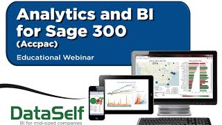
John Ejuardi, founder and CEO of DataSelf, demonstrates analytics and business intelligence tools built for Sage 300. The webinar covers sales, supply chain, and financial analytics, with a live product demo and Q&A.
Chapters
Good morning everyone. Happy Thursday. I hope you're having great day. My name is John Ejuardi. I'm the founder and CEO of Dataself. We're going to have a 30 minute, very informative and hopefully very exciting session. Thanks for joining us again. Before I jump into the actual product, the presentation, I just want to give you a quick overview of why I founded Data self back in 2005 and what the vision of the company is. So I'm an electric engineer as my background and in my early career I was a heavy duty programmer. That was what I was doing for years. Eventually I found my love for business. I took an MBA and I moved to the business area. And for me reporting and data analysis was never really an issue. I was comfortable with tables, reporting tools, I was a programmer, so what a big deal. But I quickly realized that most business people are not IT savvy necessarily and they would struggle, they would have to ask other people, consultants, IT people, even to myself, help to put reports together to slice and dash reports. So I decided to join this industry back in 2000 and in 2005 I decided to open my own business. My initial vision was, well, I have a pretty good technical background, business background, I know the industry and in the mid market there is the need for better reporting, for easier reporting. But usually the great tools out there that come from the upper market are too expensive and too complicated for mid sized companies. My vision was I believe that I can find in the upper market top notch technology that I can make it simpler, I can make it better, I can make it affordable for mid sized companies. That was the vision when I started the business in 2005. We came a long way and I'm excited to show you today the latest and greatest which I believe you're going to find very, very informative and very exciting. So let's get started. Analytics NPI for Sage 300. I'm going to spend some minutes talking about why analytics. I'm going to show the product and then I'm going to open a Q and A session at the end. So why analytics? So most people, they come to us looking for analytics for Sage 300 to improve their sales, their supply chain and financial reporting. So let's take a closer look at each one of them. When looking for analytics for sales, the most common area of improvement is just plain sales and profitability. People want to have a better understanding of who's buying what products or service they're selling, who's selling well, how profitable it is, what the ship to location, territories, you name it. Just a good understanding of growth and decline, of sales and profitability, quantity shift, things of that nature is very critical. And analytics can help you a lot with that. If you have an ordering and invoicing that is sophisticated takes time. Analytics can analyze inefficiencies points so you can improve the process. Sales commission. Sometimes sales commission is a pain. It's very time consuming. It takes hours and sometimes days, even weeks at the end of the month to come up with the numbers. Usually analytics can automate the process, usually 100%. So we can help a lot with sales commissions. Forecasting, you know you want to see what you're going to be selling. You may be looking at your past sales, maybe you're looking at information coming from your customers, from your salespeople to have a better understanding of the forecasting sales analytics can add a big value on that strategy as well. If you lock your businesses into large contracts, let's say with big retail boxes such as Walmart and Target, you better be sure that the price is a win win for you and for the client. So coming up with the right price strategy is critical. And analytics can help you with that as well. Finally, when you analyze your sales, a lot of the times the data that you need to analyze with your sage 300, ack or acpac comes from outside. Maybe it's from Excel files, maybe access SQL databases, you name it, maybe come from your clients. So the ability to combine this data with your Sage 300 system for better reporting or forecasting is critical. And analytics can help you with that as well. On the supply chain, inventory management is one of the most important ones. Just knowing your items, how long they have been sitting on your inventory, inventory turnover, things of that nature, analytics can help you a lot with that. If you have sophisticated, time consuming, inbound and outbound routing logistics, maybe products are coming from overseas, maybe you're shipping and you want to factor weather into the delivery. You name it, analytics can help you with that. If you're collaborating with your vendors, with your shipping companies, your clients, you need to get this data into your analysis to make better decisions about the supply chain. We can help you with that too. Purchasing processes, if you have them, sophisticated, inefficient analytics can help you pinpoint where the inefficiencies are. Forecasting of your inventory, are you going to be able to ship it on time? It's a big question. Many times people have. And analytics can help you with that as well. And data integration, just like with the sales side, if you have data coming from your vendors, from your shipping company, your clients. You need to combine this data with your ACPAC or Sage 300 for analysis. We can add a lot of value with data integration. Financials. Well, Sage 300 has an awesome financial component in it. Sage Intelligence. Excellent tools for financials. But sometimes people are not happy yet. Why they come to us. Well, typically it is still a labor intensive process. We can usually automate a lot, sometimes 100% of the process and make it quick. Sometimes it takes hours, days or weeks to close the financials and we can shortcut the time significantly. Multi company frameworks. If your financial tools are not cutting it, usually we can do a great job consolidating companies for financial purposes. Sometimes people are happy with their financial reporting, but they just want to slice and dice on the fly, anytime, anywhere. They just can't. Our tool provides a lot more ways to do that. Those are the main reasons for financials. We cover analytics for many things. Purchasing, payables, receivables, payroll, you name it. But these that I just covered are the most popular ones. So let me tell you a little bit about technology. What you're looking at right now is the Gartner magic quadrant for BI and analytics. Gartner is one of the most reputable companies making technology assessment in the upper market. The Fortune 2000 in every year they come up with an assessment what's going on in the upper market for BI analytics. So we just have the new release from February 2014. So just fresh information and make a long story short, the more the vendor is to the right, the better it is for Fortune 2000 companies. So not so critical for mid sized companies. But the higher you are on the Y axis, the better the company is doing, executing their vision. Whatever they're doing, they're doing much better if they're higher on this axis. So here we have Tableau and Microsoft. Tableau right now is considered the king of the hill. The top leader when it comes to data visualization techniques, dashboarding, slice and dicing. In the upper market, they are the top dog, the best company. They went IPO last year, very successful by the way. Microsoft is considered the best BI infrastructure provider. So best BI infrastructure and best analytics provider. What about them? What about us? Well, what we do, it goes back to my vision. We took the best, the top two leaders, Tableau and Microsoft. We put in a box, those two guys. We have added our own technology that simplifies their framework, removing programming. And we have added more than 2,000 reports, dashboards and KPIs to amplify it back to my vision. I want to find the best of the breed technology in the upper market. I want to make it simpler, I want to make it better. That's exactly what we do. Let me just reinforce this slide because that's our value added. Why data self analytics. Again, the best of the breed technology. Right now there is no one better. From data visualization and infrastructure, we simplify it, removing programming from those frameworks and we amplify it by adding more than 2,000 reports. Dashboard and KPIs at the end of the day is the pretty much easiest to use technology for IT as well as for decision makers. Faster deploy usually takes hours or days to deploy this comprehensive framework. And if you try to build from scratch, it's going to take you months if years. Expertise. We've been working with Sage 300 or ACPAC for the core team for about 14 years. We know it a lot for reporting purposes. We know BI tools, we know how to interconnect Sage 300 and the BI tools and we've been working exclusively with mid sized companies. So we know how to do it. And finally, low cost, literally if you buy our solution or if you subscribe for it, you can start from a license standpoint with hundreds of dollars per month. It can be that inexpensive. So we deliver ease of use fast, deploy expertise in low cost. That's our secret sauce. Alrighty. And because we use the latest and greatest technology from the upper market vendor in the mid market, we are considered like the Ferrari of analytics. It's the more sophisticated yet easy to use, the faster yet it does not cost a Ferrari. It's like you know, a Toyota price as we say. So let's take this baby for a spin. I'm going to take it for a test drive and I hope you enjoy sitting in the passenger. I'm going to cover three things in my presentation. I'm going to talk about secured access. I'm going to show some sample KPIs out of the 2000 and then I'm going to show some ad hoc examples. So let's go for it. So this is the usually when people or report consumers are going to access their dashboards and reports, they're going to go to this web portal. You can use it desktop, web or mobile devices to access it. You can. No, they can use tablets and smartphones. Now when they log into this portal which is highly secure, a person would only be able to see their own dashboards. So if I'm a salesperson I only see the sales team dashboard. If I'm a person from the finance, I only see the finance team dashboard. Now when I log to this portal, let's say I'm a salesperson, I see my salespeople dashboards and I'm going to click on one of them. Let's see the top customer by sales. Then the security can be set up in a way that I would only see my own information. It's the same dashboard. But because I'm the rep for California, let's say I would see the top customers in California while the rep in Florida opens the same dashboards and views only customers in Florida while the big boss opens the same dashboard and see the top customers across all accounts. So security can be granular to that level. Now let me show some of these pre configured dashboards. So this one is a very simple one. It shows a top performer, top customers. But overall we look at show information in an insightful manner. So if you like charts, what you can see here is you have your customers and then for every customer you have a bar which is related to the sales. Bigger bars, bigger sales. Now the bars have the color schema to show profitability, you know, not so profitable, red, very profitable if they're green. So if I look this dashboard and if I'm not colorblind, by the way, I could tell that this customer here is one of my top but is very unprofitable or low profitability. Maybe that's a problem. Maybe I should work better with this customer to try to improve profitability. I can also see profitability with these black dots on this x axis here. So very simple dashboard, but very insightful. Like this dashboard, we have lots of dashboards showing top performers on the sales side. Let's say top customers, products, salespeople, territory shipped to by sales, gross profit, quantity shipped return, you name it. But we also cover purchasing, inventory, financials, you name it. Lots of top performers. Now let me show a very intriguing way of look at top performers. If you're looking at your critical KPIs, whatever they are usually looking at the tip of the growth curve in a given period is usually very important and this is a very insightful example of that. So this example is showing my top customers by sales change since last year to date. In this example, these customers, they are growing the most in sales since last year. Most likely very happy customers, most likely salespeople working closely with them. It's a win win. Probably. I cannot, I do not worry about them. However, how about these customers the ones declined the most in sales since last year. Is there something wrong with them? Do you know what's going on? Well, the first question is, who are they? Here they are right off the bat. So knowing which of your customers, products, expenses, you name it, that are growing the most or declined the most in any given time can be critical for your business. And we have lots of those reports showing out of the box. Just plug and play, run the reports and see how well you're doing. So we have lots of those. Let's see some other of the out of the box reports that are also very intriguing. Exception reporting. Exception reporting is another intriguing way of looking at data that sometimes can be very insightful. Exception reporting shows things that are no longer happening. In this case, I'm looking at recurring customers who are no longer buying. They were buying the last 60 days, but not in the last 30 days. Maybe you want to see who are buying the last 90 days, but not in the last 60 days. You name it. It's very easy to change the buckets. The point is it is usually critical to look at your KPIs and look at which ones are no longer performing in a certain level. And that's what exception reporting is about. And we have lots of those also available out of the box. Let me show one more report and then I'm going to show how easy it is to change things on the fly. So let me take this dashboard. This dashboard is a geography analysis I have here in US and Canada. I have bubbles, bigger bubbles, bigger sales. And the bubbles are sliced by the color here, which represent how bigger the aggregation of invoice sizes are. I can also come here and change the period, year, quarter month, and see if I'm growing or declining over the period. So very easy and informative ways to see how well I'm doing and see how the slides are changing. I also have here sales by account manager. So bigger bar, bigger sales and how profitable they are. And finally I can see what products they have been selling. Now maybe I'm meeting my west coast team and I'm the VP of sales, so I have access to all information and I'm using my iPad. I could use my fingers on the iPad and select only those three states on the West Coast. And when I do that, the dashboard changes to show salespeople selling to those three states in what products were shipped. If I select one of the salespeople, I keep on further changing my dashboard to only show Sam sales, in this case in those three states, in what products he's been shipping. Changing the dashboards like this is very easy. Sometimes it takes no training for a business person to open the dashboard on a tablet, let's say, and start to slice and dice it and do this on the fly. Now if I'm a power user and I want to change extensively a dashboard and even building new ones from scratch, then I would have this edit button over here. When I click the edit button, I have full capabilities to change the dashboard from scratch extensively as well as build new ones from scratch. But before I show you that, let me tell the story behind this engine. This engine was designed by Stanford University professors who studied how business people look at business data and have insights from it. So they studied this process and you know, it's a journey. It's a discovery process. When a business person asks for a new report, they usually have an idea of what they want. But until they see some data, they don't know exactly. And that's why when they ask another person, a consultant, please build this report. The consultant goes, brings the dashboard. The person, well, can you actually change this? Summarize this way, filter that way. The person goes, bring it back. Well, can you summarize the other way? Can you put a chart? And sometimes it takes several interactions, several hours, sometimes several days or weeks to get the report ready. It's a journey. It is what it is. It takes interaction to get to the final destination. So what this Stanford University professors did was actually create a software engine that helps decision makers walk through the journey with little or no assistance from experts. Decision makers can do it. So let's see how it works. So when I click the edit button, I have access to the components of the dashboard. So I have all the components over here. Suppose I want to take this dashboard here, this particular component of the dashboard, and I want to see numbers by the penny. I'm a financial person. I can click the show me button and the show me button can give me quick ways to look at the information using different charts. Well, I want to see numbers. I'm going to click on the grid option and right there I have numbers by the penny and percentages by whatever the decimals that I want. Beautiful. Well, what if I want to break down this dashboard by product category or anything else? I can come to this data panel. I can come, let's say, to the product and select product category. I drag and drop using my fingers on the iPad, for instance. And right there I would see salesperson by the product line or product category and sales and gross profit. Very easy. A Business person can do it. What if I'm going to break down by customer? Same idea. I come to the customer list, I expand it, I have the customer name, I can drag and drop with my fingers or with the mouse and I just drop whatever I want and bingo. By salesperson, by customer name, by product line or category, sales and gross profit. Maybe I'm going to break down by year, by quarter, by month. It's just dragging and dropping and you see the information right there. We have several CEOs, VP of Sales, CFOs, inventory managers that are not IT people and they do this on the fly on their web and mobile devices. It is impressive. Business people can do it. Now what if I want to download this data to an Excel file? Well, I can click on a data select, view data and then I can check underlying data so I have all the records, all the details and then I can download into Excel and put right into the Excel file very quickly, very easily. And that's pretty much my spin. I hope you have enjoyed the Ferrari spin. Let's go now for questions and answers because we have many people on the call. I'm going to ask you to write the questions on the GoToMeeting panel and then I'm going to answer one by one and if by any chance I run out of time, we'll address on a one on basis. So let me go here to the GoToMeeting panel and see if we have any questions. Yes, we have a question here. Question from Mike. Thank you Mike. So the question is what is the ultralight data warehouse mentioned in your website? Mike, thank you for your question. So let's go to our website. Let me get out of this. Go to my website here. So if you go to dataself.com and you go to the analytics by product and you choose software architecture right there you're going to see our software architecture and it shows that we have an ultralight data warehouse. What about it? Well, the ultralight data warehouse is a way to simplify high end BI technology and we use what is called our data cell ETL which eliminates programming. So deploying and maintaining data warehouses is something much, much simpler. Usually the client, if they have it, they can maintain it or resell it let's say. So it takes usually hours or days to deploy it instead of months or years. If you're using a regular data warehouse, hours is ultralight. So good question. More questions by the way. Thanks Mike. So a question from Oscar. What is your pricing model on premise or in the cloud by name, user or concurrent. Oscar, thanks for your question. So we have pricing for on premises in the cloud that was correct. The pricing depends significantly depending on your data source. If you have single company multi companies, if you need to consolidate data from let's say ACPAC and Sage RM and other data sources, number of users also is factored into it. We probably should take this call or this question on a one on one basis and address specifically so we can design the price and give them an idea. So Oscar will contact you later to give you more detailed information about that. Thank you for the question. Another question here Susan. Thanks Susan for the question. Can users edit and create new measures? Susan, good question. Absolutely. This tool is designed to make the job easy for end users. Many of the new metrics, end users can build them by themselves. Other metrics that can be more elaborate or it can be used across all the organizations or for all the teams, then it should take care of them. On average, more than 70% of the customer reporting needs, meaning new dashboards, new reports or new measures can be taken care of by the client. So this technology is really impressive and we can take this on a one on one basis to show how impressive it is to also build new measures on the fly. Susan, thanks for your question. More questions. We have more questions here. So question from Windsor Windsor, thanks for your question. Are there several samples specifically for Sage 300 that we can get a client up and running with some wins? How quickly can we get a client running in some with the basics zoom, all about speed. Windsor, thanks for your question. I guess you are a reseller by the type of question. Absolutely. We have a framework for resellers that usually we ask a reseller. If you give us about 10 hours to work with you and some of your prospects that are a good fit for this business, usually within these 10 hours we're going to get one or more sales and you're going to see how easy and how impressive that you can get the decision maker of the organization, the CEO, the VP of sales, the CFO to sign off. So yes, when we do that, often we or you depending the engagement can get a copy of their data, load to data self and show their own data. When we show data self analytics using the client's own data, it's really impressive how quickly you can get a sale, usually in a matter of hours. Sometimes you get a pretty large sale. So Windsor, yes, absolutely. Let's be in touch after this call so we can help you understand and hopefully engage with you to move forward with that awesome. So we are running out of time. We have a few more questions here and we're going to address them on a one on one basis. Let me just show some extra information here that's going to be important for you. I recommend going to our website, come here to dataself.com, go to analytics by product and choose, let's say the acpac option or sage 300. Tomorrow we're going to have on this particular link here a recording to this webinar so you're going to be able to watch again. You have here also links to the test drive. You can view demos, you can see the software architecture brochure and the sample reports and KPIs. We also recommend you to sign up for our Twitter and feeds into LinkedIn. Anyhow, I really appreciate your time and interest today. If you want to contact me at any time, I'm going to put my information here, my cell phone as well as my email and Twitter account. So feel free to contact me. And we're here to educate you. If you're a good fit, awesome. If we're not at least going to learn more about what we do, how we position ourselves and how we look at the other vendors so we can help you make the right decision. Thank you for your time. Have a great Thursday and I look forward to be in touch with you again. Thank you.










