Analytics and BI for Sage CRM webinar
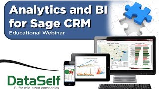
DataSelf AI built a BI layer for Sage CRM that combines Tableau and SQL Server with 2000 pre-built reports. The platform includes interactive dashboards for sales and customers, mobile access, and a drag-and-drop interface to edit queries without coding.
Chapters
Good morning everyone. Happy Thursday. Thanks for joining us. Today we're going to be talking About analytics and BI for Sage CRM will be an exciting and informative 30 minute session. Before I jump into it, I like to give you a little history why I founded this company and what the vision is. I founded the company back in 2005. You know, I'm an electrical engineer. As my undergraduation course in my early career I was actually programming for years. So I was very good at programming stuff and eventually I went have my MBA and moved into the business area. And for me, reporting data analysis was never really an issue because I'm comfortable with programming with tables, links, filters, stuff like that. But I quickly realized that usually business people are not programmers and they will have challenges asking for reports, new reports, change reports, and you have to ask for other people, consultants, friends to help them come up with the right information. And sometimes they just cannot afford to wait. They are in a call, in a meeting, they have to make better, more informed decisions. So when I founded it itself, my vision was, well, mid sized companies, they have these challenges, they need more information, they need better information for management, but they cannot afford the Fortune 2000 BI solutions which are too expensive, too complicated. So my vision was, well, because I know a lot about technical things and a lot about the business side. I think I can find in the market, upper market solutions that are really good, that will work well for mid sized companies. I want to make those solutions simpler, I want to make better for mid sized companies. That was the vision. I want to get the best of the breed, make it simpler, make it better. That was back in 2005 when I started the business. We came a long way. What you're going to see today is the latest and greatest and I'm pretty comfortable you're going to find this very, very cool. So let's get started. I'm going to spend a few minutes talking about why analytics, why us? And then I'm going to show the product how it works. And then at the end we're going to open a Q and A session. So why analytics for Sage CRM and usually sales information. So first of all, opportunity and pipeline management using your CRM system can be challenging to pull information out of it. It can be time consuming, it cannot be no anytime, anywhere available using mobile devices. So analytics can help a lot. Looking at better ways at analyzing your opportunity in pipeline management, if you have campaign and contact management can also be challenging. And with analytics there are many ways you can slice and dice your data to see where is more effective, who's going to do a better job, market verticals and so forth. So very, very helpful if you do support cases with your CRM. Also sometimes checking what issues are the most frequent, maybe what time of the day they're happening, how long it's taken to fix them, who are more productive, many ways to look at the support cases and have a better understanding of the processes and allocate resources accordingly. Usually CRM is related to sales, so having a much better grasp of your sales and profitability analysis across your organization. And sometimes it's good to combine information from CRM with your ERP so you have a better picture of your sales profitability. And definitely analytics can add a huge value for those initiatives. Sales commission. If your sales commission is not simple and your CRM and ERP are not doing the job and you have to do manually at the end of the period hours to crunch the data to come up with the commissions. Often analytics can automate sometimes 100% of the process and make something that anytime, anywhere, you can see how commissions are going throughout your goals. Finally, data integration. You know, sometimes you need to combine your CRM information with your ERP information and sometimes with the POS systems, point of sale systems, Excel sheets or information coming from your clients to do a better forecasting. There are many ways that sometimes you have to bring data from different places, combine them with your sage CRM to make more informed decisions. And analytics can definitely provide many ways to tackle those needs. So these are the most typical needs that people come to us. Many others can be covered, but today we're just talking the most important ones. Well, this slide talks a little bit about technologies, about us. Let me explain because it's a very interesting concept here. So Gardner is one of the most reputable companies assessing technology in the upper market. And every year in February they release what they call the magic quadrant for BI and Analytics. So in the upper market, how are the BI vendors doing? So make a long story short, being more on the right of this quadrant is not so important for mid sized companies. It is for Fortune 2000, but not so for for mid sized companies. But the higher you are on the Y axis, the better because you're executing whatever you do much better. Well, what you can see here, these top two companies, Tableau and Microsoft Tableau right now is like the king of the hill. They're doing an awesome job, better than anyone else. According to Gartner, when it comes to data analysis, visualization, KPIs Ad hoc analytics they just went IPO last year. Very successful. Microsoft is considered pretty much the best technology when it comes to infrastructure of bi, data warehousing, even OLAP and other things. Those two vendors are the top notch in their own categories. What about them? What about us? Well, what we do is actually we take the top two vendors in each one of those categories. You know, analytics and data warehousing. So Tableau and Microsoft SQL Server we put in a box, we add our own technology that eliminates a lot of the programming involved when you leverage those two technologies. So it simplifies it and then we add our very comprehensive set of 2000 reports dashboard MPIs ready to go. So we amplify the technology. It goes back to my vision when I opened the company. I want to find the best of the breed that will work for mid sized companies. I want to make it simpler, I want to make it better. And that's what we do. We take right now actually the two top companies. There's nothing better out there in their own technology frameworks. We make it simpler, we make it better. I'm going to go over again this concept because at the end of the day is the value we add. So again top notch technology, the top two SQL Server and Tableau as infrastructure. We add our own technology that simplifies and eliminates a lot of the programming involved and then we amplify it adding those 2000 reports. Dashboard KPIs kind of plug and play approach. At the end of the day what all of this does is it's easy to use for business people. And even for it, this is one of the easiest technologies to be used for business people. They can use the technology anytime, anywhere. They can access information, they can slice and dice it for it. They'll be able to maintain the technology. So when business people need to do things, the IT will quickly can change the framework to allow business people to become self sufficient. On average, more than 70% of the customer reporting needs of business people, they can tackle them by themselves. They do not call an IT for that. So very easy to use for it. And for business people it's fast to deploy. Usually it takes hours or days for us to deploy the solution. And if you try to build the same thing from scratch, hiring people, absolutely you can. Most likely it's going to take you months if not years to get what we have out of the box. So fast deploy is a big value that we provide. Expertise is another big value provide. We've been working with high end business intelligence solutions since the year 2000. So it's been 14 years. We know Sage CRM, we know Microsoft BI, we know Tableau, we know how to connect all them together and we've been working specifically with mid sized companies. So we know how people look at data and we know how to bring the data and make it very compelling for decision makers. And finally it's low cost from a license standpoint. You can literally start using data self BI for a few hundred dollars per month, usually depending on your customer needs. There's a lot more involved but it is inexpensive so it doesn't cost you a fortune. So that's what we use, that's our value added. Top notch technology, simplified, amplified in those four topics is what gets at the end of the day already. And because we use top notch technology, we compare our solution like the Ferrari among mid market analytics solutions. We're faster, we're more sophisticated, we're better overall. But we do not cost a Ferrari. I mean we do not cost even like a Toyota. You can go literally and have a small investment and get this top notch technology for your own business. So let's take this baby for a spin. What I'm going to do now is show three different buckets of my presentation. I'm going to show secured access to it. I'm going to show some of the sample KPIs out of the 2000 and then I'm going to show how easy it is to change things on the fly. So let's go for it. So most of the time users will access information in data science analytics through a web portal. They can use a browser, they can use a desktop or a mobile device such as a tablet or a smartphone. When they log in to this portal then security kicks in. Only if I'm a salesperson, I would only be able to see the sales team dashboards. If I'm a person from the finance team, I would only be able to see dashboard from the finance team. Now when they open one of these dashboards, I'm going to open one of the sales dashboards, kind of CRM dashboard related. Then another layer of security can kick in which is let's say this dashboard shows top customers by sales this year to date. If I'm the rep for California, it would only show California top customers. The rep for Florida opens exactly the same dashboard but only gets top customers in Florida while the big boss opens the same dashboard and view top customers across all accounts. So security can be granular. The same dashboard for many different people, but then they only have access to the information that they are granted for. So that's kind of how security works. Now let me show some of these out of the box KPIs. And this is one of the intriguing ones from a CRM standpoint, looking at sales, actual sales, my top customers, we have lots of what we call top performer dashboards like this one for sales in this case. In this example I have bars and bars are related to this axis. So bigger bars, bigger sales. Each bar has a color that represents by gross profit. So from not very profitable to very profitable. And I could clearly tell this customer here is one of my top customers. But it's fairly unprofitable. Maybe something wrong, we need to work and make it get greener color. We also have on this chart black dots that relate to the percentage gross profit on this axis. So anyway, this is not like rocket science kind of dashboard per se. It's just my top customers I probably already know even out of sage rm. But I'm just showing here that visually it can be very compelling to look at these guys and maybe have an insight from profitability and see if I need to do something better. Which one of them. Another intriguing dashboard, and sometimes very important, is actually looking at the tip of the growth curve. In this example, I'm looking at the tip of the sales growth curve. So top customer by sales increase these guys here and top customer by sales decrease these guys here in a given time. This case year to date, most likely the top growth are happy customers. They're buying a lot. Salespeople working with them, no problem. What about the ones declining the most in sales? Sometimes some of them are not so happy and sometimes people don't know about it until it's too late and they're gone for good. The point is, when you look at the top of the growth curve of different KPIs, sales, profitability, quantity, shipped, cost on hand. If you're looking from the ERP side, I would say expenses, you name it. Looking at the tip of the growth curve is usually critical and we have lots of reports that look at that and can help your team focus on resources where it matters the most. Let me show some other out of the box KPIs here. Opportunity by geography. So this one has the map and then we have bubbles. Bigger bubbles is bigger potential sales. And then the bubbles are sliced by the certainty of each opportunity. So I can see where the biggest opportunities are. On the left side I see the account managers and then how much the potential sales are and what the the certainty of each opportunity is. So Kind of very straightforward dashboard, very dynamic. We'll show later how to change them. I'm going to show only two more dashboards that are intriguing. Exceptional reporting. Exceptional reporting, like looking at the tip of the growth curve, exception reporting can also be very critical. Exception reporting helps analyzing things that are no longer happening. This example, if you have recurring customers, why these customers are no longer buying. This example, show me customers with sales the last 60 days, but not in the last 30 days. Maybe you could look at the last 90 days versus the last 60 days or whatever it is. But the point is looking at exceptional reporting, things that are no longer happening can be insightful. So you can see some of these clients are having some issues so we can be proactively working on them. So very important kind of analysis. All right, I'm going to show one more example of the out of the box and then I'm going to show how to change things on the fly. Let me go for a sales by geography analysis. So in this example here I have again the map and this is actual sales. So bigger bubbles, bigger sales. And in this case I have sliced the bubbles by the size of the deals. Large, large deals, medium sized deals and small deals. I can very quickly come here and click this to see how things are changing over time. And I could be looking yearly, quarterly, monthly, whatever it is. This is a yearly example. So I see that I'm growing and maybe the large deals are increasing, which is pretty good. I also see here on the left the sales by salesperson. And I'm also using the profitability on a color schema to see how profitable each customer sales are. And then I have what products being shipped by this whole dashboard. Now assume that I was actually the VP of sales and I'm meeting with the west coast team on my iPad. I could, I have access to all information, but I only want to see west coast team information. I could use my fingers on the iPad, let's say, or select with the mouse those three states. And right there the dashboard changes to only show how much these salespeople are selling to those three states in what products they've been shipped. Maybe I only want to see one salesperson. So if I click on Sam now it changed again. It's showing how much sales Sam is doing for those three states in what products have been shipping. Maybe when I see more people combine, maybe all the not so profitable ones, I just keep on clicking and then the dashboard keeps on changing. These kind of changes, they're very easy and usually business people will take very Little time to learn how to do it by themselves, they can do on web browsers. They can use mobile apps like for iPad, Android and smartphones. And on the fly, anywhere, anytime, make more informed decisions. Now, if I'm a power user, I also have the edit button available. This is only for power users, people who are more sophisticated with data analysis. If I'm one of them, I can click the edit button. And now I can extensively slice and dice these dashboards. Before I show you that, let me give a little history about this interface here. This interface was designed by Stanford University professors. They studied how business people look at business data and make sense out of it. Data analysis and reporting, it's a discovery process. It's a journey. When a business person asks for a report, they have an idea of what they want, but until they see it, they don't know exactly. And that's why when a business person asks for a report and the it goes and comes back with a report, the business person, well, good job, but can you please summarize this way? Filter that way, put a chart here, change the filter and then, you know, Sometimes it takes 10 interactions until the report gets ready. It is what it is. That's a discovery. It's a journey, it's a process. It takes interactions to get there. So these Stanford University professors, they studied that process, how business people go through about it, and they created this engine that helps decision makers walk through the journey with no assistance or little assistance from it. And that's what this product is about. It's helping decision makers easily and quickly find information that they want on the fly. Having said that, let me show quickly how it works. So I'm here, have these three tabs that are part of the initial dashboard that I was showing. Now suppose I want to change this salesperson dashboard and I only want to see numbers by the penny. I click the show me button and here, this show me button shows me what visualization techniques make sense out of this kind of analysis that I'm trying to look at. I cannot put on a map because I have no geography component. So this is part of the Stanford University professor engine. It shows you what you can do, how you can walk through, what options are available. Anyway, so I want to see numbers. I click this grid approach right there, I see buy salesperson sales by the penny and percentage gross profit. Okay, what if I want to add some information here? Well, I can come to the data panel and let's say I'm going to extend the product and I see by product line I can drag and drop to my report, let's say after salesperson and I could use my fingers on the iPad. So let's say bicycles, person by product line, sales and gross profit. Very easy, very fast. Maybe when I break down by customer, I can come to the customer list here and I can choose customer name, for instance. And I can drag and drop maybe before in the middle or after I put it in the middle in this case and there it is, by salesperson, by customer, by product line, sales and gross profit. Very easy, very intuitive. Maybe when I break down by year, by quarter, by month, same idea. I can drag and drop document date, let's say to my columns instead, right there I have by measure, by year. If I expand a year, I go to the quarter level and then I can go to the month level and so forth. Very straightforward, very easy. This is something that business people with little training can actually do it and they can offload it from the reporting side of it. It will take care of the back end system, the framework, but users usually can take care of a lot of their own reporting needs. What if I want to download some information to my computer, to my Excel? Well, you can choose one of these measures, let's say this one. And I can choose view data. I can go to the underlying data and here I have all the records that sum up to that particular amount. So I can have invoice, date or opportunity dates and probabilities. You have an invoice, invoice, date, invoice number, so forth. You could download and then that becomes in your computer an Excel file. And now you have all the detailed information in Excel for the manipulation. Again, very easy for business people to be more independent when it comes to reporting data analysis. So that's pretty much what I want to show. I hope you have enjoyed Ferrari Spin the Ferrari Drive. Let's open for questions. If you have questions, Please use the GoToMeeting panel. Write the questions and we'll address them right now. So let's see if we have anything. Yes, we have some questions here. So the first question is from Kathy. Thank you, Kathy. Can data from ERP be integrated with CRM? Good question. Let me change here and show the architecture of the solution. So if you're a little technical, even if you're not, this is a very high level concept. What we do is we take data from Sage CRM and we put into a separate SQL Server data repository and it's called the Ultralight Data Warehouse. It's easy to do it, it's easy to maintain it. And because it's a separate repository, we can easily bring data from any other data sources. If you want to combine your ERP information, you if you have, as I mentioned point of sales inventory systems, if you have let's say information coming from your customers, if you have big customers that provide you with estimates of their purchase, you can combine all this data in the data the Ultralight data warehouse. So when you go to analyze your Sage CRM information in those data panel that I showed for sales, you can have pieces of information coming from other data sources. So absolutely, if you want to combine ERP and CRM and any other relational database, this framework provides the foundation using battlegrid technology to do that. Kathy thank you for the question. Let's see what else we have here. Question from Bob what CRM specific reports do you do? Bob Good question. Let me switch gears here. If you go to our website dataself.com and you go to analytics by product and you choose Sage CRM by the way here later today or tomorrow we're going to send you a link that will have a recording of this webinar will be posted on this link right now. If you click here you're going to see some old message longer one. So I would recommend you to wait until tomorrow to get the latest this current recording. You also have here you can request to S Drive View Demo sign up. You have the software architecture brochure and this link gives you the list of reports available out of the box and if you go to it there is a section for CRM and then you can see what reports are available out of the box for Sage rm. Bob, good question. Thank you. What else? Let's see here. Question from Tom Tom, thanks for the question. Part of my forecasting data comes from Excel sheets. Can that be integrated too? Tom, thanks for the question. Kind of circles back to the same topic as before. I kind of mentioned about bringing data from the ERP system from CRM. Excel is also considered a can be considered a relational database source. So if you're doing your forecasting or part of your forecasting in Excel files. Absolutely. It can be integrated into the Ultralight data warehouse and combined with the CRM information. So let's say when you look at your goals, you can have opportunities, actual sales and goals and goals could be coming from an Excel file. Absolutely, that can be done. Tom, good question. Thank you. Well, we're running out of time here. We have a few more questions here. But I really appreciate your time and interest today in our business I hope you found it informative. Here is my contact information, my cell phone, email and Twitter handle. If you want to just contact us to discuss bi analytics data warehousing just to be more educated, feel free to call us. We're here to educate people and hopefully if we're a good fit, awesome. If not, at least we'll give you some good insights. I hope you have a wonderful Thursday and I look forward to hearing from you in the near future. Have a good day. Thank you.










