Analytics and BI for Sage PRO webinar
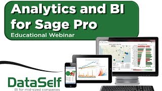
Johnny Girardi of DataSelf shows how to add enterprise analytics to Sage Pro using Tableau and a lightweight data warehouse. The platform handles sales analysis, inventory, and forecasting, and can preserve historical data during ERP migrations to extend Sage Pro's life.
Chapters
Good morning everyone. Happy Thursday. This is Johnny Girardi. I'm data self founder and CEO. Thanks for joining us today we have a very exciting and half an hour session, so let's get the ball rolling. Before I jump into it, let me give a little introduction about why I started this business. Back in 2005 I was already working with business intelligence community, industry and actually I'm an electric engineer. As my background in my early career I was a programmer. So for many years I was a heavy duty programmer. Eventually I did my mba, I moved into the business area and for me, reporting data analysis was never really an issue. I was very comfortable using reporting tools, pulling data from databases, tables, things like that. But quickly I realized that most decision makers, business people, they're not necessarily programmers per se, you know, and they would have challenges with that. They would need to call a consultant or a third party to help them with their reporting needs. So I realized that there's a big need for better reporting tools, easier to use. And my vision was the mid market, mid sized companies, they need better reporting, they need analytics and business intelligence, but they usually cannot afford the top notch technology from Fortune 2000. So my vision when I found the company was I want to find the market top notch technology, I want to make it simpler, I'm going to make it better and I'm going to make it affordable for mid sized companies. So that was the beginning of the vision. We've been around for about nine years now. We came a long way and what we're going to cover today is the latest and greatest and specifically focusing on the Sage Pro product. So let's get started. I'm going to spend a few minutes talking about why analytics, Then I'm going to show the product and we're going to open a Q and A at the end. So first of all, analytics for Sage Pro. So some big topics in the Sage Pro community is Sage Pro is being discontinued. So what about it? For how long are you going to keep it? What's going to happen when you transition into a new erp? Those are big questions and actually analytics can help you significantly either way you go. One of the ways to extend the life of Sage Pro is many companies, they have reporting pains, they want to have better understanding, budgeting, forecasting. And how can you do it if Sage Pro is no longer being supported? Well, if you add analytics to Sage Pro, you're going to have a much better analytics platform. Your reporting, data analysis will be much enhanced and hopefully you will be able to keep Pro for Longer time if that's your intention now, if you're planning on moving to another ERP package sometime in the future, analytics can also help with the transition. We have several clients where we deployed our solution with Sage Pro and when they moved the new ERP package, pretty much a good chunk of the reports they were kept the same. And when people are analyzing, let's say sales, they were analyzing sales history like they never changed the procedure because actually what we did was we combined Sage Pro with the new accounting package data in the data warehouse. So from a reporting standpoint, it's just sales data or purchasing data or financial data, it doesn't matter. And it helped them a lot make the transition from a reporting standpoint so much easier. So those two topics are big ones. And analytics can play a big role in helping you stay longer or when you transition into a new ERTP package. What else? So many people when come to us looking for analytics for SagePro, they're trying to improve their reporting and analytics and the most popular areas are sales, supply chain and financials. So let's talk a little bit about some of those challenges from a sales standpoint. The most popular is just having a good idea of sales and profitability, how much money I'm making, where I'm making good money, where I'm losing money or not making as much money. Clients that are growing, declining and figure out that in a better way. So analytics play a big role helping you analyze your sales and profitability way, way better. If your ordering invoicing processes can be more elaborate and you may have delays in ordering shipping, analytics can help you keep track of where the delays are happening and more quickly and more proactively fix the issues. If you have elaborate sales commissions, often very labor intensive, analytics can usually automate the process a lot, sometimes 100%. So anytime you can just pop reports and see where commissions are throughout the month of the period. Forecasting, trying to see how much sales you're going to get, looking at past sales or maybe pull. Pulling data from your clients or forecast from your salespeople is a big deal in analytics and also facilitate that process Price strategy if you sell long contracts to, let's say big boxes like Walmart and so forth, the best thing is have the right price. So it's a win win for you and the client. And being able to come up with the right price strategy can be challenging and analytics can help you with that. Data integration is a big topic all over the place. Doesn't matter what you're doing, if you're trying to bring data from other data sources. In the sales side. If you have sales forecasts in Excel files or if you're receiving information from your clients with inventory on hand and things like that, analytics can help you combine all this data with your erp, with your CRM and have the single version of Truth in a single place. So analytics can help you with that as well. On the supply chain, simply inventory management, seeing where things are, how long they've been sitting on the inventory, things of that nature, inventory turnover. If you have elaborate inbound and outbound routing logistics, things are coming from overseas, it's taking a while, maybe going to be delivering there is rain and you want to factor that information into decision making process. Analytics can help you with that. If you're collaborating information with your supply chain, either your vendors, your shipping companies or your customers, getting data into a place where you combine with your Sage Pro can be critical and analytics can help with that as well. Purchasing processes, if they're elaborate, we can help you analyze it. Forecasting, forecasting on inventory on hand, are you going to be able to ship things of that nature? Analytics can help as well. And data integration all over the place. If you're bringing data from different places, you need to combine with your Sage Pro. Analytics is usually a great platform and value can be added from that standpoint. We can cover all different areas, purchasing, payables, receivables, financials, budgeting, whatever. But these are the most popular places or topics that people come to us. So let me talk a little bit about us. This is the Gartner Magic Quadrant. Gartner is one of the most reputable companies assessing technology out there and usually they assess Fortune 2000 technology. Anyway. Make a long story short here, this is top notch BI analytics platforms in the upper market. Being more to the right here is usually more valuable for Fortune 2000 companies. So not a big deal to be more to the right if you are looking mid market needs. But the higher you are on the Y axis the better. Well these two companies, you know tableau right now is the king of the hill when it comes to data visualization, dashboarding, analytics and Microsoft is the top provider on the BI infrastructure standpoint. So what about this? What about us? Well what we do data self analytics is we actually take the top two technology providers from the upper market. We put in a box tableau and Microsoft SQL Server infrastructure, we add our own technology to simplify it and we add over 2000 reports, dashboards and KPIs to amplify it. This goes back to my initial vision when I started the company. You know, I want to get the best technology out there. I want to make it simple, I want to make it better for mid sized companies. That's what we do. That's Data Self analytics. Let me put it in another way just to make it sure, because this is the core of what value we provide. Again, top notch platform. There is no one better than these two companies out there in the upper market. We simplify IT with our own technology, eliminating a lot of the programming involved in typical solutions involving the top notch vendors and we amplify it. Over the years we have built a very comprehensive set of reports, dashboards and KPIs that help you get started quickly and efficiently. In a nutshell, this is pretty much the easiest to use technology available from a business user standpoint. There's pretty much nothing easier than this. From an IT standpoint. This is top notch and still in easy to deploy, easy to maintain. Usually we can deploy the solution very quickly, usually in hours and days. We deploy something that would take usually months or years if you build it by yourself. The core team of Data Self has been working with this kind of technology for over 14 years. So we know Sage Pro, we know Microsoft BI, we know Tableau BI, we connect them and we know how to customize them for mid sized companies. So a lot of expertise working with all of this technology for mid sized companies. And at the end of the day it's low cost. This is not going to cost you a lot. Usually you can get started really inexpensively. From a license standpoint you can get started with a few hundred dollars per month. So cost wise it's affordable for mid sized companies. So that's the value we provide in a single slide. Alrighty, let's get over the boring slides and let's take a look at product. Because we're using top notch technology, best of the breed, we compare our solution like the Ferrari. Among the analytics solutions out there, we're the faster, we're the more sophisticated. But we do not cost a Ferrari. We do not cost even a Toyota, depending how you get started. So let's take a spin on this baby. I'm going to cover three different buckets on my presentation. I'm going to show secured access to the framework. I'm going to show some sample KPIs out of the 2000 reports KPIs and then I'm going to show how easy it is to change things on the fly. So let's do it. So this is how most people will consume information from data self analytics. They would view information in dashboards using a web portal, using a web browser, or mobile devices such as tablets and smartphones. When the person logs to this portal, they would only be able to see their own dashboards. So if I'm a salesperson and I log into this portal, I would only be able to see the sales team dashboard. If I'm the finance team, I would only be able to see the finance team dashboards. Now when I open one of these dashboards, I'm going to click one of the sales dashboards. Then the system can be configured to only render information specific to this user. So if I'm the rep for California, let's say I would see the top customers in California, the rep in Florida would view the top customers in Florida, while the big boss opens exactly the same dashboard and this person views the top customers across all accounts. So same dashboard, but for every user. Security will take care of customizing what the person can actually access. So that's how security works. It's pretty secure and pretty customized. Now let me show some of the out of the box reports. And this is one of the very popular one, simple but very popular. It's showing a top performer and in this case, top customers buy sales this year to date. And I see bars on this x axis. Bigger bars, bigger sales. Each bar has a color theme or schema that follows this standard. So red, not so profitable. Green, very profitable. Right here I could tell that this customer, which is one of my top customers, is not so profitable. Maybe that's a problem. I should try to work things out to make this guy to become greener. I also have profitability looking on these black dots on this axis. So very easy to see sales profitability in a single screenshot and help decision makers quickly look at things and make sense out of them and make faster, better decisions. So that's one of the top performer dashboards. We have lots of top performer dashboards. The next one that I want to show is sometimes even more intriguing. If you have recurring customers, lots of recurring customers, this dashboard can be very critical. This dashboard shows a different kind of analysis. You know, it's looking at the tip of the sales growth. I'm sorry, the tip of the growth curve, in this case, sales growth curve. So bigger bars is bigger increase since last year. Bigger bars to the bottom means bigger decrease. Typically these clients are very happy. They're buying a lot. Sales people are taking care of them, everyone is happy. But these clients decline the most in Sales, sometimes there's something wrong, maybe they're not being well served and nobody is paying attention to them until it's too late. So looking at reports like this can give you insights into critical trends so you can focus on those initiatives, fix the things that are wrong, or take advantage of the things that are going well, make better decisions and grow your business. So we have a lot of reports looking at growth curves, tip of the growth curves from sales, purchasing, expenses, you name it. Let's take a look at another out of the box report that is also kind of intriguing. Another intriguing type of report is what is called exception reporting. Exception reporting shows transactions that are no longer happening. For instance, this is a sales example. I have regular customers, but they're no longer buying. So in this example they were buying the last 60 days but they're not buying the last 30 days. Why is that? Maybe it's okay, maybe it's not okay. Knowing who they are is the first step towards realizing if something is wrong and proactively fix the issue. So again, exceptional reporting is usually important, critical in looking for your sales, purchasing, financial expenses, payroll, whatever can be critical. And we can help you make better decisions with exception reporting. I'm going to show the last example and then I'm going to show how easy it is to change things on the fly. So let's take a look at sales by geography. And my presentation today was focused on sales because it's usually easier to convey the message. So this dashboard has a map showing bigger bubbles, bigger, bigger sales. And then each bubble has been sliced by the size of the deals. Large invoices, medium size and small size invoices. And I also can come here and change the time and see if things are growing or declining over the years. And I could go as far as my data would go. So very informative, very cool to look at the changes. I also have on the left, sales by rep and showing profitability by rep and what products has been shipped for each rep. Now suppose I'm the VP of sales and I'm meeting with the west coast team and I want to look more details what's going on with the west coast team. I could use my fingers on my, let's say my iPad or if you're using a mouse on a computer, I can select those three states and when I do that it changes the dashboard to show only salespeople selling to those three states in what products that are being sold. Then you know, suppose I want to only see for one salesperson, let's say for sam. I click on SAM now, the dashboard changes again. It only shows sales of SAM in those three states in what products were shipped. I can use the control button and select more and see what happens. So very dynamic, very easy to use. A businessperson with little training will be able to make these changes, sometimes with no training whatsoever. Now, if I'm more sophisticated user and I want to have more power, then I also have the edit button available here. The edit button allows me to extensively change queries, slice and dice them on the fly. That's only for more power users and I'm going to show how that works Now. I'm going to click the Edit button now. And before I jump into showing how it works, let me tell the story behind this user interface here. This user interface was designed by Stanford University professors. They studied how business people look at business data and make sense out of it. As you may know, reporting data analysis is a journey. It's a discovery process. When a decision maker asks for a new report, he has an idea of where this person wants to go. But until the person views something, they don't know exactly the final outcome. And that's why usually when business people ask it or consultants for report, the report comes back and then they ask some changes and then it goes back again and they ask more changes and more changes until it gets ready. Sometimes it takes 10 interactions to get it ready. It is the way it is. It's a discovery process. People have to view things to make the decision. I want to sort it differently, I want to group it differently, I want to chart, I want different colors. It's a discovery process. So these Stanford University professors, they study how business people walk through the journey. And this created this software engine that helps them walk through the journey with little or no assistance from consultants. And that's what's behind this technology. That's actually no tableau behind the scenes. So how does it work? Well, here right now I have these three tabs that they show the three pieces of the dashboard that I was showing when I click the edit button. And what if I want to see numbers by the penny instead of charts? Maybe I'm a numbers person, not a chart person. I go to the show me button and the show me button gives me what data visualization techniques are available based on the kind of data that has been selected. Because I'm not looking at geography component here, I cannot put maps. So this is part of the engine that helps people decide or walk through the journey without calling for 18. Okay, so in my case, I Want to see numbers by the penny. So I'm going to choose this grid approach. So right there I see salespeople and numbers, sales amount and gross profit. What if I want to change this? What if I want to add customer information, product information, you name it. Well, I come to this data panel that shows me in this case sales details, information and I can expand these dimensions and see sub components. So if I want to break this report down by product line, I can type product line here and I can drag and drop into my report, let's say to my rows. I could use my fingers in the iPad, just drag and drop. There it is. By salesperson, by product line, sales and gross profit. Very easy, very simple. Maybe you want to break down by customer address, your name. What is customer address by the way? Well, we have these pop up windows telling more information. In this case, address comes from the customer table. What about shipto? Well, ship to would come from the information recorded on the invoice header. Anyway, if I want to break down this by customer, I could take the customer name and drag into my rows or columns. Let's put between the salesperson, the product line and there it is by salesperson, by customer, by product line, sales and gross profit. Very easy. Do you want to see over time? No problem. I can drag and drop my document date into my rows or columns. Let's see on the columns first. So right there, by measure I have by year and if I expand the year, I can see by year and by quarter. It's very easy, it's very user friendly. What if I want to go to the underlying data? I can choose, let's say a measure and I click view data. I click on it and now I can go to the underlying data, see all the records that rolled up, came up with the total amount. I can see all the details, invoice number, customer number, whatever. I click, download all rows and now I could put it in Excel for instance and do more for manipulation if you want to. Very easy, very intuitive. Anytime, anywhere. You can be in a meeting, on a coffee shop or in a bar. You pop your smartphone, you can start viewing your data, slicing, dicing, making better decisions. That's pretty much what we do in a nutshell. Very good, much appreciated. So that was my presentation and now let's open the Q and A session and to ask for questions. Please use the Gotomedi panel to ask your question. I'm going to address 101 so let me take a look if we have any questions here on the gotomedi Panel and yep, we have some questions here. The first one is from Bob. Thank you, Bob. So explain again the benefits when transitioning to a new ERP from Sage Pro. It's a very relevant question. When you move from Sage Pro to another accounting package, usually what happens is you're going to be moving your method tables, your customers, you're going to be moved over to the new upcoming package. Your products, your salespeople, your users, your GL structure. However, usually your historical transactions will not. It's very hard to take, let's say invoice history, purchasing history, even GL transaction history and move from one accounting package to another. So what happens is once you move to the new accounting package, you kind of lost a history. So if you want to see a historical report, you have to run a report against your new package and another report versus against your old package and maybe you have to combine them. Some kind of copy and paste in Excel is very labor intensive with data self analytics. We can actually take the SagePro history and freeze it in the data warehouse and then combine the SagePro history with your new accounting package history. So if you look at let's say a sales report is just sales data. It's just salespeople, customer people, product people, product information, I'm sorry, invoice dates and so forth is all frozen and combined together. When you do a sales history analysis, it looks like you never change the accounting package. You can go back your current data in your new accounting package all the way back and it's just sales data all combined in our analytics solution, the way we do that, by the way, let me show here. The architecture is because we have a data warehouse. We have what is called a ultralight data warehouse. Using SQL Server and using our ETL to remove programming, easy to deploy, easy to maintain, very inexpensive. With an ultra data warehouse we can combine data, we can bring data from CRM systems. We can have what is called a single version. The truth that helps people combine data from different systems, transition from Sage Pro into to other ERP packages. I hope my answer was not too long. Thanks Bob. That was a good question. What else we have here? Another question very relevant to the Sage Pro community. That's from Peter. Thank you Peter. In what sense your solution extends the life of Sage Pro. So I guess this question comes from the fact that you're trying to keep Pro as much as you can because it's an awesome product and probably have it heavily customized. It would be very extensive to change it. So if today you're using Sage Pro and you're happy with the reporting capabilities, we cannot help. You're happy with the reporting, data analysis, people getting information when they need it, making good informed decisions. I have nothing to add. However, it's frequent that people are trying to get more value out of SagePro. There's a lot of good data in it. Invoices, purchasing, payables, financial information and decision makers want more information readily available anytime, anywhere. Or maybe you're spending too much time running reports. We have clients that sometimes take weeks to close their months because they have to copy data from Pro and put in Excel and combine and massage it. Very labor intensive. So if you fall into one of these categories where you spend too much time with the reporting on an ongoing basis and or if your management wants better, faster information anytime, anywhere, then talk with us. Most likely we can enhance the functionality of Sage Pro and hopefully extend the time that you're going to be keeping Sage Pro and make the best out of the investment. Well folks, we have more questions but we're running out of time so we'll be addressing them on a one on one basis after this presentation. Before I leave here, I just want to tell you that if you go to our website, which is dataself.com and later we're going to post into the learning section, we have recorded webinars so you're going to be able to go there and view our existing webinar recordings including this one we're just going over. Also, if you go to the analytics by Product and you click for Sage Pro here, you'll find many different resources. You'll find the recording of this webinar on this button right here. You also can ask for test drive. You can see our software architecture, you can see our brochure as well as the a sample from the 2000 reports and KPIs available. Folks, that's it. I really appreciate your time and interest today. My contact information is right here. You have my cell, my email, my Twitter handle. So if you want to contact me, it will be a pleasure to just discuss BI analytics and just help you make better decisions if it's the right time to embrace an analytics solution like Towers. Thank you very much. Have a happy Thursday and looking forward to hearing from you. Thank you.










