Analytics for Sage 100 (MAS 90 | MAS 200) webinar
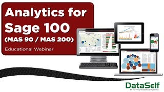
Johnny Girardi, founder of DataSelf, demonstrates analytics tools built for Sage 100 users. The webinar covers how mid-sized companies can access their data without technical expertise, shows the platform's security and customization features, and answers questions on deployment time and pricing versus competitors like Sage Intelligence.
Chapters
Good morning everyone or Happy Thursday. Thanks for joining our session. This is Johnny Girardi. I'm the founder and CEO of Dataself. Let's get the ball rolling. So before we get started, let me click here. I want to thank all of you for joining our session. I started this business data self about 8 years ago and make a long story short, the idea when they found this business was analytics in business. Intelligence was a pretty well established technology in the upper market for Fortune 2000 companies. However, mid sized companies, they're also trying to improve their processes, becoming better, making better decisions, more informed decisions and they they usually would not be able to afford the solutions from the upper market vendors. So my initial vision was mid sized companies need this right now, it's too expensive. So I went through a process of building a company where the main focus was coming up with a solution that was really easy to use, that would be able to fit the budget of mid sized companies and that they would be able to maintain themselves, not only being a software package, but coming up with a very comprehensive of reports and dashboards out of the box. So as you invest in this technology, you can get started with a very comprehensive set of out of the box reports. So we started this company about eight years ago and we came a long way. This is the fourth interaction of technology. So let's take a look at what we have today and hopefully you'll find very interesting for your sage 100 or mas, 90 mes 200 packages. So what we're going to be talking here today is first of all about 15 minutes talking about why analytics? And then we're going to spend most of the time looking at the actual product per se. And then at the end we're going to have a Q and A session. So why are you here? Well, most likely because you don't have easy visibility into your data, into your operations from a reporting and data analysis standpoint, most likely it's too labor intensive. You know, when you ask for new reports, you want to modify reports, you want to slice and dice the data. It may take too long from the business user standpoint to get the information that they need and from the IT or consultant putting them together. So it's usually not fast, it's usually not empowering the decision makers with easy access to information. And finally, reports may run too slowly. Those are the traditional challenges of reporting solutions such as Crystal and Excel and access. So why data Self analytics pretty much is, is the ability to empower business users. We came up with a technology that really allows non IT people to get information that they need, when they need it, where they are. So they can be on a meeting, they can be on a phone call, they can be meeting in a coffee shop, in front of the client, in a restaurant and they should be able to find information as needed and do it by themselves. So that's what we do in a nutshell. Empowering business users. So one of the most important things when you think about empowering business users is easy. These people are usually not IT savvy. So we must be really intuitive and really user friendly. So this is one of the focus and again, easy means not only being able to find information, but if they want to filter it, if they want to slice and dice it, they should be able to do it themselves again, anywhere, anytime. Second is, as I mentioned, over many many years we have built a very comprehensive out of the box solution for sage 100 or mas 90, mas 200. And today if you buy the complete package including the Sage 100 modules as well as let's say Sage CRM, you will have more than 2,000, yes, 2,000 reports, dashboards and KPIs ready to go. Very comprehensive. And when I go to the product presentation, you'll be able to see some of them. What I'm going to show today is just give a quick glimpse into some different areas of the analytics solution we have. Out of the box. Sales is one of the most popular areas that people come to us to get better analytics. So I'm going to show quickly when I go through the product presentation things like sales and profitability analysis, how to look at order and invoicing, efficiencies, sales commission, you may have a fairly complex process. Analytics can help you making dynamic sales commission throughout the month. So so you don't have to wait until the end of the month to do commissions forecasting, pricing strategy, and then sometimes you have to add to a sales analysis data from outside of your Sage 100. Products such as POS systems maybe receive information from your clients. Maybe they're like big box retailers such as Walmart, Target and so forth and they give you some information. So the ability to combine data for sales analysis is usually critical and we can tackle that too. On the supply chain management, if you have that typically inventory management, inbound, outbound routing and logistics collaboration with your vendors and maybe even with your customers, analyzing closely your purchasing processes, doing forecasting and also bringing data from other data sources may be something very important when you're doing supply chain dataself covers, reporting from pretty much all modules from MAS from Stage 100, such as AR, AP, GL, inventory, purchasing, sales and so forth. So let's go for a test drive. And our solution is so fast, it's is so intuitive and so impressive that we say that data self analytics is like driving Ferrari. So let's take a test drive of this Ferrari. We're going to have three main segments of the product presentation. We're going to start with a secured access to it. I'm going to show typically how people go about that. Then I'm going to show some simple key performance indicators out of the 2000 package. And then I'm going to show usually one of the most impressive parts, which is showing how easy it is to build new dashboards from scratch. And the purpose of that part of the presentation is we want to show that you can do it, or if you're too busy to learn how to do it, hopefully someone really close to you will take the time, which usually sometimes is just a couple of hours or less, bit more, and they'll be able to provide you with information as needed. So let's go for the product presentation I'm going to switch to the web portal. So most of the time people accessing data self analytics, they access through a web browser or through mobile devices such as tablets and smartphones like an iPad or an iPhone. So when they log to their portal, the first thing that happens is there are three levels of security. First of all, this data is usually hosted in your intranet, so highly secure behind your firewall or if you put it on the open Internet, we use encrypted technology that will avoid people from hacking into your system and have your data only available for people who have access to it. So that's the first layer of security. When they log in right now I have this user 1 login, then I would log into my own set of dashboards. So right now here I'm looking what the sample projects would be. It could be a C level kind of dashboard for CEO, CFO and so forth. Could have finances, dashboards, human resources, sales, supply chain, purchasing receivable. We can have many different projects for different teams. Now when I log in, if I were, let's say a supply chain person or let's say a salesperson, when they log in, the tool would automatically throw me into the sales team dashboards, so I would not be able to see sea level dashboards, finance and so forth. I can only see the sales team dashboard. So that's the second level of security. The third level of security Is let's say if I go, let's say if I'm a supply chain person and I come here and I open one of these dashboards, then the technology, I mean even though this dashboard is the same for the whole team working in the supply chain team, but it would only show my own information. So if I'm managing only let's say a certain product line, then when they log in, when they open up a dashboard, I would only see that particular product line information. While my co worker who has access to a different product line, when this person opens the same dashboard as myself, this person only sees the product line that they're taking care of. While let's say the big boss open the same dashboard and see all information. So three levels of security to be sure the data is secured. You only can see dashboards for your team in only your own information. Now having said that, let's go for the second part of the presentation which is showing some out of the box dashboards and I'm going to show some on the supply chain and some of the sales just to give some ideas. On the supply chain. We have many things covering different perspectives. One of them could be analyzing your cost of sales from an inbound standpoint. Sometimes that's relevant for some businesses and we have ways to do that. Inventory productivity is something that fairly often people that are selling products, they want to take a close look at it and see information from an inventory turn standpoint. So we have dashboards like this showing inventory turn where you can analyze the top items by inventory turn which ones are not turning so quickly so you can focus on the right products to get them out or improve the efficiency of the ones that are not turning out as quickly. So inventory productivity is a big one from a purchasing standpoint. Sometimes you may be bringing products from overseas when you have a big logistics situation. So being able to manage lead time knowing inbound and outbound items can be something very important. And if something start to fall behind, like in this case we have in different color items are falling behind, you can be on top of those initiatives to be sure that if it's going to take too long, maybe you're going to be switching to a different vendor and then being able to fulfill orders on a timely manner. So supply chain can be a big topic. I can talk hours about it, but I want to focus a little bit on sales which typically in presentations like this, in webinars like this, we have more people looking from a sales standpoint. So I want to show a little bit about that. So here's some of the sample dashboards that we have for sales. We also have for mobile devices specifically. Since mobile devices, they have smaller real estate, so they have to be designed for that purpose. But let me open one of these top performers, which is usually a popular way of looking at your own data. Let me open the first one, which is a very simple concept. This one is showing top customers by sales. This year to date, we actually have a lot of reports showing top performers, like top customers, top salespeople, top products, top territories by sales, cost of sales, gross profit, or if you're looking from purchasing, top vendors, maybe on a GL side, the top expenses, things of that nature. Now when you look at these reports, there are many ways to visually interpret the data. So this one is like having bars for sales. The color of the bars is represented by the profitability. So we have a good insight of how they are. And we can also have, let's say, these black dots that relate to gross profit. So kind of informative to tell good insight into profitability. Now the next dashboard that I want to show is usually even more intriguing because for some businesses is very critical. This one shows a different perspective. It's looking at the top and bottom, I mean the top growth in a top decline in a given period. So this one is looking the top sales change this year to date, minus last year to date. So clients who have been growing the most in sales since last year, as well as the biggest declining sales since last year. If you have a lot of recurring customers that you want to be sure you're always doing your best for them, most likely the top growth, Very likely you are taking good care of them because you're placing orders, they're calling back. But what about the ones declining the most in sales? Sometimes some of these clients are unhappy. Maybe the competitor is taking your business away. Maybe there is something you can do to reverse the trend. So a dashboard like this could be insightful to tell some initiatives that maybe today you don't have time to pay attention. And with an insight like this, you may be able to know what's going on, call these people and try to reverse the trend. So we have lots of reports looking at the top and bottom performers from different perspectives so you can be sure that you're looking at the right initiatives. Another type of report that is also very informative sometimes is what's called exception reporting. Let me show an example of exception reporting. So exceptional reporting is when you look at transactions of things that are no longer happening, like in this case, I have regular customers that they usually buy, but I have no sales in the last 30 days. So why these customers were buying before and they're no longer buying. Sometimes it's okay, it's seasonal, but sometimes there's a problem. So here I have sales in the last 60 days, but no sales in the last 30 days. And I can even see this on a geography standpoint. So let's say if I'm the person that is from this state taking care of this territory here, if I mark that territory, I could just get a smaller list of customers in that territory that is falling into this category so I can call them up and see if I can reverse the trend. So anyway, this is how usually people consume information. And as I just went through, we have a very comprehensive set of out of the box solution with more than 2,000 reports, dashboards and KPIs. And most of them are like this. They have charts. They also have great information that can be a great starting point to analyze your business initiatives. All right, now I want to go into the third part of the presentation, which is typically the most interactive. And the idea is, okay, beautiful, you're seeing some nice dashboards here, but how about customizing them? Typically, you have your own specific needs and you or someone in your organization needs to customize dashboards specifically for what you're looking for. So let's take a look at how easy it is to customize. And the main idea that I want to give here today is you can do it if you want to do it yourself, it's not complicated. You'll be able to do it. If you're a decision maker that are too busy to learn, no problem. The good news is you don't need to have it to do it. Hopefully you have an assistant that will be able to. Maybe you're in the middle of a meeting and you need some kind of insight. You call the assistant and say, hey, can you build a dashboard? Xyz? The person builds and in a couple of minutes you get on your iPad and then you can make money from decisions. Hopefully better decisions. Hopefully bigger deals, better deals. So let me show a scenario like that. So suppose that my boss, let's say the VP of sales is in California negotiating or discussing some meetings with the sales team. And he's in the middle of this discussion with the sales team. And then he called me, which I'll be the assistant assistant, and say, hey Johnny, can you please build a dashboard where it shows sales and gross profit by salesperson and also A sales by geography so I can make decisions with my team here. I say, oh, no problem boss, give me a few minutes and I'll get back to you on your iPad. So I just got the new request. So as the power user here, I'm going to switch to the data self analytics desktop tool which allows me to extensively customize and build dashboards from scratch. Now this tool here again is easy to use and has been designed with business people in mind. I'm going to give some ideas why this is so much easier than other options out there. So first of all, here on the left we have the data panel. The data panel is where I find what we call the reporting parameters. Right now I'm looking at sales analysis, sales information. So I have here a list of dimensions which are typically things you want to analyze, like categorize, filter by, such as customer product, invoice, information, salespeople and so forth. If I come here and I open the customer list, I see customer reporting components. If I go to the product list, I see product related. The actual solution for Sage 100 has a much more comprehensive list of reporting parameters. However, for presentation we keep it clean and simple so we can convey the message. At the bottom of this panel we have the measures, the numbers that I want to analyze. Cost of sales, gross profit, quantity, quantity, quantity, shipped, sales, amount. If I'm looking at let's say job cost or perhaps payroll, I want to see people, number of people, number of hours, overtime, things like that. The other thing that is very important for decision makers is these people may not be necessarily it savvy. So they may come to this list and not know exactly what they're looking at. For instance, salesperson information. What is the salesperson information? Well, it could be the account manager currently assigned to the customer, or it could be the salesperson code that was stamped on the invoice when the invoice was issued. So there are two different pieces of information that are both salespeople. Which one do I want to use? So in this tool the first thing that we have is these pop up windows. So I put the mouse over salesperson and it's showing me that this is the rep recorded on the invoice. So if I look at sales two years ago, it would look at sales by the reps back two years ago. Now if I go to the customer list and I look at the account manager, this account manager is the rep currently assigned to the customer. So if I look at sales two years ago by rep, by account manager, it's still Looking at based on today's categorization. So anyway, these pop up windows, they work all over the place for dimensions as well as measures and they help decision makers figure out and find the right reporting parameters to put in a report. All right, very good. That's kind of intuitive. Now building a report is usually a journey. The decision maker knows where they want to go, but until they see something, they don't know exactly what the final outcome is. And because it's a journey, if you need someone else to build your dashboard, let's say it person or consultant, every interaction, it may take hours and even days to go through and get the report together. So not efficient if you don't have solution. Like data cell bi, this tool has been designed to help decision makers to walk through the journey. Actually, this tool, the engine behind this tool, was designed by Stanford University professors who analyze how business people look at data and what kind of data visualization techniques can help them get better information out of the system. So as I'm going to show the example now, I'm going to show how easy this technology is. So let's go back to my request. My VP called me, asked me for a dashboard showing sales and gross profit by salesperson and then a geography analysis. So let's do the first part of the dashboard. I'm going to choose salesperson. I'm going to choose amount, sales and percentage gross profit. That's one piece of information. Now I know my boss and I know that my boss likes to see charts and likes to see colors. So let's see if this tool can find me something that will be informative for this perspective. So I could come to this show me panel. If I click, I collapse. If I click, I expand it again. Right now I see what kind of data representation techniques would relate to these kind of reporting parameters. Because I didn't choose something like address or ship to, I have no mapping capabilities. So the tool knows what I'm selecting and gives me the right option. So let's start just picking and choosing, see which one can be informative. The first one just gives me information on a grid format. And if your boss really likes to look at numbers at the penny, most likely the grid is the way to go. My boss, I know she wants different. So let's look at some other alternatives. This one here gives me boxes, bigger boxes, bigger sales. And the color of the box is represented by a color scheme or color theme for the profitability. Kind of cool, but I'm not impressed. I'm going to go for the next approach. And then the idea is you keep on clicking on options until you find something that you feel wow. I think this one is going to be informative. And in my example, I like this one. So I have my salespeople here. I have amount sales, so a bar for each customer by sales and then borrow for percentage gross profit. Awesome. I'm going to stick with this approach. Now, I know that my boss pretty much usually don't want to see the sales of my two top salespeople. They are like rock stars and she doesn't need to manage them. So I'm going to exclude both of them very easily. Very easily. I just put the mouse over and choose exclude. And I know she likes to see all these notes sorted by descending order notes to see the top at the top of the list. I think this is getting really beautiful. I think she's going to give me a raise today. Finally. I think, I mean, she likes color. So let's put some color to this chart and we'll talk about profitability. So let's use profitability. Drag and drop into my color mark here and look at that. I think she will love this perspective. I have right now a very easy insight into. Let's say this salesperson is very low in profitability. Maybe it's a red flag. We need to work with this guy as well as my top salesperson here. Also, the profitability is kind of not that great. I think this is a winner. I'm going to rename this query to sales and GP by rep. All right, very good. I think the first part of the query is done. Now I'm going to build the second query and she asks for a geography analysis. If she wants geography, I better put in a map. So I'm going to choose customer address and amount sales. So I'm going to go now to my show me button. And now I have mapping capabilities. I'm going to enable the bubble approach. And right now I'm looking at country information. And we have by default country, state, city, and zip. But we can have any kind of geography. We can have territory, we can have county, actual address, you name it. So she asked sales by state. So I'm going to drill down to the state level. And I kind of like this. So by state I have bubbles. And the size of the bubbles relates to sales amount. Let me make these bubbles a little bigger. About that. Looks good. Okay. So sales by the bubble showed the sales amount. Now, I also know that she's usually analyzing sales looking at the size of the Deal. And currently, for the past few years, one of our goals is to try to increase larger deals overall. So I'm going to make an extra slice to this proposal. I mean, to this view, I'm going to go to the invoice header and we have this deal size component which breaks down invoices by small, medium and large invoices. I'm going to take the deal size and I'm going to drop it to my color mark and we're going to tell that this is going to be a pie chart. Wow. I think this is going to be really impressive and very informative for her. Now, typically, when you're analyzing data, you want to see things changing over time. Is it growing, is it declining over the years, over the quarters, the periods, the months, the weeks, whatever you want. How can I add a time component to my dashboard? Well, typically we can also use drag and drop, so very easy to drag and drop information into a dashboard. I'm going to drag and drop my document date to my columns. And now what I have is for every year I have a different column. And then I can see the trend. In this example, I see the sales is growing, let's say in California, and the large, the blue, which is the largest invoices are growing. So we gotta give her a tap on the back because she's doing really well in that perspective. I think she'll love this kind of insight. Now remember, she's doing this meeting on an iPad. She has an iPad. And when I combine my prior query with this one, it may be kind of cluttered. So I'm still not that happy. I'm going to put my year analysis on the rows so I have a different perspective. Now. Still cluttered. I don't think she's going to like it. Let me try putting pages, which is a different way of doing things. So now I have a single map. I can put some notes on this map telling what the actual page name is and the page name is the actual year. Let's make this a little bigger here. So that's the year. And now we have this slider that we can change and slide it with our fingers on the iPad and see what's going on. Or even if you're in a presentation and you want to put this on a loop playing back like this. As the period changes, I see the whole thing change on my map. Now this looks like my Ferrari and I really love it. And I think she will love it too. So let's wrap this part of the query. I'm going to call sales by state. Sales by state. And now we need to combine these two queries into a single dashboard. Very easy. Let's do that. I'm going to click now new dashboard. And then here on the left I would have all the queries that I built. I could have several, five, ten. And now I just drag and drop, very easy. I'm going to drag and drop sales by state. First I'm going to tell to fit to my computer screen. And then the second segment I'm going to drag and drop and again very easy. I can just drag to my left quadrant, top quadrant, right, right quadrant, bottom quadrant, very easy. Just drag and drop where you want. So I'm going to put it on the left and I'm going to give more room to my map. And finally I'm going to tell that each one of these segments they're actually filters. So let me put this all as filters and I'm going to put my legend actually below my map so we have some more room here. And that's my dashboard. Awesome. I'm going to call this, I'm going to call Johnny Dashboard. Beautiful. So I just built a dashboard and if I were not explaining to you, I would be able to build this dashboard in probably half of the time much more quickly. But okay, I did my job and now I need to send this dashboard to the VP, to the iPad. So I'm going to publish this dashboard and right now I have connected this to my cloud server solution and then I'm going to say that I want to only publish to the Johnny dashboard I'm going to put into my sales because she only has access to the sales team dashboards. And I click OK here. So I'm just going to publish the dashboard and I could come here and tell who's going to have access to my dashboard. I could say only the sales team click OK and then I'm going to publish this to the web server. So now it's being sending the information to the cloud server. This could be again on premises or it could be in the cloud. Now I would call my boss and say hey boss, I just finished the dashboard. Go to your iPad and refresh your sales, your dashboards since you would be inside of the sales project. When she would refresh this she would be able to see the data cell BI demo which is the workbook I just created. I click on it and then I see Johnny Dashboard. So she come here now and she just clicks on Johnny Dashboard and right there she sees my map and the sales by gross profit by rep. And she looks at here. Oh wow. Yes. This is what kind of information I was looking for. Now I'm meeting with the west coast team. I can come here and just select the west coast states on my iPad using my fingers. When I do that, the dashboard changes to reflect only salespeople selling to those two states and how well they're doing. Suppose if I'm looking at the not very profitable salespeople, I can start clicking on them. And right here, I mean right now I'm looking at the size of the circle is 26 million total when I choose only Sam. Now what I'm doing is I keep on changing. So now I'm looking only sales in those three states and I can keep on selecting other people, just analyzing, let's say the ones that are very unprofitable. And I'm going to be talking with them and discussing with them. So as you can tell, it's very easy for the business person now getting this dashboard and start to slice and dice it on the fly. Now most business people, they are very likely to be happy with something like this, being able to see a dashboard quick, sorry, quickly and filter it out. Now my VP of sales, she's more sophisticated and she actually knows how to change dashboards on the fly if she needs it. So she comes here and says it's great and blah, blah, blah. But hey, I actually want to see something else different. Now by herself on her iPad or wherever she is, she clicks the edit button. What happens is now she has a user interface similar to the tool that I have. So she comes here, for instance, she sees the salespeople and she says, hey, I want to see only numbers because now I'm going to the nitty gritty details. So she changes to the number only approach and actually I want to see the sales broken down by salesperson by let's say product line. So she comes to the product list here, she expand it, find product line and she drags and drops into the report with her fingers on the iPad. And right there she sees by salesperson, by product line, sales, gross profit. Maybe she wants to see by year. She can come in drag and drop, very easy, very intuitive, she can do it. So right now we have the same information, sales in three years and gross profit for three years. The point is it's easy. And if the business person can take a little bit of time to learn how to slice and dice extensively, they can. So let's say suppose I want to work with this dashboard here. And then I'm talking with my people, and then I suppose I see this information here and by some reason I, I want to go to the Nitty Gritty Details. I want to see the actual invoices behind the sales here. I can click this button, which is the view data. And when I click the view data, I actually go and see the underlying data and I have all the records that were behind the information. I can see invoice number, I can see invoice date, I can see customer number, product name, whatever you want, everything. And then it takes only like if I click download, I can download this information into an Excel file and keep on slicing and dicing. Since she's on an iPad, she doesn't have an Excel file, but if she were on a notebook, she would be able to download this and open right into Excel. Let me see here if I can quickly download this. So let me take another one here. Underline data, show our records. Oh, there you go. So I'm downloading 28 megs of information from my server. So there's a lot of records actually behind, by the way, the sample database that I'm using here, it has over 1 million records in the sales. And even though I have a lot of data, you can tell that the reports in slicing and dicing work really fast. Now, because I'm downloading so much information, I took something with a lot of sales, it's taking about a minute to download. But the formula is, once it's downloaded, we'll open it up quickly. All right, so this is overall an overview of the solution. The main point is it has a very comprehensive out of the box with thousands of reports, dashboards and KPIs, and it can easily be sliced and diced by business people. So I just downloaded the whole data in detail and now I'm clicking to open in Excel right now in Excel, I just dumped all the records. And then if I'm a Power Excel user, I could come here now and just do my analysis, detail analysis, record by record. All right, let's wrap the presentation and open for Q and A in a minute. So let me maximize this deploy here again. How do we do it? How do we make it so easy? How do we make it so fast? How we give you information whenever you are. Well, it's because we use a ultralight data warehouse that is usually installed on premises. Then we have the data self analytics component, which is powered by Tableau. And this can be on premises in a private cloud or on our own management services. And at the end of the day business people can access information anytime, anywhere using desktop, web browsers and mobile devices. How about return on investment? Well, when you look at data self analytics, one of the most important things is this tool can actually empower your decision makers with better information anytime, anywhere. So let's say looking from a sales standpoint, if, if your salespeople starts to have this kind of capability, it's very likely that when you're in the middle of calls or maybe they're meeting clients, they'll be able to find on the fly more information about the situation and make bigger deals, hopefully more deals or more profitable deals. So if you know decision makers can actually make better deals or cut expenses better, they usually can move the needle of your bottom line. They can increase your bottom line by a few percentage points, 1 to 5%, for instance. So if you are, let's say a $10 million a year company and you increase your bottom line by 1%, how much money is that? That's how you look at return over investment. Data self analytics. Typically we have many clients that get the investment back as soon as they open some of the out of the box reports. Typically it takes a few weeks or a few months for people to have the investment back because we help them address critical needs in their business and quickly pay for the investment. Having said that, how much does it cost? Typically with a four to five figure you can have this analytics in place. You can get your feet wet, perhaps with as low as four figures. Typically when you look at a comprehensive solution is going to be in the low mid figure or five figure. If you are looking at a comprehensive package with all reports and dashboards, we provide. All righty. We're right on track. So I'm going to open for Q and A and if you have questions, you can please go to your gotomeeting panel and use the chat box to ask for questions. So please feel free to do that. So one of the questions I have here is about pricing. How is the price for additional user? We have four type of user licenses. We have the desktop license, which is the power user. We have the web license with full capabilities, just like I showed that people can actually license data on the fly. We have a viewer license and we have a way to distribute static dashboards for unlimited number of users. So additional users can be as low cost as zero. If you're using the way to distribute static dashboards through email or shared folders. And if you go with the more expensive user license. Looking for my yearly subscription, for instance, it can be a few hundred dollars per end user. That's a good question. Other questions let's see here. Time to deploy. It takes usually hours to deploy. Let's say data self analytics for sales. Sometimes it may take a few days and only rarely. There's a lot of customization that may take weeks worth of effort. Overall. Let's say if we close a deal today, until we get access to your server, we install, you test, we validate and we train you. Usually takes some weeks time period. However, the actual effort can be as low as a few hours. Again if your system is very simple. If you have more sophisticated needs, it may take days, maybe even weeks worth of effort. So that's typically how long it takes to deploy the solution. More questions so one of the questions here is make a comparison of data self analytics with Sage Intelligence. So Sage Intelligence is a solution that comes built in with the latest Sage products. It's a great solution. It's primarily focused on the financial side for profit and loss and balance sheet things. It does a great job on that front and we consider them like a Bimmer Mercedes, a Porsche. A great solution, great pricing. If you fulfill your needs, most likely you're going to be happy with that. We're more like the Ferrari. Among these players in the whole Sage community, our solution is the fastest, the most intuitive and the one that comes with the biggest out of the box solution. So comparing to Sage Intelligence, we provide a lot more value, being easier to use, really intuitive and much faster to run queries. Looks like those were the questions. Any other questions? Well if you have more questions you can send an email directly to my to myself. You can see my cell phone number here, my email and my Twitter account. So if you have more questions, feel free to email it to me or give me a call or tweet me. I'll be glad to go over give more explanations about how our technology works or how we stack against different competitors, or how we can fulfill your needs. I really appreciate your time and investment in this gotomeeting and I look forward to speaking to you again. Thank you.










