Analytics for Services - Job Cost P1 - Dashboard Example - DataSelf / Tableau
A short demo-style video transcript showing a DataSelf/Tableau job cost analytics dashboard for professional services organizations. The speaker demonstrates interactive features (filtering by company, period, customer, profitability), data blending across multiple ERPs, exporting to Excel, and drilling into contracts; closes by promising a follow-up video on dashboard creation and customization.
Chapters
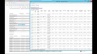
This video is to talk about job cost analytics with dataself. The first part I will show an example of this dashboard in how interactive a dashboard can be for companies looking for job cost analytics. It's generic idea, but the idea is to show the possibilities. The second part of the video is the most important because I'll dive into showing how easily dashboards like this can be customized and how the data structures in dataself actually facilitate the job for business people anytime, anywhere to be more self sufficient, you know, finding the answers to their questions. So let's get started with this dashboard. First. This is one dashboard that was created using our out of the box solution for a company that want to see top customers by contract. This organization actually is comprised of four different companies and they are listed here. Actually three of these companies use the same ERP system and professional services in project management software. The fourth company uses a different ERP system in a different professional services in project management software. However, because Data Self has a data warehouse, we are able to blend all this data together. They're all data that comes together and will allow and allows users to easily license their data in a consolidated way as well as by individual companies or group of companies. This particular dashboard here for this company, they sell services and they are really focused on selling contracts and then over time upselling and extending the relationship. So this dashboard was designed to show their top customers in this example across all organizations. So the top 15 customers across all of them on a descending order by the original contract sale, then showing how much the actual sales is so far. And right now I'm looking on this year information and the variance means how much extra sales I got from the original contract. And of course my top customers, they're doing pretty well, they're growing across the board. And you know what, if I want to see information, let's say for last year for instance, I just click previous year. And right now this dashboard is completely focusing on last year information. Let me go back to this year and actually show for this quarter instead. So as I click and I can change easily to quarter months, weeks, it could be fiscal periods. The dashboard automatically, you know, responds to my commands in a way back to this year. Now this dashboard has been designed to help people see data on grades like this as well as on charts. Some people really driven to look at data on charts. And this chart in the middle here actually has the same information as you can see here, but actually having bars for the actual sales. And these lines is the contract sale. And if it's Blue means you know, we're having success and we're selling more than actually the original contract. If you put the mouse over any of these bars, then you'll have this pop up window showing details, actual sales, customer name, contract, sales variances, profitability information. So just put the mouse over and you can see in a more visual format what these numbers are telling on the grid. The right chart shows profitability analysis. This company is targeting to have the profitability between 25 and 50%. And they're using these color legends to easily tell most of them are green, meaning they are the target profitability. Some contracts are above, which is great, and some contracts are below. So not so good. The bottom section is showing all contracts that were awarded from my top customers. And now I can start interacting with this dashboard. Let's say, hey, this customer here not doing really well with profitability. What's going on? I can click on it and by clicking on it it automatically drills down and only shows contracts for this customer. And see that pretty much across the board, all of them. I'm underwater, so not doing really well. And this might require more attention. What about this customer that is almost, you know, below my minimum margin. If I click on this customer, then I narrow down the analysis. At the bottom I'm still above 25%. But as you can tell, there's a lot of contracts that are underwater and might need my attention. What if actually I want to export this data into, let's say an Excel and send to someone else, I can click on any of these data points on the dashboard, I can choose this View data button and then I can choose full data, show me all the records. And when I do this, I actually have every single information related to this particular customer. And I can export by clicking Download, I get an Excel file. And if I need to share with someone else that doesn't have access to this tool or you know, do some analysis in Excel that I'm comfortable with, I can easily get the data into Excel and take it from there. Now what if on the other hand, what I want to do actually is I want to remove some of these customers out of the list because hey, I don't want to look at this unprofit because for whatever reason, it doesn't matter, I can click on the customer and say exclude and you can exclude as many as you want or only keep them. In this case, I'm going to exclude this customer. Now, this customer is out of the picture for this analysis and then I get the next one at the Bottom that now has been promoted to the next the top 15. Very interactive. I can reverse, you know, go back and bring the ones that I removed or let's say hey, I'm just looking at close opportunities. What if I want to see active on hold or different contact sizes by different people, different sales team. Or maybe I only want to see some of the, you know, Costco maybe you know, I don't want to see floors and then I unclick floors and automatically the whole dashboard will interact to show, you know, everything except floors or you know, out of the multi company system. What if I only care? Suppose I'm the a B person, I don't care about the other ones. I can just uncheck the boxes and right now the dashboard is focusing on ab. And here's some interesting, something interesting. The way that this dashboard has been created is in a way that if the actual is below the contract it means is a failure. You know, we couldn't deliver and the client probably broke up the contract. So visually different color to represent that and usually you know, profitability is pretty, pretty low in AB in this example is not doing so well. But actually if you dig a little further you can tell us that they have been overwhelmed by two clients that are demanding so much attention that they're not giving enough attention to some of the other clients. And if I'm from corporate I would see if I could use resources from the other organizations to help, you know, this company to not lose these other clients and let them down. So this is just a little bit of an example of how these dashboards can be interactive and you can analyze information from all different types of job cost analytics. In the next video I'll talk more detail on how easy it is to create and modify these dashboards. So please don't miss it and check it out. Thank you for watching.










