ANALYZING – Intro series – DSA Educational Video
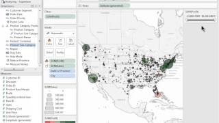
A short instructional YouTube video (DataSelf AI, uploaded Dec 3, 2014) demonstrating how to analyze data in Tableau. Covers creating and managing hierarchies, sorting, grouping, filtering, viewing underlying data and crosstabs, aggregations and de-aggregation, trend lines and model details, page-shelf animations, and forecasting (including editing and describing forecast models).
Chapters
Welcome to the Analyzing Video. In just a few moments, you'll see some of the different ways to perform analysis within Tableau. You'll learn how to sort, group, and filter your data. You'll also see how aggregations work, how to apply trend lines, how to use the page shelf, and how to perform forecasting. So let's get started. Let's begin with hierarchies. Hierarchies are a great way to organize your data in a way that makes sense to you. To create a hierarchy, we just grab a dimension and drop it on top of another. We can name a hierarchy, and once we've created that hierarchy, you can see it within the dimensions pane. If I want to add a new dimension to my hierarchy, I can simply drag and drop that dimension right in there. Notice now that I've created a hierarchy, I have the ability to collapse and drill down. I can even interact with my hierarchy directly on the visualization itself. If I want to add a new member to my hierarchy, I can also do so by right clicking on a dimension and selecting Add to Hierarchy. If at any time I wish to take my hierarchy apart, I simply right click and select Remove Hierarchy. With my store data, I'm interested in analyzing the profitability and sales of my products. To do this, I can sort my products in a few different ways to help me identify problems within my business. The first way I can sort within Tableau is by using the Quick Sort options up here on the toolbar. Notice what the tooltip says. I can sort my subcategories as Sending by Sales or Descending by Sales. I can also simply select a column and and drag it exactly where I want it to be. In this case, I want my west and region to be on the left. I can also sort down a column or across a row simply by hovering over that column or row and selecting the Sort icon. If I want to define explicitly how I want a sort to work on any dimension, I can open up that menu, select the Sort option, and from this menu I can define exactly how I want that sort to work. In this case, I'm okay with having my subcategory sorted by descending sales, but I could select any field within my data source to sort on that field. If I ever want to clear a sort from a given dimension, I can go to that dimension and simply select Clear Sort. In this case, I wanted that sort, so I'm going to hit the back button. Now that I've sorted my data in a way that I'm happy with, I've noticed that Some of my product subcategories have very small bars associated with them, and they're all kind of in the same category. In my mind. I'm going to group these subcategories up into one group by holding down the control key and selecting Multiple Items and then selecting the Paperclip icon. Now that I've created a group, I can right click to edit the alias and name it something a bit more intuitive to my end users. You may have noticed that on the Dimensions pane I now have a new dimension product subcategory, and in parentheses it says group, and there's also a little paper clip icon to denote it. This means that this new dimension is the same as my old dimension, except that it contains grouped data. I can right click on this dimension and select Edit Group to view the groups that are present within this dimension. I can even add new members to this group from this window. My product subcategory is no longer a part of my hierarchy. This is because my grouped subcategory is not present within my hierarchies list. To fix this, I'll simply drag that grouped dimension into my hierarchy list and drag the old one out. After looking at my chart, I've noticed that office machines in the west is doing very well in sales, but also pretty poorly in profit. I'd like to analyze this further in the next sheet because I'm interested in doing some analysis on my office machines in the Western region. I'm going to focus on and filter down to those marks of interest. The first thing I want to do is filter my cities by profit. So so I'm going to right click Profit and select Show Quick Filter. From here I can adjust the slider to show different values of profit or simply enter a number in the upper or lower range. And I'm particularly interested in office machines, so I'm going to show the quick filter for my subcategories as well, and I'll select Just Office Machines. From this view, I can see that California seems to have a high concentration of cities with negative profit and office machines. So I'm going to focus down on California. I can do this just by lassoing around those marks and selecting Keep Only. Or I can show the quick filter from my state dimension and select just California. So this is pretty good. I can see that I have high sales in Los Angeles but relatively low profit. I can also see I'm losing a lot of money in San Francisco. If I want to see the underlying data behind this mark, I can select View Data and Go to the underlying Data tab. From here I could sort my rows based on profit to see which customer is contributing the most negative profit. If I want to duplicate this exact view as a crosstab, I can do so simply by right clicking on the sheet and selecting Duplicate as Crosstab. Crosstabs within Tableau are special. I can still sort on one of my different measures. But in addition to this, I can treat my crosstab like I would any other view. That is, I can take different measures and drop them onto the marks card to modify the way my marks are presented within my crosstab. For example, I can take profit and drop that onto color or maybe sales onto color. And I can see that Los Angeles has a much higher sale than all of my other cities. If I take unit price and drop that onto color, I've discovered some new insight. It seems the more negative my cities become in profit, the higher the unit price becomes. If I want to view the grand totals for my crosstab, I can go up to the Analysis menu, go to the Totals menu and show the totals that I'd like to see. Let's move on to talk about aggregations within Tableau. By default, Tableau will automatically aggregate your measures up to sum. For example, if I drag out sales, I can see that my sales have been summed up to 8.9 million. If I want to change the default aggregation of my sales, I can simply right click on Sales, go to Default Properties and modify the default aggregation. Here I can also view my data in a deaggregated format. For example, currently each of my bubbles represents my aggregations for each of my product categories. If I go up to the Analysis menu and deselect aggregate measures, I'm now viewing a bubble for each row in my data source. This can be useful if you want to compare your data on a row level basis. Let's move on to trend lines. I'd like to conduct some further analysis on Office machines in the West. This scatter plot shows me my sales versus my profit where each mark represents a different product. In order to enable trendlines, I simply right click and go to the Trendlines menu and show trendlines. I'm interested in office machines so I'm going to bring Product subcategory out onto the row shelf. Now I have a scatter plot for each of my subcategories. If I move region onto the column shelf, I can now see for each subcategory how my products are doing within each region. If I scroll down to Office machines, I can see that my trend line is going downwards. I can also see some four different products in this case that are doing exceptionally poorly in terms of profit. I can focus in on office machines by double clicking and double clicking on the West. Hovering over these marks will show me exactly what products those are that are doing so poorly. If I'm interested in seeing the model behind my trendline, I can either hover over it to view that P value and equation or right click and select Describe Trend Model. This will give me all sorts of useful information pertaining to my trendline, including the R squared value, the P value, and even an ANOVA table. Notice that I had to do absolutely no coding or scripting whatsoever to yield this table. All of it is just automatic. Let's move on to the next section. This sheet shows me some time series analysis for my different product categories. I'm going to filter down to office machines so I can really see what's going on with my sales over time. I can see when my sales are peaking and when they're dipping. If I'd like to see this as an animated view, I can copy month over to the page shelf. Now if I change the marks to circle and make sure that my trails are enabled, I can hit the Play button and see my sales animated across time. If I want to see the forecast of my sales, I simply right click Go to Forecast and show the forecast. I can also edit the forecast model and describe exactly how I want that forecast to work. For instance, I'll ignore the last three months and I'm really only interested in the seasonality of my sales. Lastly, I can right click to view the forecasting model. This provides all sorts of useful information pertaining to that forecasting model. This concludes the analysis video. Thanks for watching. Be sure to check out our other on demand videos and happy analyzing.










