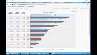
A demo by DataSelf AI about budgeting analytics and interactive 'what-if' scenarios. The video contrasts simple BI slicing of budgets (accounts, subaccounts, variances) with interactive analytics: excluding dominant accounts to make charts readable, applying growth adjustments (e.g., +15%) to budgets, and running forecasts computed as last year plus growth percentage minus a churn rate (example churn = 5%). The presenter shows per-account mini-charts, color-coded variance (red/blue), and YTD filtering (focus through August) and tests different growth scenarios (examples: 15%, 20%, 30%) to see effects on which accounts fall below or above forecast.
Questions this video answers
5% (a 5% drop in customer base on average).
Examples shown: +15%, +20%, +30% applied to budgets/forecasts.
Through August (the presenter removed three future months to focus through August).
An account labeled 'NSEN' was excluded (the presenter mentioned leaving 'IXAS' and excluding 'NSEN').
Chapters
Now let's talk a little bit about budgeting. So now I'm switching to a different example. Budgeting can be very different depending on the needs of each company. Some companies keep their budgeting numbers in the RP system and they just use the analytics to slice and dice their data. This is one example. They come to the report, they see the accounts, the sub accounts, what's being posted, what the budget is, variations by figure and by percentage. And then you're just using to report. You can use colors to tell what's above and below budget and make charts out of it. So many companies using the BI only to slice and dice their budgets by different, you know, gel segments, territories, divisions and whatnot. Some companies, they want to do more kind of analytics out of it. And this is a very simple example and it's a very common example that many people tell me. Well, when we put in charts, the information doesn't look good. It's very hard to read. And I'm just simulating one problem here, which is when you open this actual versus budget, there is one account in this case that is so big that the charts for everything else, like, you know, this chart is almost like meaningless. It should be very good because the bar represents what the actual budget is. This little line is what the budget in the color. If it's blue, it's below budget. If it's above, above is beyond budget in this case our expense account. So beyond is bad. But you know, when you look at the small bars, it's almost like, you know, you can't make much use of this particular chart. But once you are using this framework, it's very easy to say, hey, this account I already see, I don't want, I don't care about it anymore, I'm going to exclude. And there you go. I excluded the big account. Let me just go back to show I'm excluding the NSEN and leave IXAS and everyone else. And by doing that, so access is the next one, it's so much easier to now see how each account is doing. So if you're focusing on the red ones, you can tell many of them are below the budget. Actually, this is actually a revenue, so being below the budget is not good. You want to be above the budget. So red means you are below budget. Below the you forecast the revenues. Now in this case, we also have ways to influence the budget. So the budget numbers are coming from the erp, but in this example, they want to actually apply a growth range to see what happens. So let's say I want to increase by 15% my budget. And by doing that now, many of the accounts went below budget and we need to work better on those things. So I'm just showing here what happens when you apply the 15% and how the colors change and how that can be insightful for people to be on top of things and focus on the ones that are having the most challenges. The next example is a simple forecast with what if. Usually what if scenarios, they have a lot of different variables that influence different parts of the process. So let me start first talking about the forecast of this example here. This example, we have actuals as the top line in the forecast at the bottom. In this example, the forecast comes from last year plus a growth percentage, which is defined by this parameter, minus a churn rate. On average, this customer has a 5% drop in their customer bas. So they usually put the churn rate here and to make the projection for this year. But then they want to grow the accounts and they put, hey, we want to grow our accounts by 20% total this year. So you make those changes and you see what happens with your numbers. Now, in this case, for each of the accounts here on the far right, we have a little chart showing the bars which are the actuals this year. And then the line is the forecast from taking last year in applying these different ratios, the churn rate and the growth. If the actual is below, the forecast is red. If the actual is above, it's blue. So by looking at this, you can have an idea of how well each account is doing. If you try to have the same perspective from the numbers, it's so much harder. So using this kind of visual cues can make people much more quickly focused on the right accounts. In this case, maybe I don't want to see the future. I just want to focus through August, which is my current year to date. So I just removed those three months. And now I can see in a much more concise view the what if scenario. In the what if in this case, I'm using these two different parameters to control growth and decline. Let's see if I want to grow 30% so far. In this case, now I'm below my target. This is the total for the whole year which comes from the same year. So I have several different components here influencing the whole what if scenario.