CALCULATIONS – DSA Educational Video – Intro series
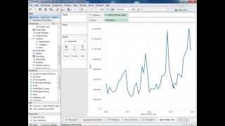
Learn three calculation types in Tableau: row-level vs aggregated (fixing a profit ratio error with SUM(profit)/SUM(sales)), a discounted unit price formula, and quick table calculations for percent difference over time.
Chapters
Welcome to the Introduction to Calculations video. Please feel free to follow along with the companion workbook that's attached to the video as it already contains the instructions and the data sets we'll be using today. We're going to go over just a discussion around different types of calculations, and by that I mean row level versus aggregate versus quick table calcs. Just to give you a general overview of calculations in Tableau, there are additional videos that cover specific function types that can also be found on our training page. So in this case, I'm going to start by making a mistake that most new users to Tableau make, and I'm going to explain why they make it and how you fix it. So I'm going to start with a blank sheet here and I'm going to bring out Row id. This is simply a field that has a number that's in sequence here for every single row in our data set. And I'm going to bring out my profit to text and I'm going to double click Sales so that that's put into the table as well. So what I'm going to do here is create a profit ratio. So I'm just going to right click my profit field and choose Create Calculated field. This same dialog box can be reached by going to Analysis and choosing Create Calculated field as well. So I'm going to take here my profit divided by my sales and call this my profit ratio wrong, because I know this is going to return the incorrect results. And to make sure that this shows up correctly, I'm going to right click this field and change the number format here to percentage. And I'm going to bring this out into my view and you'll say, hey, that looks right. You know what's going on here? Why is that incorrect? And you can't tell because at this point we're doing a row level calculation. So for every single row, what we're doing here is we're dividing profit by sales. And then for the next row, we're doing that exact same calculation and so forth. But really what we want to do here is a different calculation. We want to do our profit ratio correct calculation, which in lieu of doing this at row level, adds in aggregation here. So my sum of my profit divided by the sum of my sales. And just as a side note, you'll notice here I didn't put the brackets around sales here, but it's still functioning correctly. And that's because you don't need the brackets around single word dimension or measures, but you will for things like number of records once there's spaces and multiple words. So I'm going to click OK here and again I'm going to format this as a percentage quickly here so that we see the correct information and I'm going to drag this out. The first thing you'll notice here is that on our profit ratio wrong we get this option to choose the aggregation. We don't get this on our correct profit ratio because we set that aggregation within our calculation itself. The next question you're asking is why are these the same? These are the exact same numbers. You said they'd be wrong, but really the reason they're acting the same is that we're at the row level of detail. So the aggregation versus non aggregation does not matter here how. However, if we go to example 2 here and recreate this view using our continent field in lieu of our row ID so we get a much higher level of detail here, you'll see the problem illuminated brightly. So I'm going to bring profit out to text again and double click sales and then I'm going to add my profit ratio wrong and my profit ratio correct to the table as well. And now this is where you see the problem. So now instead of getting the correct response of 28.83%, which I get using that aggregate calculation, my row level calculation gives me crazy numbers that don't seem to make sense at the surface. But this is pretty easy to see what's going on here. If I bring rowid out here again, you'll see that the numbers are matching. So what we're doing here, if we keep a few of these rows just so we can demonstrate this here we're getting the same numbers because we're at the row id. If I were to highlight all of these, you'll see that I get, you know, the nine rows they're matching. But what we're going to do here when I remove row ID is these numbers will aggregate differently than these numbers. I will sum these up getting that incorrect percentage. Whereas in this case I take the sum of the profit for Africa and divide it by the sum of the sales instead of doing it for each row. So here I get 113% because I'm summing up all of those distinct row level calculations. Whereas here I'm just taking 8.8 thousand divided by 18,000 to get the correct number. So just because the profit ratio has to be an aggregate calculation in this context doesn't mean there aren't going to be context where row level calculations are useful. So in this case I want to see the average discounted unit price for my different categories in my data set. So what I'm going to do here, since each of these rows may have different discounts. So I'm going to start by bringing out my category and additionally I'm going to bring out my unit price from my dimension and I'll sort this appropriately so we can see that my average unit price for copiers and fax is about $750. But what is that when I take into account my discount? So, first of all, what does my discount look like? If I right click this and choose Describe, I'm going to be able to see what this looks like. And it looks like it's a percentage. So between 0 and 25. So I know that I can just multiply my unit price by that percentage. So I'm going to right click my unit price here and choose Create Calculated field. And since I just described my discount and I know that it's just simply a straight percentage, I can just multiply it by that. So this is going to give me unit price times that discount. So unit price times a quarter at the most. But what I want here is the actual discounted price. So unit price times one, minus the discount. And this is going to happen for every row because I know that instances of each product may have different discounts. So I'm going to call this my average discounted unit price. This is an appropriate calculation to do at the row level because I want to check this for each of my orders. This isn't something I want to do at the aggregate level because I don't care if one product has a 15% discount and another one has a 1% discount. I don't want to aggregate that. I want to do that at the row level and then aggregate those results. So the first thing I'll do here is I'll change this back to average. And now you can see on average I discount these by about $30. So there are instances where row level calculations are going to be useful. So don't always just jump to the aggregation, though they are more common. The final example we have here is talking about another type of calculation we have in tableau, and these are known as table calculations. There's going to be another video specifically discussing these at a deeper level of detail, so please feel free to refer to that for more information as well. So in this case, I'm going to start by using my order date, and I'm going to start by looking at my raw sales information. So I'm going to bring out order, date and sales. You'll see we're using that tableau hierarchy for the dates and building out to year automatically. But what I want to do is use my continuous day parts down here so that I can see my sales by month over time. And this is useful. I can tell visually in some cases, you know, where I went up, where I went down. But in cases like this, it's somewhat difficult to tell whether I increased or decreased. So how can I show this in a more visual manner? How can I see how much of a jump this was versus how much of a fall that was? I can do this with a quick table calculation. So if I hold down my control key and click and drag sales, I'm just going to create a second copy of it up here on the row shelf. And on this second copy, I'm going to left click this drop down or similarly right click the pill and hover over quick table calculation. And I'm just going to choose percent difference. And you can see a couple things right away. First of all, the axis has changed to a percentage because of the calculation we've chosen. And second, I didn't have to know the formula to create a percent difference that was built in. What we're doing here is taking the information we received back from the database, so all of this information here, which is known as the table data, and running this table calculation on top of that table data. This explains why we get this one null, because we have a first point here. We don't have any sales before January 2010, so there's no way to calculate that difference. But once we get to February, we know we had a large drop in sales, so we're able to calculate that difference. These calculations can be controlled in many ways. So I could change this to say, hey, I want to look at this by year, the next date, so I could start and go backwards. These are very flexible calculations and very powerful calculations. Additionally, they don't have to just be used on the row shelf. I could hold down my control key again and drag this and put it on color so that I visually really call out where the large differences are both negative and positive. This has been just a brief introduction into calculations in Tableau. If you have questions about specific function types, whether they be logical or number or table calculations, please refer to the next subset of videos that discuss those in more detail, as well as refer to the documentation and other knowledge base articles we have on our website. Thanks for watching Happy analyzing.










