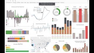
DataSelf's Tableau dashboard pulls AR, AP, cash, payroll, and sales data into one view for CFOs. It projects cash flow 60 days out, flags a -$1.2M shortfall on Sept 26 if a payment is missed, and shows 12% revenue growth year-over-year. Drill into aging receivables, inventory by unit, and orders ready to ship.
Questions this video answers
Projected negative $1.2 million on September 26.
60-day cash flow projection (configurable to 30, 60, 90 days).
$3,300,000 (configured threshold).
About 7,000 receivable records (up to six days late).
Top 10 products by cost on hand add up to more than $200,000.
Chapters
This is an example of a dashboard that was created using the data self out of the box solution. At the end of the video I'll talk about how easy it is to build it from scratch. I'm going to show some examples, but for now I'm going to focus on how insightful these dashboards can be and how interactive they can be. This dashboard was specifically customized for the CFO of a distribution company. The way the charts have been laid out, the interactivity as well as the drill down in possibilities were done specifically for this cfo. However, the point of this video is to show that this kind of dashboard can be built for any person or any group of people. The CEO, the cfo, salespeople, financial people, any team member, any team groups. And they can be very interactive, very, very easy to slice and dice the data and even share data using, let's say, Excel and other formats. This particular dashboard is bringing together data from many different data sources. It has data coming from receivables, payables, cash on hand, payroll, GL transactions, sales, sales order, inventory on hand, CRM information, and website visits from Google Analytics. All of these different data sources together in an interactive dashboard. So let's take a look at the dashboard and have some ideas. This CFO needed to see financial metrics as well as operational metrics together. Some of these metrics, they are lead metrics showing things that are going to happen in the future. And many of the metrics are like lag metrics showing performance as of today or past performance. On the far left we have the lead metrics and one of the most important is the 60 day cash flow projection. This could be 30 days, 90 days, any period. For this CFO it was 60 days. And what he can see here is if he clicks on today, he sees how much money he has on cash today. If he clicks ar, he sees inbound money coming from receivables. If he chooses payroll, expecting money going out to pay payroll. And if he clicks AP is money going outbounds for payables. And as he put the mouse over, he can see for every day in the next six days the inbound and outbound money from cash if he clicks projection. Now he has this line that shows what is the expected cash on hand based on all of these metrics together. And in this case he's going to go to a negative $1.2 million on September 26th. And this line is line of credit available. So as long as the money doesn't go, the negative money doesn't go beyond the line of credit. He's doing fine. He doesn't have to worry about Now. I can simulate here, for instance, one payment that in a day was not going to come. And there's some issue with this order and how will that affect my cash flow? So right here I removed the payment from a day and my cash flow went over the line of credit limit. And the CFO in this case would have to deal with that issue. So just a very simple example to show how interactive it can be. The next view here is orders to be shipped in the next 60 days. And there's a bar showing for every customer the total open orders to be shipped. So very easy to see based for the most important. If I click here, I could see more details about it. The next section is from the CRM system and it's only showing the hot new opportunities. They're expected to close in the next 60 days. Hot are based on probability above 75 or 90%, all interactive. If I click here, I can see more details of the information and even drill down. At the very bottom there is the AR aging receivables that are aging. And let's say, hey, I actually want to see what are my over six days invoices. I want to click on this line, which is red. Red means no good. And the tool will drill down the dashboard will drill down into this more detailed dashboard showing for over 60 days all the customers that have passed due invoices. If I want to see 60 days instead I click 60 days here. Now I see for all 60 days and maybe I don't want to see the invoices, I just want to see the customers. And there it is in a descending order, all the customers. Maybe I need to share this information with someone else using Excel. How can I do it? In any point of this dashboard, you can go and select View data and you can export data into this format all the records that you have for that particular metric. You can even download this information into an Excel and then share with other people. Downloading is something you can enable for people to do it or not, depending on their credentials. So right here I just downloaded all the records, in this case, about 7,000 of receivables that are up to six days late. All right, this second column here has lag metrics showing past performance and they're looking some color schema. Blue is for last year, black is for this year. This top one is showing revenue year over year. In the total, I'm growing about 12% since last year. These two curves, they show the sales last year and this year month by month to see how I'm doing. The bottom one has website visitors from Google Analytics and let's say how we're doing on the east coast. I can select this is on the east coast and right there it changes and shows I'm more than doubling in the east coast hits since last year. That's awesome. Maybe people want to see even more details. We created a web visit zoom. If I click on it, I go into this other section of dashboard where it shows only for the selected states how I'm doing from a website visitors and I can tell Florida, New York and Virginia growing significantly since last year. All of the tabs are here at the top. I could navigate directly into them or by using the drill down capability that I'm just showing to you. Some other metrics here lag metrics like ebitda, you see more information about it. Pretty much all charts you can drill down into more details. This section here it has three different expense accounts that the CFO has to watch closely and each one of them they have in this pop up it shows the current expense year to date, what the budget is and what is the budget available for marketing. This example I see there is $85,000 that I'm beyond over budget. And the bar shows in red. Red means is not good. I have to take a close look or change the budget. And the line here is what the actual budget is. This section is for inventory assets. This company is a distribution. They have a lot of inventory so we have to watch closely. And here shows inventory assets by quarter and in this quarter is too high is above this threshold that we configured. So the CFO clicks on this red bar. It goes into this other dashboard that shows the inventory assets by business unit. And on the right side it has information coming from the inventory on hand system that shows hey, you know we are above the threshold. You know the threshold is $3,300,000. We are above it. In my top 10 products by cost on hand add up to more than $200,000. And if you put the mouse over in each one of them, you can see how much we have on each warehouse at the bottom. Like the top one we have mostly in the China warehouse. So this is just a quick overview of how interactive it can be. If you want to learn more about how easy it is to create this dashboard and change it, how long it took for the CFO dashboard to be created, please click the next video on this page and also be sure to subscribe to our YouTube channel to learn more about our latest news. Thanks for watching.