CFO Dashboard Part 2 - Adding a new chart and time to build dashboard with DataSelf / Tableau
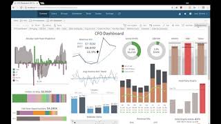
DataSelf AI walks through how a CFO added a new chart to an existing dashboard and shows the actual time it takes to build one using DataSelf and Tableau together.
Chapters
This is the second video of the CFO dashboard. If you haven't watched the first video, I recommend doing so. You can find the link to that video at the bottom of this YouTube in the description section. Anyhow, in this video I'm going to cover two main things. The first one, I'm going to show you how the CFO added a new chart to this dashbo. In the second part I'll talk about how long it took the CFO to build this dashboard from scratch. So let's start with the first part which is adding a new chart. And this dashboard is showing all consolidated data here. But his business actually has three different organizations, is a multi company system and all the metrics are already consolidated in the data self system and showing here like a unified perspective. Now the CFO added in this column here a new chart showing sales by individual company. So I'm going to show you how he did that. So I'm going to get out of this full screen mode. And he's a power user, he can create things. So he has the edit button. He clicked the edit button to get into the edit mode. And here he want to create a new chart. So he came to the bottom, he said I want to create a new sheet. He clicked this button and now he has a new blank sheet. So he needs to see sales information. He goes to the data sources available in his system and he's going to find the SA revenues there is. So he selected SA revenues and he needs to see company information from the multi company system. So he takes the company dimension. He dragged and dropped into columns and then he picked sales. He dragged and dropped into rows and voila, there it is. He got the information which is showing sales by company with the vertical axis. Maybe that's it. He created a new view. Now he goes back to the dashboard tab and now comes a little bit of layouting and trying to make things look nice. So he wants to put the dashboard right in this section here. So first of all I'm going to go back here to that dashboard and change this, give a name, going to call sales by company. So there's a clear title to this new sheet Back the dashboard tab. I'm going to take the sales by company and drag and drop it right here. Right here. So I just dropped it that one. I need to give more space. So let me just rearrange things a little bit here. Oopsie. Room for this one. And I'm gonna get this one. You go all the way down here and actually I don't need to see the title of this chart because I know what it is. I'm going to say remove the title to give you more room. And right there I just added the new piece of information, sales by company. Now reality is once he did that he realized oops, actually this is the whole company history of all companies. And what he actually wants to see here is last year sales and this year sales on a year to date basis. So oops, not ready yet. We need to show last year and this year on a yearday basis. So he went back to the query and we need to filter this to show this year. So took invoice date added to the filters and then he's going to say the filter is relative date because he wants to see years and always the last two years, which is this year and last year. So right now he filtered the whole data to show only the last two years worth of data. But he needs to see year over year. So only sales last year through August, which is my sample database, goes through August and this year through August. So he has to add another filter under date fields, which is the year to date filter or dimension into filters. And right now I'm going to say I don't want to see after year to date, I only want to see sales on a year date basis. So right now I filtered my whole data set from the whole company history, all companies history, into the last two years on a year to day basis. Well now I want to see that the information split by year. So when I take you by state drag and drop to my columns. When I do that, it shows for every year how each company is doing. But I prefer to see in a bar format. So I'm going to choose back to the bar format and there it is by company. I see sales in those two years, so maybe we're done. Let's go back to the dashboard, see how it looks. Awesome. That's exactly the information that he needed. But wait, I think we can do better. Sometimes when you look at this, it's not looking really as standard as everything else. We're using color schemas to show blue for last year, black for this year. There's a bunch of access information here. Let's try to clean up and bring the look and feel of this new chart similar to the other ones using the same color schemas for instance. So let's do it back the sales by company. Now what we want to do is we're going to bring invoice date to the color shelf right there. Now I have the same color schema as the other charts. And now this axis became no longer necessary because the year information is already showing me on the same color as the rest of my dashboard. So I can tell for the year you do not need to show me the header. And the header is gone. Also, there's a lot of room for this Y axis. Let's clean it up a little bit. I'm going to take sales drag into my labels. So now every bar is telling how tall it is or how much the sales is. And now we make this whole area also no longer necessary. So let's click here and say don't show my header. And now this dashboard is. This view is much cleaner. If I go back to the dashboard, I can see that it's pretty standard with the rest of this whole column. So it's looking much, much more cleaner now. Let me give a little bit more room. And that's it. That's what actually the CFO did let me save this dashboard. So I'm going to go to file and click save. So the dashboard has been saved. Now I'm going to do file and close. I'm going to go back to see how my dashboard looks. And there it is. So it took minutes for the CFO to went through the data discovery process thinking what he wants to see added, realize he needs to change, realize you need to change, adapt, change the look and feel and make the dashboard looks again super clean. And with the new piece of information, which is this new segment showing by company sales last year and this year with the same color schema on a year to date basis, very straightforward. Now, how long it took the CFO to build this dashboard from scratch. Before I tell you the time, let me tell you how complex this dashboard is from a volume of information. There are actually 31 different views in this whole dashboard. What is a view? This is a view. This is a view. This is a view. This is a view. So right here in this column I have four views. So 4, 5, 6, 7. If you count all the views of all the tabs, it adds up to 31 views. And there's a total of 84 different metrics or KPIs in all of these views, the total is 84. What I mean by that, this is a metric or KPI. This is a metric. This is a metric. And these lines have the sales by month, this year and last year. So in this chart alone there are five different metrics. Some of these other charts only have maybe one or two metrics. But the total adding all of them is 84 different metrics. So there is a lot of information packed into this dashboard and the CFO created from scratch. He told me that pretty much in the course of a month, you know, from when he started until he finished, he invest about 16 hours to come up with this dashboard as is. So a lot of hours. However, he said that, you know, about six hours was the amount of time he invested into creating the actual queries. Just like I created this one. That took about three, four minutes. It took him about six hours of creation of queries and talking with people and tweaking and changing things. That would be an average of 12 minutes per query. In a lot of this, 12 minutes is because it's a discovery process like this one. If he knew exactly how he wanted from the beginning, probably would take two minutes instead of four, but it takes some time. Now six hours of was creating the queries. What about the other 10 hours? Well, the other 10 hours he told me is which is something very common, is the look and feel of the information, the formatting, the colors, the grouping of the different views together in how he decided to organize the different tabs and the drill downs. Just to give an example, initially the layout, when he put together all of the views together, the layout was very different. And eventually he realized that, you know, all of these four views, they would make sense together because they are lead metrics, they're looking to the future. And there's actually a handful of people in the organization that they have a lot of work centered around the cash flow projection and things that influence cash flow. So he decided to make it okay. This column here is going to have this lead measures to focus on cash projection related metrics. While this other column here is mostly centered around sales. And a lot of the sales team efforts are also centered around these four different metrics or views. And the other ones are more financial operations. So he told me that about 10 hours of his time was pretty much reorganizing, changing, formatting, cleaning was not creation process was more a beautifying and making some something simpler to convey the message of this dashboard. Now the question also is how much technical assistance he required during this work. Well, first of all, he is not an IT kind of cfo. He's not. He's a very CFO kind of person. He knows accounting and financial whatnot. Very, very people person. Dr. And he actually tackled this dashboard about six months after they started with the data self project. He got initially six hours of training, which is our default. His Training, live web based. Then in those six months that he was working with Dataself, he already had worked and built many reports and dashboards. So he was not a beginner, but he's not a kind of business analyst kind of role. He's a cfo, very busy. But he thought that he was the one who had to build his dashboard from scratch and he had the skill sets in place to put it together. So he actually did the job with very little assistance from anyone else. Sometimes he called us or some other people to figure some details of the configuration, but. But the great majority of the work he did by himself. The other question is, was it worth it for a person as busy as he is to invest 16 hours of his time to build his dashboard? And he told me absolutely there was no way that he would be able to talk to someone else that would not understand all of the business, all of the interactions among the metrics and the people that are using these metrics. He was the right person to understand what needs to be done. And by doing it, by talking with different people, showing the ideas and implementing it, he came up with this dashboard that now is completely automated. Every day this dashboard is always refreshed. And there's actually section of this dashboard like this left column here, this whole lead measures section they have on a monitor screen in an area where a handful of the people are really working closely with no cash flow projection and planning. And this section in this monitor refreshes every 15 minutes. So as you know, new orders come in, more opportunities go up and down and age changes, they see the cash flow being changed. So it makes very dynamic in making their team to focus a lot more on the business needs. And before this dashboard and data self, they were spending so much time to get to the data, to get to the insights and now that part is automated, they can focus on analyzing the data, making decisions and making the process more efficient. I hope you found this video informative. Please be sure to subscribe to our YouTube channel using the link that is currently posted on the video. Thanks for watching.










