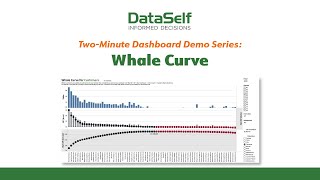
A short YouTube demo by DataSelf AI showing a "Whale Curve" Customer Profitability dashboard for retail (example: convenience stores). The narrator explains how ordering frequency (daily vs weekly) affects delivery-related "document overhead charges" and therefore net profitability. The dashboard is organized in three tiers (total sales per customer, gross profit per customer, net accrued gross profit) and highlights profitable vs unprofitable customers (black to red dots). The example uses an invoice/document overhead charge of $2,000 (users can set their own).
Questions this video answers
$2,000
Chapters
Profitability when pressed to identify the one KPI that is most meaningful to the sales side of a business, the universal answer is profitability. As illustrated in the current Whale Curve dashboard, there's no better example than retail businesses such as convenience stores. These stores need to restock their inventory on a frequent basis. The decision of how often to submit these orders is is left to each store. Some of these stores, the ones that don't use inventory projections, purchase items on a frequent basis, very often daily. Other stores, the ones that use analytics to project inventory needs, are able to get away with less frequent purchasing, typically weekly. This minor difference in frequency has a major impact on profitability due to the high cost of delivery charges. The more deliveries a store requires, the less profit they make. These delivery charges are in the current dashboard referred to as document overhead charges. They reflect the average cost per invoice of doing business, typically including charges for prepping, packaging and delivery charges. They often spell the difference between being profitable and not. This example of the Weill Curve uses the figure of $2,000 for its document overhead charge. You would specify your own invoice cost. The topmost tier of this dashboard shows total sales revenue per customer for a given year. Note that this analysis can also be sliced by region, sales rep, item, etc. The middle tier shows each customer's gross profit and the lowest tier shows the net accrued gross profit. And as the black dots turn into red dots, you can easily see which clients are contributing to your bottom line and which clients are detracting from it. With dashboards like this one, dataself enables you to instantly see who your money makers are and aren't and where to focus your sales efforts in the future.