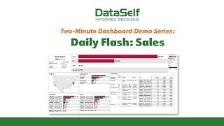
DataSelf AI's Daily Flash dashboard gives you a consolidated view of sales metrics with color-coded goal status and the ability to drill down from summary totals to individual transactions. Customize revenue measures, set thresholds, and explore by geography like California.
Chapters
The Daily Flash is a great example of two things. First, it shows how a single dashboard can give managers, supervisors and executives a place to go for a consolidated daily snapshot of key business metrics. Here, a sales snapshot showing data ranging from summarized totals to transaction level details. Likewise, an inventory Daily Flash could show inventory on hand, recent transactions and stock projections. Second, and equally as important, this dashboard illustrates the degree of flexibility and customization that you can build into Data Self's reports and dashboards. For example, the current display measures revenues by gross sales, but it could just as easily measure revenues by quantity sold or by gross profits. And note how this dashboard uses color coding to indicate whether a customer item or sales rep has met their goal, shown in black or has not shown in red. The time period for that goal, whether monthly, quarterly, yearly, or something else, is up to you. You can also view your business from an entirely different perspective, such as geographic. For example, we could drill down into the details of our sales in California and instantly get to the customers items and transactions associated with that region. As with all Data Self dashboards, Drill down is everywhere. Choose a specific customer item or salesperson and within just a few seconds see only the transactions that pertain to that selection. You can even define for this report your own limits in terms of minimum acceptable gross profits. So, as useful as this particular Daily Flash dashboard is to sales management, keep in mind that this is just the tip of the analytical iceberg. Apply the Daily Flash concept across your organization and just imagine the results.