Dashboard 101 (Tableau, DataSelf, Power BI)
Johnny Giorardi from DataSelf walks through dashboard design fundamentals: use color and layout to grab attention fast, put important stuff top-left, stick to simple charts like bars and lines, and strip out anything that doesn't add information. Make dashboards fit how people actually work, not the other way around.
Chapters
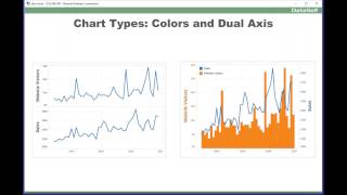
Good morning everyone. Again, my name is Johnny Giorardi. Me and my main team, we've been doing bi dashboards analytics for 17 years now. And throughout all of these years, we have run into so many situations where people ask us how can we better represent data charts and dashboards. And we've kind of learned through our own experience by reading books, by hearing experts. And we have a lot of things usually to share, give insights on how to make it more visual, more impactful. At the end of the day, dashboards is to give insights about something and sometimes people want to make it more distracting, sometimes people want to really focus on insights. So the tricks or the tips I'm going to be covering today is mostly focusing around being meaningful, being insightful, trying to give the story of the data very efficiently, very quickly. You want to shorten the time that it takes to get to the insight so people have more time to decide and to act on their decisions. So that's pretty much my goal here today. And this is the agenda. There's a lot of things I'm going to cover, but I'll try to go quickly to give you the most important concepts about these things. So let me start with the visual perception. It's a very important concept. You know, our brain works in a certain way. Some things our brain does very quickly. Some things is very analytical. You have to take, take time. So if I ask you in this particular table, how many nines are there on this table? If you're like most of us, you have got to scan row by row until you count how many nines. That's the attentive side of your brain, the process inside. It's very slow, very analytical, very detail oriented. Well, what you want to do in dashboards is shrinking the time to get to the inside. So there's ways to get to the answer more quickly. Like in this example, I just changed the nines to red bold. And now in a few seconds you get the answer. And that's about the pre attentive processing side of your brain. It's one side of the brain that doesn't need to look in detail. It looks at the big picture and get an insight and get what's going on. Typically, the pre attentive process side of the brain uses colors, shapes, different ways to give you the perspective more quickly. And that's what we're going to be talking about throughout this presentation, is how to focus on techniques that will leverage the pre attentive side of your brain. So again, shorten the time to get the Insights. So let's go for it. Now that we talk about the theory. First of all, big picture, how do you put information on a dashboard? I think this is kind of almost like a no brainer. But overall the top left side of a dashboard and the center are the most important pieces of it. Now how many dashboards you have seen where people put a big logo of the company on the top left corner? It's pretty popular. If this dashboard is for the outbound for marketing, awesome. You want to show people your brand, great. But if it's a dashboard for your internal people, probably the top left corner is not a good place to put your logo. So put it on the right on areas where it's not so important from a data visualization standpoint, the top left in the center should be where the most important data of your dashboard should be focused on. And of course the bottom right corner is the least important. So layout is about location, location, location, like in real estate. Now you should also avoid scroll bars in dashboards. Ideally you have a single screen with everything in it. If you have to scroll, some people are not going to be scrolling, they're not going to be seeing to the bottom. So if you can try to avoid that. Sometimes people take screenshots of dashboards or they printed. And if you don't have a time, date and time when that was done, sometimes that information is critical to make a decision about when this dashboard was taken. So be sure to add date and time stamp if the dashboard warrants that. Legends very important colors and whatnot. So be sure to include them. If this dashboard will have rare visits like once a month or whatnot. It's important that this dashboard have visible explanations to explain what the dashboard is about. Because some people have a hard time reading dashboards if they're not reading all the time, the same dashboard, be sure the explanations are visible now. Dashboard that people are using all the time, every day, every week. Well, maybe you should eliminate the explanations because once people see it, that real state is lost and you're no longer focusing on the insight, you're losing real state with text. So for frequently visited dashboards, try to minimize the amount of explanations you have on the dashboard. Let me show an explanation or an example of these things on a real dashboard. This dashboard here was actually one from our clients. It's a fairly good dashboard overall. At the very top it has an explanation of what this is about, is a what if sales forecast by salesperson. It tells how it works. It has this little legend telling red is below Sales is below forecast, above is green. So you can very easily focus your eyes on the things that are going up and down. You have a timestamp when this data was refreshed. So overall this dashboard is kind of good because it's giving a lot of information. But if you see this dashboard all the time, you have to scroll it to see the whole data. All of this real estate is not being well used. So one way to make this dashboard more meaningful, more insightful, if you're looking at it all the time, is this version here. We got rid of the legend. Well, once you know red is below forecast, you don't need a legend, you remember it. Once you understand how things work, you don't need to reign, the whole explanation becomes completely relevant. So now we took away piece of the data that were there for initial learning and we put them behind this help button that if the person doesn't remember, they put the mouse over, there's a little pop up explaining what the dashboard is about. In that way you have more space for your data, you don't have to scroll, you can take a look and more quickly get your insight. So little example of how to look at all of these things and make more sense when you design your dashboards. All right now, BI tools usually have several ways to show data. Many visualizations, sometimes very cool and whatnot. But the point is you want to give people insights. And sometimes some visualizations are just hard to understand. For instance, personally I love scattered plots, but most people don't understand them. And the question is, will you have time to explain to people how this fancy visualization will work? Or if you're using some fancy things that are very cool but they're not giving the story, should you do it? I like to talk about the TV commercials where everyone talks about them but nobody knows what is trying to sell. It's the same thing. Some visualizations, they are beautiful, but they don't tell the story. So this slide about what visualizations have proven to be simple. People understand them, people get them inside very quickly. So I'm going to list them. Bars, very easy lines, very easy areas. Also very insightful. Sometimes putting labels can be cluttered. So be careful, don't put too many labels. But if you put a few in the right spots, they're really meaningful. State indicators, up, down, flat, very easy to read. Understand. Some people are against putting tables or grids on dashboards. In my experience I have seen, I don't agree with those people. I think sometimes it's very meaningful when you Want to see information by the penny. That's really important to have tables. And also some people are not driven by charts. They actually like to see numbers. So sometimes you have to put tables and grids on your dashboards, maps. Also a no brainer for geography analysis, pie charts is kind of tricky. If you go and try to find research about should you use pie charts or not, you're going to see a wide range of people saying, don't use it. Some people, yes, it's great. In our perception, our history, we tell that, you know, if you're using up to three different data points, pie charts are very easy to spot which slices are bigger than the others, more than three, it starts to get very hard to see the trends. And if you're trying to use pie charts with different samples, let's say in three different time periods, it may not be very meaningful. And I'll talk more about that. So pie charts is tricky. It can be very simple if you use only two or three slices. It can be completely useless if you use more. And bullet charts, Bullet charts is one of the most popular and most valuable ways to look at trends. When you're looking at, let's say, goals versus actuals, if you want to use that kind of perspective, it's really, really insightful. So these are the very popular and most used easily understood visualization tabs that we found in our experience. Now I'm going to show some examples that we have seen over and over. And it's good to keep in mind. This chart on the left we have sales and sales goals. Sales in blue, sales goals in red by month. And it kind of shows a story that we're trying to show. You know, is it, you know, what are we doing better versus the sales goals? It kind of shows in a way, but it's not so intuitive. You have to really look closely. How about now? A simple change from bars to lines shows you very clearly that across the board, across all months, we are above sales goals. So the point here is experiment. Sometimes bars are better than lines, sometimes it's the opposite. Give it a try on both. See which one gives better insight in what you're trying to communicate and stick with it. Sometimes you have to show to other people because maybe your brain is a business analyst and you get the insight, but when you show to your users, maybe they don't get it. So be sure that when you do things, show to your users, ask their opinion, and see which approach work better. So this is just an example that can tell the story of Just changing between one of the two. It's amazing how much better you get the insight. Cool, huh? This chart here on the left is from another, sorry, real case scenario. The client, our client was doing website campaigns and they want to see on average how long the website campaigns, the Google Analytic website visitors, how long it would take for them to drive more sales. So pretty much they would have spikes in their website, how long it would take them to get sales, more sales out of those initiatives. So the initial dashboard was showing this, which you kind of can look at the charts and make sense out of it. Eventually as we evolved the solution using more colors and dual axis, we got to this. It's exactly the same data, but in a much more meaningful ways. Both pieces of information are together and they have different colors in different shapes. And if you look at even the axis, this axis is in the same color as the bars. So it's very quick for the human brain, for the pre attentive side of the brain to relate the right bar to the right representation, in this case the bars. And this is a blue font with my lines. And now much more quickly I can see how my initiatives, website campaigns are affecting my sales. So using colors, legends, shapes, dual axis, sometimes you can make a chart much more meaningful, much more quickly to get to the insight. Again, some people, as I told you, they are completely or very against putting numbers and grids on dashboards. I'm going to show another example where putting that information is completely valuable. This dashboard initially was a request from a client. They want to see from a sales growth, the top customers by sales growth since last year to date in the top decline in the single chart. A very insightful piece of information because usually the tip of the growth curve, biggest decline and biggest growth are very important initiatives. So this chart initially was giving that insight, but it's a little hard to read what's going on. So eventually this chart evolved so things became horizontal so we could more easily read the customer names and using the bands, associate the right bar to the right person and even putting the numbers on the bar per se help people much more quickly. Have not only a size idea, promote precision, number of growth and decline, that sometimes was very critical for this particular client. They even went and changed the dashboard to make like a little table in the chart here because they have a large sales team and some of the salespeople, they were only looking at the bars, they didn't care about the numbers, they want to just see the overall sizes. While some people, some of the salespeople they were not chart driven people. They couldn't make much sense of the bars, so they want to see the numbers. So this was like a compromise to help them all. Some of our clients that we have delivered this dashboard, they like this much better because it has less information, is more concise, and gives the story more quickly. So just give you some ideas of what you can explore to make it more meaningful for your client base. Now, this concept, data ink ratio, is one of the most interesting that I've learned over the years when it comes to trying to make sense out of data. Edward Toffel was the guy who came up with this concept. He said that the amount of data, I'm sorry, the amount of ink you use in a chart, really critical. And you should only use data to, I'm sorry, ink to represent insight. If you use less ink or more ink, you're not making a good job. Let me make the point here. This particular chart shows sales by salesperson. It's beautiful. It's 3D. It has this, you know, different colors. It has this nice legend. So I can associate each bar for each salesperson with the axis. I have an idea of, you know, this is about $2 million and whatnot. It's a very beautiful way of representing this data. Now, it's also distracting. You know, when you put all of these colors, some people may have opinions, they don't like it. I'm going to tell you a real story. Something like this was done for one of our clients, and one of the bars was pink. And that bar was for a male salesperson. Guess what that male salesperson didn't like about the pink color. And there was a little confusion and discussion and it was a complete distraction. I mean, why, you know, if color is not adding value to your dashboard, why do you want to create those confusions? People are going to have opinions. They don't like it. They want to do different color. Well, let me show one way that this dashboard becomes so much more meaningful with the right amount of ink. So now what we see is a single color, a neutral color. So pretty much everyone will be fine with this color. There's no legends. Every bar has its own name. So you know exactly what the bar represents. You have the amount of each bar, so you don't even need to have an axis. And pretty much you eliminated a lot of colors, a lot of ink. You're mostly focusing all the ink towards giving an insight. So this concept is very valuable. And if you use it wisely, you'll see how much more Insightful and less distracting these dashboards and charts can get. Let me show another example of this data ink ratio. So right now we're just showing side by side a poor selection of colors versus a good one. Now sometimes it can get even better. Suppose this dashboard is. This chart is trying to show you also some actionable data. Are all of these product types just. You just want to see, let's say the sales. Well, sometimes you want to add something else. Let's say something actionable. In this case profitability as a color. Now the size of the bar represents the sales and the color represents profitability. And that can become even better representation of your insight. A great way to use the data ink ratio. Kind of cool, huh? Other ways of where data ink can be relevant. This particular example also from one of our clients. They want us to have two different charts by salesperson. The first chart was just showing their sales alphabetically so salespeople could quickly find how much they're doing. And the second one was a performance kind of dashboard showing in descending order how well they're doing. So initially, you know, overall it looked like a good dashboard, good information. But then if you are, let's say Henry, how well you're doing on this dashboard? Well, you're not using your pre attentive processing part of your brain. You have to use the analytical one and just go down the list until you find Henry is right here. Well, you're not using the best colors and shapes to tell the story. How about this? In this case, once Henry sees his dashboard and knows his color is green, next time, every time will be super quick to find his bar on both sides of the charts. So this is an example where you have to put more ink to make more insightful. The ratio of ink is really critical to get to the right perspective. In this case, you know, if Rick didn't like pink, right. Well, it's worth the fight. Rick is going to complain. But you could quickly change the Rick from pink to another color and you move on. The point is in this case putting more colors is helpful for the insight and it's worth adding it. I think this is the last example for the data ink ratio is just using some ways to relate the right bar, the right representation to the right entity. This example again, I have salespeople, they show bars in a kind of descending order how much is growing the whole pipeline. But it's hard to tell which of these bars the right person. Just putting more ink in this case bars or lines will help you relate one to each Other so data ink ratio is a great concept. I recommend you to explore it, make sense out of it and use it. You'll see that using the right data ink ratio can be very, very helpful. Now number formatting, formatting can also be a fun topic. I've seen things like this. You look at this little table, you have quantity sold, you have sales and percentage gross profit. And boy, this is ugly and it's hard to read. There's no comma for a thousand separators, there's no dollar sign. Every time you look at this grid, you have to think about it. You're not using the pre attentive processing side of the brain. You got to really think through how about this, the same data, now we put thousands, millions, we put, you know, comma separators, this is $, so there's an amount, this is not $. So eventually you know this is the quantity, this is the dollar percentage, the sales and this is the percentage growth. You know, once you do this, you can start making the header even smaller because once people learn you can even eventually remove completed the header. They know this is quantity, they'll know this is sales, they'll know this is percentage, gross profit. So using the right formatting can be really important. In this case we even use color to tell well this is low. So from an actionable standpoint, this is so much more informative and insightful than non properly formatted approach. What about date formatting? Well, especially months is one of the most popular topics to be formatted. Just using the regular name is very popular, very descriptive, but it takes a lot of real estate. In dashboard, sometimes you don't have a lot of real estate and the last real estate you use or the better use the state, the real state the better. So using the abbreviation approach is one of the most popular in short and great ways to talk about months. Sometimes you have very little room and people are using the dashboards all the time. So you can use only one letter. Also one letter can be very helpful, especially if people are using this dashboard frequently. They'll get it, they understand it and next time they don't even think about it, they'll quickly know this is June, this is July. Or sometimes you use the numbers of the month. And if you have fiscal periods that are not calendar, this approach is usually one of the best. So different ways to do that. Now this particular chart is another example from another of our clients. The initial goal was to see how they were doing over the years by month, is it growing year over year, whatnot and this was the first chart. Very clean, very simple, kind of insightful, but it would take a lot of time for people to really make good sense out of it. Are we growing? Did we grow versus last year or not? So let me show what eventually this chart grew into. It got into this. How about that? At first this dashboard can be a little bit of a, whoa. So many things, what happened? But once you get the hang of it, it's amazing how much information you got from it. First of all, it's a three year period that we're looking at and we have the bars with different colors, 20, 14, 15 and 16. So this is, you know, 2014, 15, 16. I don't have to repeat again the years because now the colors are telling me that story. This top part shows the overall trends over the years. And we have a trend line that shows that, you know, we're growing a little bit. Second year we grew more. Third year we're growing even further. So overall we are doing great in that perspective. So the stop section give this part of the story of how we're growing throughout the three years. The second section, the third, they're connected using the bands, color bands, and they have the months. So it's kind of connected by the bands. Now that this middle part shows a line for each one of the years. And I can tell that 2014 I was pretty much, you know, both years I was above then 2014 and in 2016, sometimes I was a little below 2015. So this middle section gives me a trend analysis comparison year over year from a big picture. You know, overall we're doing great. 2015, we grew every single month. 2016, we didn't grow every single month, but overall we're doing fine. Now if user want to really dig into the detailed numbers, that's why the bottom part of this, you can go for every month and see the numbers by the pin pretty much to see growth and decline and have a very good perspective. A single dashboard that will take this story, which was kind of cool, but it gives completely insight into different ways of looking at these trends. So color shapes, bands, putting together this nice representation. So part of this story is also a journey. When you start with a new dashboard, you have an idea, you put it together, you show to users. Maybe the first one is not great, but it's better than nothing. And as you see people using, you see people struggling, certain things, you refine it, you change it, you evolve it, and eventually you get something that is really awesome. And this is just one example of that. Process. You start with something simple and eventually you nail it. You get it, people will love it. So feel free to experiment using these things and you'll see how impactful they will get. Let's talk about role focused dashboards. Sometimes you have, you know, if the dashboard tool that you have is outside of the flow, people have to go to the tool to get the insight. Sometimes that will not work because some people, they don't have the time, they don't have the patience, they don't care. They're just going to go to their flow of work and make decisions based on that. But if you know that some insights, some dashboards can help people make better decisions, well, it's your job to actually insert the those dashboards into the flow of people's job. This is an example of putting a dashboard inside of a CRM system, in this case Salesforce. And as the account manager goes through, let me see my accounts, let me see all my opportunities, let me see my contacts to call as they go through these CRM pages. These dashboards would be inserted into the flow. So there's no way to not see it. Maybe the person is going to look at it, but at least they don't have to make extra clicks. They don't have to go to another page, another application to see it. So be sure to try to insert dashboards and charts into people's workflow and rest assured they will use more information, they'll make more informed decisions. This is another example of role focused dashboard. A CEO, another real case scenario. She asked for a very simple dashboard that will give the main KPIs that she was concerned. Every day she wanted to check on her phone and if there is something she need to do, she would click, let's say on this particular block on her phone, it would jump into another report giving more details and she could make some actions, call the person, why not? So use this kind of, you know, very simple format as a starting point so people can explore. Now this dashboard has another interesting story. So the person who built this dashboard put, you know, red, yellow and green, very popular colors to tell something is great, something is not so good, something is bad. Roll it out to the CEO. The CEO kind of loved it and was using the dashboard for a while. And one day accidentally, the person maintaining the dashboard changed the color theme of this dashboard and he went to other colors so he was no longer using red, yellow and green. Guess what happened? The CEO called what happened and the guy who what I did right, he was scared. I love this New dashboard. And he was like, no, what? Well, the CEO was colorblind. And those colors for her before, red, yellow, green, made completely no sense. She was happy with the numbers, exactly what she wanted, but the colors made no sense. And when he changed the color theme, he went to a colorblind, friendly color theme and she could tell the differences. And she was saying, I love it. It's amazing. So let's talk about colorblind. If you have a lot of users, you should know that on average 10% of males have some kind of colorblind issue and females about 1%. How do they see things? There are many types of colorblindness. This is one of the most popular ones, the red green color deficiency. So if you have colorblind people in this category, this is how you see it. If you are not colorblind. And this is how they see it if they are colorblind. How the CEO was looking at the dashboard before like this. If you're not colorblind, you could tell this. She was looking at this and there was always this yellowish kind of color they would change and she would not see at all. Once the person changed to different color schema, she was seeing like this. It's pretty cool. Now, rendering dashboards, how should you do it? Well, sorry. Typically you can render dashboards using different tools better. If you have a tool that render dashboards in different formats. So you can see the desktops, web, mobile, email. So the more the better. Sorry. Sometimes you want to push reports and dashboards to people. Let's say you send an email to people with the reports and dashboards so they just get it, they have no option. It's a push. Sometimes you actually want to have pull. When they want to see something, they go to it. So pull is they log to exit the dashboard. Or it can be self service. Let's say I can tell I want to receive this dashboard by email every day. This other dashboard, I want to go and find myself in this other dashboard. I want to bring it into my flow. So different ways to deliver, be sure to consider those options to make it more effective. You want to be sure to put the information in front of people in a way that they wanted when they want it. So method is important for that kind of approach. And sometimes you actually have to change your BI tool. Maybe your BI tool is not doing it. A lot of people use Excel for dashboarding and sometimes dashboarding. I'm sorry, Excel does not provide all possible ways to deliver information in a way that people want. And then maybe that Excel should be changed to something else. Security Security can be very critical if you are doing dashboards and you have a lot of people. And if you have sensitive data, be careful and test it extensively before you give to users. I've seen people being fired because they gave the wrong data to certain people. So be sure to test security how users will access the data and receive before you push it out because this can be very sensitive topic. Screen sizes Nowadays people are accessing dashboards using all sorts of devices. Big monitors, notebook screens, tablets, smartphones. Again, if you use Excel for rendering your dashboards and whatnot, usually you're going to have challenges giving good screen sizes for different users. Excel is very hard to do those things, very time consuming to change the sizes. There are many tools out there that makes this completely seamless. You create a dashboard, the tool automatically fit that dashboard to the right size of your screen. From a big screen to the small screen. So again, sometimes you have to change your bi tool to make this job a lot more efficient. Let's talk about interactivity. Dashboards sometimes, if you make them interactive, it's awesome. Sometimes you don't want to have any interaction. So use it wisely. If the dashboard is for analysis, yes, add interactivity, drill downs and whatnot. If the dashboard for storytelling, sometimes it should have zero. Just look, don't change anything. Putting pop up windows sometimes is very insightful, but remember that we have a very short term memory. All the information that is important should be always visible on the dashboard. The pop up windows should be only for oh, what is this about? When I see some extra data, but most likely people will forget the data quickly if it's not in front of their face. Filters. Some people add a lot of filters to their dashboards. Sometimes they get cluttered. So just use the filter. That makes sense. Filters can also make dashboards faster or slower. So be careful with filters. They can be helpful or they can be a pain. Let me show some examples of interactivity now. So now I'm showing data self analytics. The platform that we use is powered by Tableau. Tableau is an amazing visualization tool, but there are many out there. What I'm going to show about is the concept. So I'm going to open one of these dashboards. Sorry, the first one just talk a little bit about filtering. So this dashboard has two filters on the right. Very simple, very easy to understand once you see okay, I have my pipeline back on manager. I have all the opportunity status, close open one out opportunity stage and let's say I Just want to see my open opportunities because I want to help to close some sales. So very easy. Come here, I remove closed one. And last, I'm only keeping open opportunities. Very useful filter, very easy to understand right there. I'm only seeing open opportunities. Hey, I actually want to help my sales to just make the decision. So I'm going to just click decision. These are the opportunities that are on the decision stage and as the VP of sales I want to focus on them, I want to help them close. And then you can also use tools that will allow you to. Let's say you're looking at this chart and let's say hey, I want to help add. At the bottom I have all of the opportunities and when I click add bar now it changes to only shows ad opportunities. So this is an example of a dashboard that has filters, has interactivity. It has this pop up windows that when I put the mouse over I can see more details. So look at this pop up window. It gives me the account manager name, how much is the potential sales, all this information. But once I move it over I forgot pop up. It's good to look at something but you can forget very quickly. Let me go look at another example of interactivity dashboards. So this one here is a financial dashboard and there are different ways to interact with this dashboard. Let's say you want to give drill down capabilities. Well, typically you can design what people can do, limit or expand the possibilities. In this case, suppose I want to allow users to drill down from segment two to segment three so you can build that functionality. When user comes over here, they click the plus signal. Now from segment one, I'm sorry from segment two to segment three and if they can drill down further so you can put these plus signals to expand to the next level. Just one example that you can control the user experience. Or maybe now you want to drill the bars. When the person clicks the bar, they drill into this Atlanta bar and go into more detail. One click, one drill down. Maybe you don't want to let them drill down. They click, they only see the pop up window. Or let's say I'm going to click on this bar and in this example I have three different drill down capabilities. They could go into completely different reports even this is the Atlanta bar and I can drill down into balance details, monthly details and I can go into let's say opportunities from CRM inventory on hand, let's say. So giving options to drill from one place to another can also be very interactive with dashboards. Let me choose one of them here. Balance details. So now I'm still in the Atlanta office information and I see the balance details and I have more information. And this, all this dashboard is interactive. So sometimes you do want to get this interactivity for people to do data analysis and sometimes you want to even allow some users to completely change the dashboard. Many users, they're not sophisticated, they're not going to learn how to change dashboards. But some people, maybe they want to be enabled. Let's say if I'm a power user and I want to add GL segment 3 to my view, well, this dashboard doesn't have a way to see it. Should I call it? Well, if you're using the right BI platform, you can give certain users more power and they can change the dashboard. I'm going to show an example using the data center application here. This case I'm a power user, I have the edit button. If I were not a power user, I have no edit, I cannot change it. But as a power user, I click the edit button so I can change the dashboard. I could be using, let's say my iPad and let's say I want to add GL segment 3 or anything to this view. I could be using my finger in my iPad here. Segment 3 I could just drag and drop and put in the middle or maybe I want to put it in between very easily. Could change the dashboard to get more insights. If I want to see something else, I just drag and drop. So giving ways for people to change also on the fly, anytime, anywhere is important. So sometimes you also have to look at other BI tools if they're not giving that kind of power today. All right, let's move on. Now let's talk about things that you should avoid when doing dashboards. And I talked about pie charts that pie charts can be tricky. That up to three slices they are great. Above three, usually they're not very helpful. This particular example is a real case scenario. I actually got from Business Insider. These three pie charts, they were sampled in three times of a year, beginning mid of the year and end of the year. And they're trying to tell how things are growing between number 1, 2, 3, 4 and 5 data types. Can you tell if they're growing or changing at all? I can't. I look at these, they all look about the same. How about this? It's exactly the same data, but now we have a little board for every sample beginning mid end of the year. And now I can tell clearly using my pre attentive brain that at the beginning it was growing. At the end it was declining. Try that with pie charts and good luck. So, pie charts again, too many slides. So trying to compare things that are similar is completely. It can be completely useless. So be careful using pie charts. How about 3D charts? Especially pie charts. This is another example also for Business Insider. Which slice is bigger, the red or the blue? If you're like most of us, it's very hard to tell. How about this? It's exactly the same information. However, now the smd which is red is this one and the other One is this one. This one is 55. 0 50% bigger. So if you want to deceive people, maybe you should use 3D pie charts. But in business, if you're trying to get your people to get the right information, the right Insight, completely avoid 3D pie charts. Overall, 3D charts are distracting. Avoid 3D charts. Usually flat 2D are much more insightful. If you found this informative, these are some books that are very helpful for getting these kind of things that I covered today. Also in my last slide, you have my phone email. So if you want to talk with me, discuss some ideas, I'll be glad to share them with you. And with that, I'm going to open the Q and A.
Sounds great. Thanks Johnny. If you have questions, please type them in the question box or raise your hand and I will unmute you. Maybe I'll just. I'm going to unmute people now, so if you're multitasking, mute yourself again. If I hear a lot of background noise, I will re mute you. People are going back on mute. So we have some time here. Let's ask Johnny some questions. Does anyone have one? We got an expert on the line. Perfect opportunity to ask. Well, Johnny, you did such a great time covering it. There's no questions today, so keep in mind, everyone, you can ask questions out on the Navug open forum. We have a great, helpful community out there. You're sure to find answers to what you might be looking for. And there are some great subject matter matter experts like Johnny that follow that regularly. And on the other side of that, if you see people's questions out there that they're posting, jump in, go ahead and respond if you haven't done so in the past. We're all here to help support each other. I'm looking here to see if anybody's raising their hands and Johnny, they're not. So look at this slide here. Johnny provided his contact information. If you think of something here as you're working on your next dashboards here. You can jump in and ask him a question. I'm sure he wouldn't mind you reaching out since he's giving his contact information.
Laurie, just a final comment. Especially because in this market so as I was showing here, most of the things that I showed as techniques, screenshots and the examples, I used the data set of analytics which is powered by Tableau in the Microsoft world. Power BI is also a great BI tool that is having a lot of traction and people are using it and using for data visualization techniques. There are a lot of people continuing to know is Power BI the right fit for them or not? Actually, people have been asking this question to me a lot. I have a fairly good insight into it. I don't want to go over into this, but if some of you guys are considering changing your BI tool from whatever you're using into something else, I would love to give my insights what I Like about Power BI what I Don't like about Power BI what I Like About Tableau what I Don't Like About Tableau we have looked at so many different BI tools out there. QlikView, Spotify, Panorama and and usually I can tell the good and the bad, you know the strengths and weaknesses and help you decide which one is the best fit for you. So feel free to access me for brainstorming about BI analytics. I'm here to help and if we're good to do business together, awesome. Otherwise, we're all here to move things forward.
Thanks Johnny. And check out on the navug.com upcoming webinars too. We have a lot of Power BI coming up. So Joni, I might even loop you into one of those on some pros and cons. Always nice to hear from someone who knows a lot about it. So with that, I'd like to end today's session by reminding everyone that this is recorded and you'll receive a link to this here shortly as soon as I get this posted. I want to thank you again Joni so much for coming on today and sharing your knowledge of this with everyone and I hope you all enjoy the rest of your day. We look forward to seeing you on another webinar really soon.
Thank you guys. Have a happy Thursday.
Thanks, you too. Bye for now.










