Dashboard Development – Intro series – DSA Educational Video
This is a step-by-step instructional video showing how to build interactive dashboards in Tableau. The presenter demonstrates assembling pre-built sheets (profitability map, scatter plot, bubble chart, products list), arranging them (tiled and floating), adding legends and compact layout containers, and creating interactivity via quick filters (year slider), filter actions (Use as Filter, targeted actions, single-select), dynamic titles, and URL actions (displaying product images). Dashboards are named Global Sales Analysis and Product Analysis and a final walkthrough shows the end-to-end interaction.
Chapters
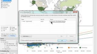
Welcome to the video on Dashboard development. In just a few moments, you'll learn how to create an interactive dashboard. Keep in mind that I've created all of these sheets ahead of time so we can jump straight into the Dashboard development. Feel free to download the companion workbook to see how these sheets were created. Now, let's get started. The main sheets I'll be showing you in my dashboard are my profitability map where each country is colored by profit, A scatter plot where each customer is compared on a sales versus profit axis, a bubble chart showing the orders of each customer and a products list showing a list of my products and their sales, where each bar is segmented by customer orders. When I'm ready to create a new dashboard, I can click on the new dashboard button next to the new sheet button. This will create a new dashboard. You may have noticed that this screen is a little different from the new sheet screen. First of all, we can see that all of the sheets that we've created can be located here on the left hand side. And we also have some different objects and options here. I'll also note the sizing option here and I'll set mine to laptop so you can see my entire dashboard. To get started building my dashboard, I simply select a sheet and drag it onto my dashboard canvas. Notice that when I drag out sheets, a gray box appears to indicate where that sheet will be placed. One of the new features in this version of Tableau is the ability to place floating sheets. By selecting the floating sheet option, I can now drag sheets out on top of other sheets and objects. I'll drag my bubble chart out onto my scatter plot and resize it a little bit so it fits in this blank white space and I'll remove the title as well. There we go. Next, I'll drag out my legends onto my charts so I can save a little bit of screen real estate. If I hold the shift key down, I can automatically switch between tiled and floating. So by holding down the shift key and dragging these legends onto my other sheets, I can set them to floating and I'll just resize these a little bit to really get those into the places that I'd like them to be. I also want to hide the titles for these sheets, so I'll uncheck the show title box to hide those titles. Now that I've placed some sheets on my dashboard, I'm ready to build out some interactivity to do this. I'm going to go back to my map sheet and I want to see a quick filter for My years. So I'll take order date and drop that onto my filter shelf. I'll select years and I'll just select all for now. Then I'll go back to my dashboard and enable that filter control from my drop down menu. I want to see this quick filter as a slide bar type, so I'm going to set it to slider. Now I can see that it does indeed affect my map. However, I want it to affect my scatter plot and my bubble chart as well. So if I go back to the drop down, I can select which worksheets I'd like this filter to apply to. In this case, I'll just select all of the worksheets on my dashboard. Now when I filter through, all of my sheets will update. Rather than having my quick filter on the right hand side here, I'd like it to be right on top of my map. So I'll just drag that out. I like to place both my profit grading here and my quick filter here into the same window. To do this I can use the layout container. I'll take the vertical layout container and drag that onto my sheet. Then I'll add both of these controls into that layout container. Now I can move both of those layout containers at the same time and resize them. So this is great for organization and space efficiency on your dashboard. I like to add some pop to my quick filter here. Rather than having the ordinary number readout, I want to create a custom label. To do this, I'm going to go into my year watermark page and demonstrate how to create that. I'd like to see the year label. So I'm going to take order date and drop that onto rows. You can see that headers have appeared here on the left. I'm going to hold down the control key and drop this onto text as well so I get that appropriate text here. Next I'll hide the headers and edit the font to something that adds a little bit more pop. I'll set this to castellar. I think it looks great on maps. I'll set this to size 28 and then I'll make this a bit wider. Next I'll go back to my dashboard and add that to my sheet. Next I want that year watermark to basically replace the readout here on my quick filter. The first thing I'm going to do is hide that old readout by going to customize and unselecting show readout. And I'll also unselect the show all value and hide the title. Next I'll Add that year watermark in there and hide the title for that as well. The next thing I'd like to do is make it so my filter also affects this year readout. So I'm going to go back into my quick filter and select the worksheets that it applies to and check year watermark. Now we can see it's correctly appearing here 2012 and it will change accordingly. But I don't want this scroll bar here. So I'm going to adjust the size to entire view and I'll center that by going back into format and changing the alignment. There we go. I also don't want borders around this number, so I'm going to go to the borders tab and select no row divider and no column divider. So that's looking pretty good. I want it to be a little bit more transparent for my map though. So I'm going to go back to the sheet and adjust the color to increase the transparency. And I'll make the number a little bit larger so it's easier to see. So I'm pretty happy with that. The next thing I'd like is that when I select something on my map I want my scatter plot to update as well. So I'm going to go to the drop down for the map and select Use as filter. Now when I select a particular country, my scatter plot will update with the relevant data and my bubble chart in this case is updating as well. In the case that I only want my scatter plot to update and not my bubble chart to update, I can go to the dashboard menu and select actions. From this menu you can see that filter one has been generated. This is because I set my profitability map to use as filter. I'm going to rename this filter to something that makes more sense to me. You can also see that from my source sheets only profitability map is checked and my target sheets. All of my sheets are checked. I don't want my profitability map to affect my bubble chart, so I'm going to uncheck that. I also want to check single select only so that this filter will only run when I select a single country and then I'll select ok, now you can see when I select a country my scatter plot will update. However my bubble chart will not. Next I'll do the same thing for my scatter plot. I'd like my scatter plot selections to update my bubble chart but not my map or my year filter or anything else. So I'll set this to be used as A filter. Or I can go straight to my dashboard menu, select actions and add an action directly from here. In this case, it'll be a filter action and I'll name this filter action Scatter Plot selection. And the source sheet will be my scatter plot. And I'll be targeting just my bubble chart. When I clear my selection, I'd like my bubble chart to simply disappear. So so I'll exclude all values. I'll run this on a selection, and I'm okay with selecting multiple marks. So from here I'll select OK and then select OK again. And now when I select something on my scatter plot, only my bubble chart will update. I'll just move this more towards the middle. I'm ready to add a title to some of these sheets. I'd like to add a title to this scatter plot. So I'm going to go over to the text box tier. I'll just drag this out and call this sheet Customer Analysis. And I'll even include some instructions. I'll format this a little bit and even center it. Now I've got a title for my sheet. Let's see what happens when I click on a bubble. So I'll select a customer and select a bubble. I can see that this customer is only purchasing from telephones and communications. Maybe I'm interested in exactly what products are purchasing and what those sales look like. In this case, I'm going to use my product sheet to create new dashboard. So I'll drag out my product sheet and I'll hold shift to switch back to tiled mode. And I want this list of items to update based on my bubble selection. So I only see what items that particular customer has purchased. So going back to my dashboard, I'm going to have to create a new filter action and I'll name this action Bubble selection. My source sheet will be my bubble chart and my target sheet will be dashboard number two. Okay. Now when I select this bubble, my second dashboard will update and also notice that it jumped automatically from Dashboard 1 to Dashboard 2. Now, there are cases when I select a bubble, I might not remember what customer I selected. So I'd like to see that reflected within this sheet. To do that, I'm going to edit this title and make it dynamic based on my selection. So I'll insert the customer name label and the category. So these will change based on what I'm viewing within the sheet. So I selected this customer and this is the category in which they purchased from. So let's review to make sure that everything's Working the way we intended. I can adjust my year here which will adjust the order date for all of my data. And let's say I'm interested in my sales in China. I can see my most profitable customer here and see where they're purchasing their products. Looks like office machines. When I select office machines, I can see the customer name and what items they've purchased. Just for fun, I want to add a URL action here so that when I click this item, I can see an image of that item here from the Internet. So to do that I'm going to go to Dashboard and I'll go into actions and I'll add a URL action. I'll call this item selection. And for the URL which I've copied ahead of time, simply links to Bing images and I'm going to tag my item. So whatever item I select will be placed into this query. Next, I'll drag a webpage object onto my dashboard. And now when I select an item, it's inputted into the URL and I can see an image there. I'm going to name my dashboards now. I'll name this one Global Sales Analysis and I'll name my second one Product Analysis. So let's run through this one more time to see what dashboard we've created. I'm going to change the year and I'll select Canada and I'll notice the most profitable or highest sales customer here. Select the product category from which they're purchasing and then I'll select the item to see a picture of that item. Thanks for watching the video on Dashboard Development. Be sure to check out our other On Demand videos and happy Dashboarding.










