Embed dashboards into the tools people already use, like CRM pages, to get them actually used. A CEO with colorblindness couldn't read his smartphone dashboard until the designer switched to a colorblind-friendly palette. About 10% of men and 1% of women have some form of colorblindness, so accessibility matters.
Questions this video answers
About 10%.
About 1%.
Chapters
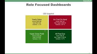
Role focused dashboards. One of the most valuable things to do for user traction. You know, if you have a lot of users and you need them to try to look at the information you're putting together, your KPIs is to actually put the reports and dashboards in their workflow. Like for salespeople, one of the best things for anyone, I mean for salespeople is if they use CRM system, you know, Salesforce and Dynamics, CRM doesn't matter. Is to insert the reports and dashboards inside of their workflow so they don't have to go somewhere else to look at the reports and dashboards. They are inside of their account page or their opportunity page. That will make much more likely that a lot more of them will look at these KPIs as they go through their daily activities. So putting the workflow will help a lot. User traction. This is an example from a CEO. One of our clients, the CEO asked for a very simple dashboard to be on her cell phone. So the BI person build this very simple dashboard. You would have four different quadrants showing the main metrics, the actual goals and variances for sales, cost on hand, Gross Profit and AR Pass 2. And the CEO could click on any of these boxes and you go into a more detailed side of the dashboard. Now the funny thing what happened was she loved the dashboard on her smartphone. One day the BI person accidentally changed the color theme of this dashboard and she calls back, what did you do? And he was like, no, oh my God, what did I do? And she said, I loved it. Now I can tell so much better what's going on. Making a long story short, she was colorblind. And for her, all of those red, yellow and green was like, you know, she couldn't tell the red, the yellow and green is all kind of the same color. Once he changed the color to a colorblind friendly theme, she could tell things so much better. So this is was how she was looking at the dashboard before he used the accidentally actually the colorblind palette. And then once he changed that, she was actually able to see this in the same way as everyone else that don't have colorblindness issues. By the way, if you have a lot of users that you're, you know, pushing reports, dashboards. To keep in mind, about 10% of males have some sort of colorblindness and females 1%. So you might have to factor in colorblind palette in your design. If you have a lot of users to provide reports and dashboards.