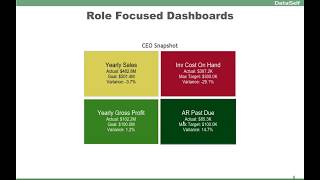
DataSelf explains two rules for better dashboards: use colorblind-friendly palettes because 10% of men can't see red-green, and design role-focused dashboards so a CEO sees four KPIs, not a data scientist's full report. Embed dashboards into the tools people already use, like Salesforce.
Chapters
Now, this dashboard has an interesting story. The CEO asked for a dashboard to be available on her cell phone so she could quickly check four main metrics of her business. You know, the actuals, the goal, the variances. And she loved it. And I'll talk more about the dashboard functionality later. However, the interesting thing here about colors is one day the person who built the dashboard accidentally changed the color theme of the dashboard. And the CEO called back and say, what happened to my dashboard? And he was like, you know, oh my gosh, what happened to the dashboard? And she said, I loved it. And let me show what happened. If you can't tell the difference between what I'm doing right now is because, oopsie, you might be colorblind. The CEO, that CEO is colorblind. And for her telling the difference between the red, yellow and green were not so easy. So when he accidentally changed the color theme to a colorblind, friendly set of colors, she was able to see the dashboard in a much more informative way. Where bad is red or a color that is showing something is not good? Yellow is kind of, you know, pay attention and green is doing well. In tableau, for instance, there are color palettes specifically for colorblind people. Now, keep in mind, if you have a large audience to your reports and dashboards, keep in mind that 10% of the male population has some kind of colorblindness, while females is only 1%. Still, if you're building reports and dashboards for your audience and you have a large audience, most likely you should consider using colorblind color palettes. Or even if you know in your audience you have some people with colorblindness, maybe you should even ask people, you know, that could be important to help them get the message across more quickly. Now, this is just a little interesting information. This is actually a traffic light. And imagine if you are colorblind that you can't tell what color this is. What should you do? Should you go or should you stop? You know, looks like, you know, some places government is not really paying much attention to this challenge for a lot of the people out there. Anyhow, going back specifically for this dashboard, let's talk about now, role focus dashboards. For some people or some function in the organization, it's very important to put together dashboards that are specific to that role for the CEO that I was talking about. So she asked for the simple dashboard to give her a glimpse of the four main KPIs she want to pay attention to. And this dashboard on her mobile device is interactive. If she would click, let's say on the red area. It goes into a completely different report showing specifically what components of, let's say in this case, cost on hand is causing that particular time of the business to be in the red side. So a very focused dashboard that by her clicking on different quadrants, she would dive into more details and she could keep on diving further and further until she would get all the answers she wanted for those perspectives. Another interesting thing about role focused dashboards is that many users, they're not very data driven per se by nature, they're just not. They are people people, they're very focused on whatever they do, but they may not be very data driven, especially when it comes to reports and dashboards. For those people, and actually for most people overall, one of the ways to help them to be exposed to your reports and dashboards, and more likely pay attention to what you're trying to say, is to insert the reports and dashboards in their workflow. I'm showing here an example for salespeople and many salespeople, they work, let's say, using a CRM system. I'm showing Salesforce, it could be any CRM system. And then the idea is to insert critical reports and dashboards inside of their CRM system, so as they go through their CRM pages, the accounts, opportunities, contacts and whatnot, in each page, you can insert a contextual report dashboard that will tell them important information. They'll help them to do their job more effectively. And this works, of course, for salespeople, for finance people, for anyone. Being able to introduce your reports and dashboards into the workflow of people can make a huge difference in helping your reports and dashboards add value to the workflow of these people.