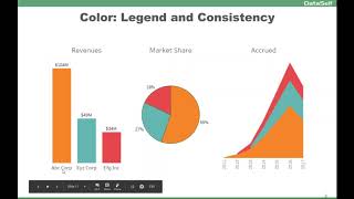
Edward Tufte's data-ink ratio shows why 3D charts and rainbow colors distract from your message. Use single colors or labels for clarity, consistent hues across charts as implicit legends, and red to flag problems that need action.
Chapters
Let's talk about color. Color is a big topic and the first concept that I like to talk is about the data ink ratio. Eduard. Sorry, excuse popping up. Edward Tuft said that data ink ratio argues against using excessive decoration in visual displays of quantity information. The point is don't put more data than you should to convey the message. This particular report here is showing sales by salesperson. It's a beautiful chart. I love it. It's 3D, different colors and there is the legend. It looks great, but it's hard to get the message. It's hard to understand exactly what's going on with the insight with the data. For every salesperson you have to look at the the color here and try to match with them. And it's not straightforward. How much each one of the salesperson is selling also is hard because it's in 3D. It's hard to tell. You know, there's a lot of ink here, not telling a lot of information. This is a much cleaner, more straightforward way to tell the same message. Here. Every bar, I have the salesperson name, I have the bar length proportional to the amount and I have the amount at the end of it. Very clean, very simple. This chart uses pretty much the only ink that is used is to convey the message of how much sales by salesperson I have. So avoid too much colors, too much ink. Focus on ink to give the message. That's the goal of visualization. Another example kind of you know the same topic about colors. Colors can be very distracting. You know, if you have a pie chart like this and you want to see your top market share, you can tell that pretty much these three take about three quarters of the total. So it's telling the story. But because you have a lot of colors, especially yellow and red, they're very, they get the eyes, attention to the eyes. If you look, you know, quite often your eyes will be driven to these two slices which don't matter for this analysis. So actually these colors in this pie chart, they are bringing distraction. This is the same chart using just a single color. And right now the colors are no longer distracting. And very quickly your eyes are only focusing on the top market share. So keep in mind that you know, too much color can be distracting and sometimes a single color is more elegant and will focus on giving the message that you're trying to convey. Interesting, huh? Color as a legend and to be consistent across different charts. This is an example where one of the chart tells the color legend. So this is a multi company framework and orange is for ABC Corp. This kind of, you know, bluish is XYZ and this is efg. And once you see this, you can tell for every other chart what the color legend is. So I do not need to put a color legend. The actual chart per se become a legend. And as you use the same color across different part of the chart, you are saving real estate, you're setting clutter, you're making clean and easy for users to get the idea, make a decision and move on. Another thing about legend and consistency with colors, this is actually a visualization that one of our clients put together for salespeople. They have in this big screen on the sales team room. So they have this is a report or a chart showing by salesperson alphabetically how much they are doing. And at the bottom the same information but on a descending order by performance looks clean, looks focused on the message. However, we can have more colors here to help people get to the point more quickly. For instance, if I'm Henry and I want to know how am I doing the whole team, I can quickly find my name here because it's alphabetical, but on the bottom here I have to go and kind of, you know, find where I am. It's not so straightforward. This is an example where putting more colors is so much more helpful. Now if I'm Henry and I memorize my color is green, next time that I look at this chart, it doesn't take much long for me to see where I'm doing from a performance standpoint. So you have to put ink enough to give the message. Not more than, not less is the right amount of ink to give you the right information. Use the pre attentive side of your brain. So color sometimes is very helpful. Like in this example. This is another example from one of our clients where they took one of our out of the box reports showing top customer by sales change since last year. To date they have the information on a grid and also on a chart. Initially very clean, very simple, not cluttered report, but is a little tricky, you know, for people who like to see charts to relate the chart to the same customer. So the evolution of this chart was actually putting more ink into it. So sometimes you have to use bands and lines to align the same entity across different part of the visualization. So sometimes again, adding more ink is the right thing to get to the point. In this case, I'm talking about bands and lines to align things vertically or horizontally. Now color can also be very helpful when you're trying to make actionable information. Here I have two examples where I have a simple visualization using a lot of colors for different type of products. So kind of a poor selection because it's distracting. This is a better one. Now is a single color. I'm just focusing on the size of each bar. But if you're trying to make it actionable, you know, if you have a problem with some of them and then you make, you know, use color hues to tell, hey, if it's red, it's bad, it's low. Profitable. Now for actionable information. This is so much more insightful to get people to act on the right trends.