Data Visualization 101: Complete Session - Tableau / DataSelf
Johnny Giorardi walks through how to build dashboards people actually use. He covers what the eye catches first, when to use color and when not to, why pie charts lie, and how to strip out visual clutter so the data shows through.
Chapters
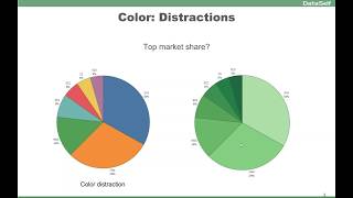
My name is Johnny Giorardi. I'm Data Self founder and CEO. Myself and my team have been doing dashboards and visualization techniques for over 17 years. So my goal today is to share a little bit of what we learned from our own experience, as well as from reading books, attending webinars and other conferences to learn the greatest and latest about data visualization techniques. So we'll talk about grids, charts and dashboards. Our agenda is pretty packed, so let's get started and I'm going to talk the first few slides about principles, a little bit of theory behind it, and then we'll show several examples of, you know, guidelines on how you should do it and what you should not do when you're building your reports and dashboards. So let's talk about the principles first. The first thing is about visual perception. You want people to look at your reports and dashboards and have get insight from them quickly. The first concept is if you look at this table and I ask you how many nines are on this table? If you're like most of us, you're going to be using your logical side of your brain, your attentive processing side. You have to go row by row and count, and it's going to take a while to do that. The alternative, like in this case, I just highlighted the nines and now in about a couple of seconds you can tell there's about 10 nines on this table. So what we're doing here? Well, we're using the pre attentive processing side of the brain. The brain has been designed through evolution to respond very quickly by what we call pre attentive visual attributes. If you use different forms, shapes, colors, position, the brain will very quickly get to the point of what you're trying to convey. So when you're building reports and dashboards, depending on what you're trying to do, you should maximize these pre attentive visual attributes because they'll help your people, your users, to get to the point of your reporting dashboard very, very quickly. So pre attentive is one of the most important concepts you should know when you're building your visualizations. Colors is a big part of the whole experience, and using colors wisely can make a hu on how you convey the point. This slide talks about the main ways to use colors. Sequential, very popular. To tell from low to the high how things are diverging. If you're looking, let's say, profitability, positive and negative. So looking at numbers and charts to see how those things are doing. If you try to change Categories showing categories through colors. So using different colors as a rule. Overall people tell don't use more than seven colors because it starts to get hard to teleport one from another. So some ideas when you're selecting colors, if you're trying to highlight something, you know, very good approach to use like a single color to highlight. Typically you don't want to make it big, you want to make it subtle to highlight. Unless it's an alert, something really critical. And then you should use a very bright color light such as red to show the attention. So before you start building or as you start building reports and dashboards, these are very important principles. Principles or guidelines. They are not rules, but they are guidelines. If you keep them in mind, you're going to get to the final destination, your most effective report dashboard much more quickly. So the first thing is what is the goal of this particular report dashboard or visualization? What are you trying to convey with it? Who's the audience? Is this someone that we're really going to be looking closely or is a lot of people and you don't know many people are not going to pay much attention unless it's something really easy to use. So trying to understand who the audience is, how many people their profile and how long it's going to take them to really embrace what you're trying to convey is very critical. How frequently you user going to be exposed to this? If it's for business and this person is going to be seeing all the time, you can simplify, you can remove legends and additional information because people get used to it, they'll know what they're looking at. If they're going to be looking only once in a while, or only once, then you have to put more context, more text to explain what the reporting dashboard is about. How long people spend looking at this particular visualization also is a big decision of making simpler or more contextual based information screen real estate. Quite often you don't have a lot of space to give the message. So you have to really try to make things not cluttered. So being able to use the real state is very important. Really well is very important. And finally, most important experiment. It's a journey, you know, as you start doing your visualization and as you get the requirements of what the visualization should be, do the best that you can show to users, get their feedback, refine and go this over and over until you get it really well. Now the most important thing is this is usually a report or dashboard for someone else. You need to get their feedback it's not about you, it's about them. And quite often, you know, they're not as business analyst savvy as you. So you have to kind of make things simple and very informative so you'll get user traction. You get users to really benefit from the information you're trying to convey. So those are the principles. Let's move now to the next part which is talking about some actual examples. The first thing is when you're building visualizations and dashboards, try to use what's considered easily understood visualization charts or types. Many users out there, they're not very data savvy, business analyst savvy. So I always tell people how much time is going to take you to teach users how to read a scattered plot. Many users just don't get it. So try to avoid visualizations that are hard to understand. These in our experience and also looking from some other, many other people that are experts in the, in the, in the field, these are some of the most popular data visualization that are really easy to understand. Most people, when they look at these, they'll have a good understanding of what it means. You know, bars, lines, areas, put some labels properly, state indicators, up, down tables. You know, some people are really against putting tables on reports and dashboards. Sometimes I would tell absolutely you have to because sometimes is the right thing. Include maps. Very popular for graphical representation. Pie charts. Many people say don't use it at all. People use pie charts. So you know, if you're going to be using pie charts, I'll talk a little bit about them throughout the presentation. But overall, if you have up to a few data points, they can be very helpful. If you have a lot of data points, often they become useless bullet charts. Great representations to show things like budgets and actuals. Radio gadgets are not very good because they take too much space. So these are some of the easily understood visualization types. Let's talk about color. Color is a big topic in the first concept that the livestock is about the data ink ratio. Edward, Sorry, excuse popping up. Edward Tuft said that data ink ratio argues against using excessive decoration in visual displays of quantity information. The point is don't put more data than you should to convey the message. This particular report here is showing sales by salesperson. It's a beautiful chart. I love it. It's 3D, different colors and there is the legend. It looks great, but it's hard to get the messages. Hard to understand exactly what's going on with the insight with the data. For every salesperson you have to look at the color here and try to match with them. And it's not straightforward how much each one of the salesperson is selling. Also it's hard because it's in 3D. It's hard to tell, you know, there's a lot of ink here, not telling a lot of information. This is a much cleaner, more straightforward way to tell the same message Here. Every bar, I have the salesperson name, I have the bar length proportional to the amount and I have the amount at the end of it. Very clean, very simple. This chart uses pretty much the only ink that is used is to convey the message of how much sales by salesperson I have. So avoid too much colors, too much ink. Focus on ink to give the message. That's the goal of visualization. Another example kind of, you know the same topic about colors. Colors can be very distracting. You know, if you have a pie chart like this and you want to see your top market share, you can tell that pretty much these three take about three quarters of the total. So it's telling the story. But because you have a lot of colors, especially yellow and red, they're very to get the eyes, attention to the eyes. If you look, you know, quite often your eyes will be driven to these two slices which don't matter for this analysis. So actually these colors in this pie chart, they are bringing distraction. This is the same chart using just a single color. And right now the colors are no longer distracting. And very quickly your eyes are only focusing on the top market share. So keep in mind that you know, too much color can be distracting and sometimes a single color is more elegant and will focus on giving the message that you're trying to convey. Interesting, huh? Color as a legend and to be consistent across different charts. This is an example where one of the chart tells the color legend. So this is a multi company framework and orange is for ABC Corp. This kind of bluish is XYZ and this is efg. And once you see this, you can tell for every other chart what the color legend is. So I do not need to put a color legend. The actual chart per se become a legend. And as you use the same color across different part of the chart, you're saving real estate, you're setting clutter, you're making clean and easy for users to get the idea, make a decision and move on. Another thing about legend and consistency with colors, this is actually a visualization that one of our clients put together for salespeople. They have in this big screen on the sales team room so they have this is a report or a chart showing by salesperson alphabetically how much they are doing. And at the bottom, the same information but on a descending order by performance looks, clean looks focus on the message. However, we can have more colors here to help people get to the point more quickly. For instance, if I'm Henry and I want to know how am I doing the whole team, I can quickly find my name here because it's alphabetical, but on the bottom here I have to go and kind of, you know, find where I am. It's not so straightforward. This is an example where putting more colors is so much more helpful. Now if I'm Henry and I memorize my color is green. Next time that I look at this chart, it doesn't take much long for me to see what I'm doing from a performance standpoint. So you have to put ink enough to give the message. Not more than, not less is the right amount of ink to give you the right information. Use the pre attentive side of your brain. So color sometimes is very helpful. Like in this example. This is another example from one of our clients where they took one of our out of the box reports showing top customer by sales change since last year. To date they have the information on a grid and also on a chart. Initially very clean, very simple, not cluttered report, but is a little tricky for people who like to see charts to relate the chart to the same customer. So the evolution of this chart was actually putting more ink into it. So sometimes you have to use bands and lines to align the same entity across different part of the visualization. So sometimes again, adding more ink is the right thing to get to the point. And in this case I'm talking about bands and lines to align things vertically or horizontally. Now color can also be very helpful when you're trying to make actionable information. Here I have two examples where I have a simple visualization using a lot of colors for different type of product. So kind of a poor selection because it's distracting. This is a better one now is a single color. I'm just focusing on the size of each bar. But if you're trying to make it actionable, you know, if you have a problem with some of them and then you make, you know, use color hues to tell, hey, if it's red, it's bad, it's a little profitable. Now for actionable information, this is so much more insightful to get people to act on the right trends. Let's talk about formatting numbers and dates and when it Comes to numbers. Usually we talk about currency, regular numbers, like for quantities and percentages. This is a very simple example, kind of ugly. This is showing quantity sold sales amount and percentage gross profit by different companies. Very hard to read. Numbers are not formatted and not telling the message. This is after a few changes where we put the multiplier. So for thousands and for millions, so we don't see all those little details that would not matter. Percentages with the right number of decimals in colors. Also to tell which one is below a certain threshold. In this case, this particular visualization at the beginning, let's say even the headers were in big fonts. But because this particular visualization is seen quite often by users, actually the designer make the header smaller fonts. Because once you know, you know this is quantity, you know this is dollar amount and you know this is percentage. So you could even probably remove eventually the header because the actual numbers alone are telling what they are. So these are things you can use as you experiment and as you get your users used to understanding what they're looking at and eventually know. Save real estate to focus information on the message that you're trying to convey. Date formatting, when putting no things on a date basis in month is one of the popular parts that, you know, people have challenges sometimes saving real estate or conveying the message. Because let's say months, they can be long, they can take a lot of real estate. So most tools provide different ways to summarize, let's say to use abbreviated approach. So only three letters, it takes a lot less space. Maybe you just need the first letter that sometimes is sufficient and sometimes just the number of the month. So some different ideas. Most of the visualization tools provide different means to change the formatting extensively. So if you explore, you'll find ways to do date formatting in the best way that you can for your users. Now this particular report here, it's also for one of our clients, we're trying to see trend, their trend over time and year over year growth. And the initial visualization was like this. So per year, they're looking by month and trying to understand trend over time and year over year growth. Now by exploring different colors, different chart types, different shapes. After several interactions, they come up with this approach. At first, when you look at this approach may be a little bit overwhelming. There is a lot of information. But again, keep in mind as you experiment, as you expose to your users, sometimes you get eventually to a format of your visualization that really does the job, really cuts it in a Simple and informative insight. Just to go specifically for this dashboard, the top section is to show trend over time. So they're using color schemas to represent the last three years. So 20, 14, 15 and 16, and you can tell the trend over time is growing. So the top section gives this perspective really well in a clean, concise way. The middle section and the bottom section, they're both linked together by months, using the vertical bands to tell, you know, they are, you know, looking at this months in the colors of each representation is again associated to this standard. So in this one, I can easily and quickly tell that in 2015, the orange line, I grew consistently across the board in all months, while in 2014, in a couple of months, I was actually a little bit below last year. So this section here, using the pre attentive brain, you get the story very, very quickly. Now, for those people who want to actually see the numbers by detail, the bottom section has it all. So you can see for every single month how the numbers were right there on the spot. If you print this particular dashboard on a piece of paper, you get all information that you need. If this was not supposed to be printed, maybe the bottom section could be hidden because it's a little bit too much information, a little bit overwhelming, and only people interested in seeing those details. They could click a button in this dashboard to actually expand the bottom part to show that more cluttered approach or maybe go to a second dashboard. So for this client, particularly, because many users would print or would not know how to, to drill down to more details, they decided to keep this more cluttered section because it was useful. But again, for some people, I would say just the bottom two sections would be really, really enough to give the pre attentive side of the brain the insights into what they wanted. Let's talk about layout. It's all about location, location, location. If you have, let's say a dashboard, the top left quadrant as well as the center quadrant are the most important ones. Most people will quickly put their eyes on those two sections. So you should focus the most important information of your dashboard in those two parts. Now, keep in mind, let's say if you want to put your logo right, if it's for the outside world, for marketing, yes, put your logo on the top left or in the center because you're trying to retain your logo on people's brains. If it's for an internal website for your people, your salespeople, they work for you, they know your logo, try to even avoid putting the logo or make it Smaller don't take prime real estate with information that is not to give, you know, insights to what they need. And definitely don't put the logos on those two areas if it's for internal people. So location very important in these two areas are very critical. This one is about big numbers on dashboards. In eye tracking. I have here side by side, the same dashboard where this one on the left, we have big numbers at the very top. In this one, the big numbers are at the bottom. Everything else is exactly the same. And let me show you what happens after 10 seconds of people looking at these two options in where their eyes are driven to. So the bottom area here shows after 10 seconds using eye tracking technology, that in this one here, users will see the big numbers and some of this information on the right, pretty much the big numbers are not seen at all. So if you go back to this, you know, anything that is in the bottom is not so much attention. Top, left and middle are really where people put their eyes on. So if you're trying to also put information on big numbers, be sure they're on the top left because otherwise people may not look at it. By the way, throughout this webinar, I have these at the bottom, these information and these links. If you want to learn more about details of what I'm covering in these slides, you can go to these links to get more insights into it. And by the way, later we'll provide a copy of this PowerPoint as well as the video so you can go back and take a deeper dive into those topics if you choose to. Some other tips about layout is avoid using scroll bars because a lot of users will not scroll. So unless you know, your users are very attentive and they're going to start scrolling to dig information. But if you have many users, believe me, people will not use much scroll bars. And also it's very important to add date timestamps to your reports and dashboards because sometimes people will print them or will take screenshots and, and if you don't have that kind of information, people eventually might not know when is this information current, what is the time frame? And it can be deceiving. Let me actually step back here a little bit and show two examples of reports and I'm sorry, of dashboards that will talk a little bit about all of these things I have covered so far. So the first one is this dashboard. This is not a business oriented dashboard, but this is an example of a dashboard designed for people that are going to be seeing this only once in A while, maybe only once. And they're going to probably be looking at this quite, you know, if they're interested in hummingbirds, they're probably going to spend, you know, several minutes looking at this dashboard. So there's a lot of text explaining the story of we're trying to convey. There is all of these visual, cool, distracting a way but very cool things that will talk about the whole message. So this is an example of a dashboard designed with tableau in this case that has a lot of information, very detailed, very beautiful and designed for again, people who will spend quite some time only seeing this rarely, but they got a very good insight. I remember I saw this dashboard a few years back in a tableau conference and I was amazed by such a great job done for the purpose of the dashboard. It's visually beautiful, it's appealing and every time when I show someone an example of a beautiful dashboard that you remember, this is one of them. It's not business focused, but again, sometimes you need to provide something like this. And this is a good insight by the way. And this is a more business focused dashboard. And I should have refresh it before. Anyhow, this dashboard is a dashboard created by one of our clients, the cfo. One of our clients. He actually built this dashboard from scratch for himself. After six months using data self, this dashboard is busy. Yes. The first time you look at it, it's like now, whoa, my God, it's too much information. However, keep in mind the CFO of this business every day when he opens his data self system, this dashboard pops it automatically. And he sees this every day. He can quickly spot the important things. Like on the top left quadrant, he has this 60 day cash flow projection where he sees inbound money, outbound money for payroll, for payables, how much money has on cash today and what the projected cash flow is over the next 60 days. So very important on the left, that kind of perspective. This whole left section is a lead metric kind of dashboard looking into the future, things that are supposed to come in the next 60 days, cash flow, orders to ship, new opportunities to be sold from the CRM system, Aging, open aging, all of these things very interactive, using colors. Like in this example, this whole column here, the legend is, you know, right here you can tell blue last year, this year black. The whole column has the same color legend. So clean, uncluttered perspective, all interactive. As he, you know, select things, the whole, you know, report will change in red. Colors are usually showing bad things that he needs to pay attention to. So if he clicks let's say on this inventory asset, by clicking on the red bar, he goes automatically into a more detailed dashboard where he can continue to assess and see what's going on. So two very different kind of examples. This is very busy, very distracting away, but geared towards the generic public that is going to see this only once in a while. Maybe for board meetings kind of things. You'd be using something like this. Extensive scrolling down, a lot of pictures, a lot of explanations. While this is for a targeted dashboard, focus on a specific role. Clean, still busy, but clean. If the person is seeing this frequently, they'll get the message. Alrighty, moving on. Now I'm going to talk about some different tips and tricks about using different visualization types and how you can by experimenting, do a better job. This example is showing sales and sales goals by month. And if you look at this, it's a little hard to tell if I'm meeting my goals or not. You got to really look with your attentive brain to make sense out of it by changing from a line approach. Instead now you can use your pre attentive brain site and very quickly you can tell in April you barely made it all of the months you're doing fairly well. Just a simple change in the data chart type and bang, you got the answer much more quickly or the insight much more quickly. Another example from one of our clients here, they had website visitors coming from Google Analytics sales looking at different time frame by month and they do a lot of website campaigns and they want to see how long does it take from these website campaigns to affect their actual sales. So this is what, you know, one of the interactions they did trying to see Website Visitors Spikes vs. Spikes in Sales over time as they experimented. Eventually they got to this perspective which is so much easier to read. You know we're using dual axis and the color of the legend is the actual legend color. I'm sorry, the color of the axis tells what the actual legend is. So the orange bars are for the website visitors and sales is the blue line. So it's using the same real state as the original report. But now it's so much easier for them to analyze how the spike in website campaigns, how long it's taking to actually get more business. Very clean and very informative. I kind of talked about this before, but this report is showing top customer by sales growth and decline since last year to date. These are the customers who grew the most in sales. These are the ones who declined the most in sales on a year to day basis. Very hard to Read this report, you have to read the customer, go to the top. Not great. Eventually this became something like this. So horizontally, so much easier to tell. And the red colors and blue also make more quickly for you to understand what's going on. Putting numbers for each of the charts so you can tell how much the change was. And they even eventually moved to this approach here where people who are more numbers driven, they get the insight from here, people who are more chart driven, they look at this. So together these two pieces for this company proved to be the best approach to convey the message for their users. So just some ideas on exploring different approaches to make it more useful. Role focused Dashboards One of the most valuable things to do for user traction. You know, if you have a lot of users and you need them to try to look at the information you're putting together, your KPIs is to actually put the reports and dashboards in their workflow. Like for salespeople, one of the best things for anyone, I mean for salespeople is if they use CRM system, you know, Salesforce and Dynamics or it doesn't matter, is to insert the reports and dashboards inside of their workflow so they don't have to go somewhere else to look at the reports and dashboards. They are inside of their account page or their opportunity page. That will make much more likely that a lot more of them will will look at these KPIs as they go through their daily activities. So putting the workflow will help a lot. User traction. This is an example from a CEO, one of our clients. The CEO asked for a very simple dashboard to be on her cell phone. So the BI person built this very simple dashboard. You would have four different quadrants showing the main metrics, the actual goals and variances for sales, cost on hand, Gross Profit and AR Pass 2. And the CEO could click on any of these boxes and you go into a more detailed side of the dashboard. Now the funny thing what happened was she loved the the dashboard on her smartphone. One day the BI person accidentally changed the color theme of this dashboard. And she calls back, what did you do? And he was like, no, oh my God, what did I do? And she said, I loved it. Now I can tell so much better what's going on. Making long story short, she was colorblind. And for her, all of those red, yellow and green was like, you know, she couldn't tell the red, the yellow and green is all kind of the same color. Once he changed the color to a colorblind friendly theme, she could Tell things so much better. So this is was how she was looking at the dashboard before he used the accidentally actually the colorblind palette. And then once he changed that, she was actually able to see this in the same way as everyone else that don't have colorblindness issues. By the way, if you have a lot of users that you're, you know, pushing reports, dashboards. To keep in mind, about 10% of males have some sort of, you know, colorblindness and females 1%. So you might have to factor in colorblind palette in your design. If you have a lot of users to provide reports and dashboards. This is real life. This is just a little out of the topic. Red and green for colorblind people is like the same color. Now imagine if you're colorblind, what should you do here? You're driving, you get into this traffic light and should I go or should I stay? It's amazing. But you know, our government is not taking care of, you know, tenths of the population because this can be very dangerous. All right. Rendering dashboards Pretty much today, people need information in different shapes and forms. So be sure that whatever you choose to render your reports and dashboards, they can be accessed by desktop, web, mobile device and email. So if people are traveling, if the people are at the office, they should be able to access the information. You should also have ways to push reports to people on a schedule basis. Just push it get to their inbox. You should allow them to access the reports in different, you know, so they self service, they go and they pull reports from where they are. Alerts very important. You know, sometimes people only care about information when something changes, they don't want to see unless something changes. So be sure you have an alerts module to send things only when they changed. And most importantly, be sure your BI platform allows you to insert your reports and dashboards into other applications. Because putting reports and dashboard in the flow is the most useful way to get user traction if you're handling with security issues. If your data must be secured before you push to users, test it extensively. I've seen people being fired because they didn't test security really well. They push reports to other people and the wrong data got in the hands of the wrong people and bad story. So if you have sensitive data, be sure to test extensively before you push information to users. And also be sure your BI platform provides ways that you can easily adapt your reports and dashboard to different screen sizes, to computer screen sizes, to notebooks and mobile devices, and by the way because we use tableau as the user interface. All of these things are really well taken care by the tableau framework interactivity. Use it wisely. It's very valuable if the dashboard reports are for analysis and have actionable dashboards. If not is potentially confusing for others. So you know, be careful. The way that you use pop up windows, they help you keep things clean and cluttered. So if the user wants to see something, they can put the mouse over and see what's going on. Just keep in mind that our short term memory is really short. You can usually remember for a few seconds and then you forget and only use filters that are really required. So just to show an example here of pop up, you know, when you put, you know, this is very clean dashboard because a CFO can put the mouse over things and get insights as needed. So pop ups very useful for that kind of perspective. Now moving along visualizations to avoid avoid visual distortions. In this example, the user put the actual amounts on a negative bar. So it looks like no, you are declining your data expenses, but they're actually growing. So visually it's declining. But the actual story is the opposite. So do not do visual distortions. This is something happens, it's bad. Another visual distortion. If I look at this, I have the perspective of the territory 2 is usually half of my territory 1. However, it's because my legend, my axis is not using the full axis from 0 to 11, it's from 4 to 11. So when I put 0 to 11 now I can tell my territory to is actually not so far behind my territory one. This is deceiving. There's a distortion here. Don't make people do. Visual math can be very hard. So if I ask what is the market share change over time? So I have different months, different territories. And if I try to understand, it's very hard using this perspective, the pie chart. If I use this perspective, so much easier. So east to west is a decline in May, west is less in January, east is so much bigger than West. So this is a little better to get the representation. If you use this approach, if you're trying to get the market share change over time, this is so clean, so easy to understand is the same information three different ways. And for this particular question, this is so much cleaner. However, this one tells me very quickly that, you know, January in May I have about half of my sales, while in this one, March and April have about half of my sales. So different representations, different stories. But avoid visual math. Sometimes you have to put them both together to give different answers to different kind of questions. Don't use pie charts for comparing similar data points. In this example, this is three different time frames. What's going on? I can tell if I put in bars I can tell the beginning it was growing and at the end of my period this is declining. So pie charts. Horrible for comparing similar data points, especially change over time in 3D. Usually 3D is deceiving. If I look at this, it seems that S and D is about the same as this one. However, if I put in a bar, actually S and D is about 50% smaller. I'm sorry, this one is 50% bigger. But looking at this you can tell. So usually 3D charts are deceiving, so try to avoid them. These are some suggested references if you want to learn more about it. Some YouTube videos as well as some books. Unfortunately, we're running out of time, so we're not going to have time for Q and A. But this video is being recorded and we will make available the recording as well as the PowerPoint. If you have questions or comments about this presentation data visualization techniques, please feel free to contact me. This is my cell phone, my email, and my Twitter account. Account. I hope you have a great day. Thanks for joining us and see you next time. Thank you.










