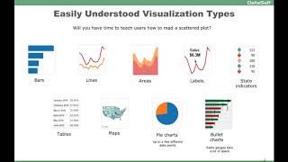
The speaker describes practical recommendations for dashboard and visualization design, advising use of easily-understood chart types for non-technical users. Recommended visuals include bar, line, area charts, tables, maps, pie charts (for few data points), bullet charts for budgets/actuals, and advice to avoid overly complex or space-inefficient gadgets.
Chapters
Let's move now to the next part, which is talking about some actual examples. The first thing is when you're building visualizations and dashboards, try to use what's considered easily understood visualization charts or types. Many users out there, they're not very data savvy, business analyst savvy. So I always tell people how much time is going to take you to teach users how to read a scattered plot. Many users just don't get it. So try to avoid visualizations that are hard to understand. These in our experience and also looking from many other people that are experts in the field, these are some of the most popular data visualization that are really easy to understand. Most people, when they look at these, they'll have a good understanding of what it means. You know, bars, lines, areas, put some labels properly, state indicators, up, down, tables. You know, some people are really against putting tables on reports and dashboards. Sometimes I would tell absolutely, you have to because sometimes is the right thing to include maps. Very popular for graphical representation, pie charts. Many people say don't use it at all. People use pie charts. So, you know, if you're going to be using pie charts, I'll talk a little bit about them throughout the presentation. But overall, if you have up to a few data points, they can be very helpful. If you have a lot of data points, often they become useless bullet charts. Great representations to show things like budgets and actuals. Radio gadgets are not very good because they take too much space. So these are some of the easily understood visualization types.