This tutorial explains how to format numbers and dates in visualizations to improve readability and convey the intended message. It covers formatting numbers as currency, quantities, percentages (including appropriate decimal precision and use of multipliers for thousands/millions), compact date formats (three-letter abbreviations, single-letter, or numeric months), and discusses a dashboard example that uses color and layout to show trends and year-over-year comparisons while balancing summary vs detailed views for printing or interactive exploration.
Chapters
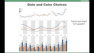
Let's talk about formatting numbers and dates. And when it comes to numbers, usually we talk about currency, regular numbers, like for quantities and percentages. This is a very simple example, kind of ugly. This is showing quantity sold sales amount and percentage gross profit by different companies. Very hard to read. Numbers are not formatted and not telling the message. This is after a few changes where we put the multiplier. So for thousands and for millions, so we don't see all those little details that would not matter. Percentages with the right number of decimals in colors, also to tell which one is below a certain threshold. In this case, this particular visualization at the beginning, let's say even the headers were in big fonts. But because this particular visualization is seen quite often by users, actually the designer make the header smaller fonts because once you know, you know this is quantity, you know this is dollar amount and, and you know this is percentage. So you could even probably remove eventually the header because the actual numbers alone are telling what they are. So these are things you can use as you experiment and as you get your users used to understanding what they're looking at and eventually know. Save real state to focus information on the message that you're trying to convey. Date formatting, when putting those things on a date basis in month is one of the popular parts that, you know, people have challenges sometimes saving real estate or conveying the message because let's say months, they can be long, they can take a lot of real estate. So most tools provide different ways to summarize, let's say to use abbreviated approach. So only three letters, it takes a lot less space. Maybe you just need the first letter that sometimes is sufficient and sometimes just the number of the month. So some different ideas. Most of the visualization tools provide different means to change the formatting extensively. So if you explore, you'll find ways to do, you know, date formatting in the best way that you can for your users. Now this particular report here, it's also from one of our clients. They were trying to see trend, their trend over time and year over year growth. And the initial visualization was like this. So per year they're looking by month and trying to understand trend over time and year over year growth. Now by exploring different colors, different chart types, different different shapes. After several interactions, they come up with this approach. At first, when you look at this approach may be a little bit overwhelming. There is a lot of information. But again, keep in mind as you experiment, as you expose to your users, sometimes you get eventually to A format of your visualization that really does a job, really cuts it in a simple and informative insight. Just to go specifically for this dashboard, the top section is to show trend over time. So they're using color schemas to represent the last three years, so 20, 14, 15 and 16, and you can tell the trend over time is growing. So the top section gives this perspective really well in a clean, concise way. The middle section and the bottom section, they're both linked together by months. Using the vertical bands to tell, you know, they are, you know, looking at this months in the colors of each representation is again associated to this standard. So in this one, I can easily and quickly tell that in 2015, the orange line, I grew consistently across the board. In all, while in 2014, in a couple of months, I was actually a little bit below last year. So this section here, using the pre attentive brain, you get the story very, very quickly. Now, for those people who want to actually see the numbers by detail, the bottom section has it all. So you can see for every single month how the numbers were right there on the spot. If you print this particular dashboard on a piece of paper, you get all information that you need. If this was not supposed to be printed, maybe the bottom section could be hidden because it's a little bit too much information, a little bit overwhelming, and only people interested in seeing those details, they could click a button in this dashboard to actually expand the bottom part to show that more cluttered approach, or maybe go to a second dashboard. So for this client, particularly, because many users would print or would not know how to drill down to more details, they decided to keep this more cluttered section because it was useful. But again, for some people, I would say just the bottom two sections would be really, really enough to give the pre attentive side of the brain the insights into what they wanted.