Data Visualization 101: Layout and Putting it all together - Tableau / DataSelf
Where you put things on a dashboard matters most: top-left and center grab attention first, so put your biggest numbers there. Avoid scrollbars because users won't use them, add date stamps in case someone prints it, and decide whether you're building for one-time viewers or daily users like a CFO.
Chapters
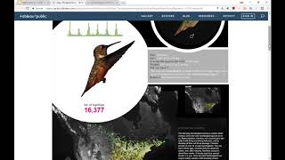
Let's talk about layout. It's all about location, location, location. If you have, let's say a dashboard, the top left quadrant as well as the center quadrant are the most important ones. Most people will quickly put their eyes on those two sections. So you should focus the most important information of your dashboard in those two parts. Now keep in mind, let's say if you want to put your, your logo right, if it's for the outside world, for marketing, yes, put your logo on the top left or in the center because you're trying to retain your, your logo on people's brains. If it's for an internal website for your people, your salespeople, they work for you, they know your logo. Try to even avoid putting the logo or make it small. Don't take prime real estate with information that is not to give insights to what they need. And definitely don't put the logos on those two areas if it's for internal people. So location very important in these two areas are very critical. This one is about big numbers on dashboards. In eye tracking, I have here side by side, the same dashboard where this one on the left, we have big numbers at the very top. In this one, the big numbers are at the bottom. Everything else is exactly the same. And let me show you what happens after 10 seconds of people looking at these two options in where their eyes are driven to. So the bottom area here shows after 10 seconds using eye tracking technology, that in this one here, users will see the big numbers and some of this information while on the right, pretty much the big numbers are not seen at all. So if you go back to this, you know, anything that is in the bottom is not so much attention. Top, left and middle are really where people put their eyes on. So if you're trying to also put information on big numbers, be sure they're on the top left because otherwise people may not look at it. By the way, throughout this webinar, I have these at the bottom, this information and these links. If you want to learn more about details of what I'm covering in these slides, you can go to these links to get more insights into it. And by the way, later we'll provide a copy of this PowerPoint as well as the video so you can go back and take a deeper dive into those topics if you choose to. Some other tips about layout is avoid using scroll bars because a lot of users will not scroll. So unless you know your users are very attentive and they're going to start scrolling to dig information. But if you have Many users, believe me, people will not use much scroll bars. And also it's very important to add date time stamps to your reports and dashboards because sometimes people will print them or will take screenshots. And if you don't have that kind of information, people eventually might not know when is this information current, what is the time frame? And it can be deceiving. Let me actually step back here a little bit and show two examples of reports and I'm sorry, of dashboards that will talk a little bit about all of these things I have covered so far. So the first one is this dashboard. This is not a business oriented dashboard, but this is an example of a dashboard designed for people that are going to be seeing this only once in a while, maybe only once. And they're going to probably be looking at this quite, you know, if they're interested in hummingbirds, they're probably going to spend, you know, several minutes looking at this dashboard. So there's a lot of text explaining the story of we're trying to convey. There is all of this visual, cool, distracting a way, but very cool things that will talk about the whole message. So this is an example of a dashboard designed with tableau, in this case that has a lot of information, very detailed, very beautiful and designed for again, people who will spend quite some time only seeing this rarely, but they got a very good insight. I remember I saw this dashboard a few years back in a tableau conference and I was amazed by such a great job done for the purpose of the dashboard is visually beautiful, it's appealing and every time when I show someone an example of a beautiful dashboard that you remember, this is one of them. It's not business focused, but again, sometimes you need to provide something like this. And this is a good insight by the way. And this is a more business focused dashboard and I should have refresh it before. Anyhow, this dashboard is a dashboard created by one of our clients, the cfo. One of our clients. He actually built this dashboard from scratch for himself after six months using data self. This dashboard is busy. Yes. The first time you look at it, it's like now, whoa, my God, it's too much information. However, keep in mind the CFO of this business, every day when he opens his, you know, data self system, this, this dashboard pops it automatically. And he sees this every day. He can quit quickly, spot the important things. Like on the top left quadrant he has this 60 day cash flow projection where he sees, you know, inbound money, outbound money for payroll, for payables, how much money he has on cash today and what the projected cash flow is over the next 60 days. So very important on the left, that kind of perspective. This whole left section is a lead metric kind of dashboard looking into the future. Things that are supposed to come in the next 60 days. Cash flow, orders to ship, new opportunities to be sold from the CRM system. Aging, open aging. All of these things very interactive, using colors. Like in this example, this whole column here, the legend is, you know, right here you can tell blue last year, this year black. The whole column has the same color legend. So clean, uncluttered perspective. All interactive. As he, you know, select things, the whole, you know, report will change in red. Colors are usually showing the bad things that he needs to pay attention to. So if he clicks, let's say, on this inventory asset, by clicking on the red bar, he goes automatically into a more detailed dashboard where he can continue to assess and see what's going on. So two very different kind of examples. This is very busy, very distracting way, but geared towards the generic public that is going to see this only once in a while. Maybe for board meetings kind of things. You'd be using something like this, extensive scrolling down, a lot of pictures, a lot of explanations. While this is for a targeted dashboard, focus on a specific role. Clean, still busy, but clean. If the person is seeing this frequently, they'll get the message.










