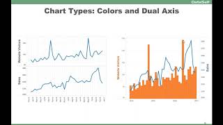
Speaker presents practical tips for improving Tableau visualizations with short before/after examples. Key techniques shown: switch chart types to leverage pre-attentive perception (e.g., line→bars), use dual-axis combos (website visitors as bars, sales as line) with axis-color mapping, reorder and orient leaderboards (horizontal bars) and add numeric labels so both chart-focused and number-focused users can extract insights quickly.
Chapters
Now I'm going to talk about some different tips and tricks about using different visualization types and how you can by experimenting, do a better job. This example is showing sales and sales goals by month. And if you look at this, it's a little hard to tell if I'm meeting my goals or not. You got to really look with your attentive brain to make sense out of it by changing from a line approach. Instead now you can use your pre attentive brain site and very quickly can tell. You know, in April you barely made it all of the months you're doing fairly well. Just a simple change in the data chart type and bang, you got the answer much more quickly or the insight much more quickly. Another example from one of our clients here, they had website visitors coming from Google Analytics in sales looking at different time frame by month. And they do a lot of website campaigns and they want to see how long does it take from these website campaigns to affect their actual sales. So this is what one of the interactions they did trying to see Website Visitors Spikes vs. Spikes in Sales over time as they experimented. Eventually they got to this perspective which is so much easier to read. You know, we're using dual axis and the color of the legend is the actual legend color. I'm sorry, the color of the axis tells what the actual legend is. So the orange bars are for the website visitors. Sales is the blue line. So it's using the same real estate as the original report. But now it's so much easier for them to analyze how the spike in website campaigns, how long it's taking to actually get more business. Very clean and very informative. I've kind of talked about this before, but this report is showing top customer by sales growth and decline since last year to date. These are the customers who grew the most in sales. These are the ones who declined the most in sales on a year to date basis. Very hard to read this report. You have to read, you know, the customer go to the top. Not great. Eventually this became something like this. So horizontally so much easier to tell in the red colors and blue also make more quickly for you to understand what's going on. Putting numbers for each of the charts so you can tell how much the change was. And they even eventually moved to this approach here where people who are more numbers driven, they get the insight from here, people who are more chart driven, they look at this. So together these two pieces for this company proved to be the best approach to convey the message for their users. So just some ideas on exploring different approaches to make it more useful.