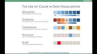
This short presentation (YouTube video) explains core visual-perception principles for effective reports and dashboards. It emphasizes leveraging pre-attentive visual attributes (shape, color, position) so users can gain insight quickly, advises strategic use of color (sequential scales, categorical palettes, single-color highlights, avoid >7 colors), and stresses understanding audience, exposure frequency, screen real-estate, and iterative user testing to refine dashboards.
Chapters
So let's talk about the principles first. The first thing is about visual perception. You want people to look at your reports and dashboards and have get insight from them quickly. The first concept is if you look at this table and I ask you how many nines are on this table. If you're like most of us, you're going to be using your logical side of your brain, your attentive processing side. You have to go row by row and count. And it's going to take a while to do that. The alternative, like in this case, I just highlighted the nines and now in about a couple of seconds you can tell there's about 10 nines on this table. So what we're doing here, well, we're using the pre attentive processing side of the brain. The brain has been designed through evolution to respond very quickly by what we call pre attentive visual attributes. If you use different forms, you know, shapes, colors, position, the brain will very quickly get to the point of what you're trying to convey. So when you're building reports and dashboards, depending on what you're trying to do, you should maximize these pre attentive visual attributes because they'll help your people, your users, to get to the point of your reporting dashboard very, very quickly. So pre attentive is one of the most important concepts you should know when you're doing your, when you're building your visualizations. Colors is a big part of the whole experience. And using colors wisely can make a huge impact on how you convey the point. This slide talks about the main ways to use colors. Sequential, very popular to tell from low to the high how things are diverging. If you're looking, let's say profitability positive and negative. So looking at numbers and charts to see how those things are doing. If you try to change categories, showing categories through colors. So using different colors as a rule, overall, people tell don't use more than seven colors because it starts to get hard to teleport one from another. So some ideas when you're selecting colors, if you're trying to highlight something, you know, very good approach to use like a single color to highlight. Typically you don't want to make it big, you want to make it subtle to highlight. Unless it's an alert, something really critical. And then you should use a very bright color light, such as red to show the attention. So before you start building or as you start building reports and dashboards, these are very important principles. Principles or guidelines. They are not rules, but they are guidelines. If you Keep them in mind, you're going to get to the final destination, your most effective report dashboard, much more quickly. So the first thing is, what is the goal of this particular report dashboard or visualization? What are you trying to convey with it? Who's the audience? Is it someone that we're really going to be looking closely or is a lot of people and you don't know? Many people are not going to pay much attention unless it's something really easy to use. So trying to understand who the audience is, how many people, their profile, and how long it's going to take them to really embrace what you're trying to convey is very critical. How frequently your user is going to be exposed to this. If it's for business and this person is going to be seeing all the time, you can simplify, you can remove legends in additional information because people get used to it, they'll know what they're looking at. If they're going to be looking only once in a while, or only once, then you have to put more context, more text to explain what the reporting dashboard is about. How long people spend looking at this particular visualization also is a big decision of making simpler or more contextual based information screen real estate. Quite often you don't have a lot of space to give the message, so you have to really try to make things not cluttered. So being able to use the real estate is very important. Really well, is very important. And finally, most important experiment, it's a journey. As you start doing your visualization and as you get the requirements of what the visualization should be, do the best that you can show to users, get their feedback, refine and go this over and over until you get it really well. Now the most important thing is this is usually a report or dashboard for someone else. You need to get their feedback. It's not about you, it's about them. And quite often they're not as business analyst savvy as you. So you have to kind of make things simple and very informative so you'll get user traction. You get users to really benefit from the information you're trying to convey. So.