Common mistakes that make charts misleading: truncated axes that exaggerate differences, pie charts that hide comparisons, 3D effects that distort values. The video shows how the same data tells different stories depending on which chart you pick.
Chapters
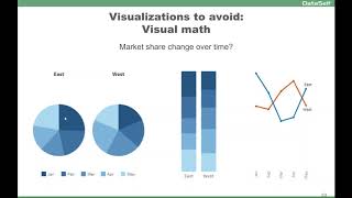
Visualizations to avoid avoid visual distortions. In this example, the user put the actual amounts on a negative bar so it looks like, no, you are declining your data expenses, but they're actually growing. So visually it's declining, but the actual story is the opposite. So do not do visual distortions. This is something happens, it's bad, Another visual distortion. If I look at this, I have the perspective of the territory 2 is usually half of my territory 1. However, it's because my legend, my axis is not using the full axis from 0 to 11, it's from 4 to 11. So when I put 0 to 11, now I can tell my territory 2 is actually not so far behind my territory 1. This is deceiving. There's a distortion here. Don't make people do. Visual math can be very hard. So if I ask what is the market share change over time? So I have different months, different territories. And if I try to understand, it's very hard using this perspective, the pie chart. If I use this perspective, so much easier. So east to west, it's a decline in May, west is less in January, east is so much bigger than west. So this is a little better to get the representation. If you use this approach, if you're trying to get the market share change over time, this is so clean, so easy to understand, is the same information in three different ways. And for this particular question, this is so much cleaner. However, this one tells me very quickly that generally in May I have about half of my sales, while in this one, March and April have about half of my sales. So different representations, different stories, but avoid visual math. Sometimes you have to put them both together to give different answers to different kind of questions. Don't use pie charts for comparing similar data points. In this example, this is three different time frames. What's going on? I can't tell. If I put in bars, I can tell the beginning it was growing and at the end of my period this is declining. So pie charts, horrible for comparing similar data points, especially change over time in 3D. Usually 3D is deceiving. If I look at this, it seems that S and D is about the same as this one. However, if I put in a bar, actually S and D is about 50% smaller. I'm sorry, this one is 50% bigger. But looking at this, you can't tell. So usually 3D charts are deceiving, so try to avoid them.