DataSelf Analytics 9 for SalesLogix
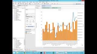
DataSelf Analytics 9 lets non-technical users build reports and dashboards from SalesLogix data using Tableau and SQL. The platform includes 5,000+ pre-built reports and claims to cut reporting work by roughly 80%. The demo shows account details, sales maps, and dual-axis charts.
Chapters
Who needs BI or who needs business intelligence and analytics? Well, typically people who need reports, dashboards and need to analyze their data are decision makers or business people or people who understand the business opportunities, the business threats and problems. Typically these people are running other people managing people, they're running the business, they're selling, they're building things. They're not necessarily IT savvy. And when these people are meeting and trying to understand what's going on, what's good and what's bad in their business, they need information from people and from reports. And with this crazy day, crazy world we have today, quite often they have new questions every day, every time and there is no reports to answer all those questions. So people who need reports, dashboards, people who need analyze their business are usually having to ask for an IT expert all the time. Can you build me a new report? Can you change this report? Can you slice and dice this report? And quite often they don't have the time to do that. They just have to make a decision. Right now they're not board meeting, they are meeting with the client and they don't have a new report. They cannot, that's a report. And then they either make a decision not well informed or they have to postpone the decision until they have information to make a decision. And that's not efficient. So business people are the ones needing reports and dashboards. And that's what we're going to be talking about here today, focusing on sales logics, data self analytics for sales logics. So how can that be solved? Well most likely if today you are working with sales logics, it's very likely that have one or maybe a few people in your organization that are the experts in reporting out of sales logics. Every time a decision maker needs something different, they got to contact this expert or expert team to ask for those things. Reality is if you are using expert centric reporting tools, you're not giving your business people information in a timely fashion. Now if you give them a user centric technology like ours, then it completely changes the scenario. Now you allow your business people to make decisions anytime, anywhere using desktop, web and mobile devices. How can we do it? Why we provide user centric technology while the other solutions for SalesLogix are expert centric. Let me tell you why. Well, this is a chart from Gartner. Gartner is one of the most reputable companies doing technology assessment for Fortune 2000 companies. You know the upper market in every year they assess how the BI and analytics players are doing the upper market making a Long story short, right now Tableau is considered the golden standard when it comes to reporting, dashboarding and ease of use analytics in the Fortune 2000 world. While Microsoft is considered one of the leaders when it comes to BI infrastructure. So these two are the best. And Tableau is by far the best of technology available out there providing reporting in dashboarding. What about them? What about data self? Well, what we provide is nothing but the very best. Using Tableau as the analytics platform. We're using BI infrastructure for Microsoft. However, we add our own secret sauce that simplifies the process. Make it easy, make it faster to deploy, maintain. And we have more than 5,000, yes, 5,000 reports, dashboards and KPIs available out of the box. So plug and play, you get not only an easy to use tool, but a ton of reports available. Make a long story short, you got the best available for Fortune 2000, but it takes hours or maybe days to deploy. So quick to deploy. We have been working with enterprise grade technology and sales logics and other mid market ERP and serum impact is for 15 years. So we know how to do this stuff. Put this stuff together and overall the solution from us, the total solution will cost you a fraction. If you try to build yourself from scratch. You can do it absolutely, but it's going to cost you. It's going to take you a year plus time with a few people and with us you can get in a few days and weeks for a fraction of the cost. So that's how we can deliver user centric technology thanks to Tableau being the leader when it comes to ease of use in dashboarding and reporting. All righty, you want to take a look at it? Let's go for it. So let me build a little story here how I'm going to go about my presentation. So first of all, I'm going to have a board meeting tomorrow. Let's assume I'm the CEO of this business, that I'm going to be showing the data. It's a sample database. I'm going to have a board meeting and I need a new dashboard because we'll be discussing many clients in detail. So I want to see detailed account manager opportunity and what customers they are working with. So one of that information for my new dashboard is just detailed information from account manager and accounts. Then we've been heavily investing in our marketing campaigns around our website and social media and I want to see if that's affecting my sales. So I want to build part of my dashboard, some charts showing the relationship between my website visitors let's say in my sales. And finally, I also want to analyze how my sales are in different regions and how my large sales are doing versus small and medium opportunities. So I'm going to build this new dashboard from scratch. And then I'm also going to look at some other out of the box reports we have available out of the 5,000, focusing on my top sales decline since last year as well as my no sales. You know, I have a lot of recurring customers and we always discuss in our board meetings who was declining the most in sales and who's no longer buying and what's going on with them. So I'm going to show this stuff which is usually related to sales logics and sales information. Let's go for it. Let's do it. So first of all, what I'm going to do is do a detailed report showing potential sales by account manager, by account, by product, and what the estimated close dates are. So I'm going to build this dashboard, this report right now. And right now I am connected to the opportunity in Sales, in SalesLogix. And here I have dimensions and measures and everything is a matter of dragging and dropping. So let's say I want to see account manager. I just drag account manager to my report, drag and drop. See, these are the account managers. I want to see potential sales, so I drag potential sales to my report. There it is. And then I want to see by estimated close date. I just drag and drop to my columns in my sample database. Those are the three years that I have. And everything here is fairly drag and drop, point and click. As you can tell, you don't need to be an expert to do these things. Well, this is a sample database, so it's not that comprehensive. But let's say I only want to focus on my estimated close date in 2014. So I can put my estimated close date in my filters and then I could choose very easily to filter by year, by quarter, by month. I want to put number 2014 and so forth. You can use fiscal periods, retail periods, whatever it is, or I can use relative date, which is fairly popular. Relative date is because usually when you're building reports and slicing your time, you want to look at things comparing to today's date, you know, this period, last quarter, this year to date, last year to date, things of that nature. So here on this relative data, I can choose, let's say years, and now I can choose this year, previous year, last number of years. If you're forecasting next three years or quarters, months, whatever it is, you Just pick and choose the time of bucket and then you know these fields and then once you do that and you click ok. Now this report will always show the last year, previous year and if I want to change to being, you know, the last three years instead I just pick and choose and the report will show that anyway. Very easy. Again it's supposed to be intuitive, it's supposed to be user centric and these things, they go a long way to help decision makers who are not it savvy to build reports like this from scratch anytime, anywhere. Alrighty. But I want to see more information. I want to see accounts. Well you just drag and drop. Let me put account in this report. So there it is. By account manager, by account, total potential sales. Maybe I want to see some opportunity information like opportunity id, drag and drop. Maybe I want to see the stage they are in. Drag and drop. You just drag and drop and you can arrange things. Let's put actually opportunity stage before maybe account manager. You name it, you just drag and drop and you get the result. Building reports like this from scratch. Sometimes people learn how to do it just by watching a demo like this. You drag and drop, you apply filters and you get the information. It's very intuitive. All righty. So this was my first part of my new information for my board meeting. The next one that I want to see is I want to see how my marketing and my website visitors are affecting my sales if there's any trend between the two. So let's build a chart analysis showing sales. So let me put my sales first here and I want to break down by month. So let's put my month in my columns. So by month I see my sales growing throughout time. Now I have website visitors that in my example is coming from Google Analytics. But this could be any kind of information about my website campaign, maybe social media information. And I'm going to drag website visitors to my report. So these are website visitors and let's make them bars. So now I have bars for website visitors and sales is aligned. Now to compare how they're affecting each other. Maybe if I put them on a dual axis approach it's going to be easier to visualize the trend. And again point and click. Drag and drop is really easy and intuitive. I'm going to choose dual access and look at that. Now website visitors in orange bars and sales is aligned blue. And now I could tell if my website visitors and my sales are related. And this would be probably a hot topic in our discussion tomorrow in our board meeting. So awesome. I think this one is a good query. Next I need to see by geography, by state, deal sizes and sales. And geography could be account address, ship to information, bill to information, whatever. There's an address component, it can be mapped. In my case, I'm going to be picking customer address, I'm going to choose the state and I have invoices here which actually has been shipped. I'm going to look at the size of the invoices, my sales and I want to put all of this on a map. And that was super easy. There it is. Let's try to understand what I just did here. So what we have here is bigger bubbles, bigger sales and then each bubble for each territory has slices which is the aggregation of large, medium and small invoices. And I think these three reports are awesome. And I can put in a dashboard for my board meeting tomorrow and let's do that right now. So I'm going to be using my iPad, so I'm going to build this dashboard for the iPad layout. So make it nice and pretty. And I want to put my map at the top and my trend analyze at the bottom. Just drag and drop and then you get it. As you can tell, it took me a few minutes to build from scratch a fairly sophisticated dashboard, but it was not complicated. Usually it does not take much time for an average computer user that knows computer stuff to learn how to drag and drop, point and click and build things from scratch that today most likely you're investing ton of hours with experts to do that to maintain those reports. These dashboards like this, they'll be automatically refreshed every time that I open these dashboards on desktop, web and mobile devices. They will have the latest information easy and fast already. But for my board meeting I also need to show my top decline in sales in my no sales. And these reports I already have available out of the box, so I don't need to build them. As I mentioned, we have more than 5,000 reports dashing the KPIs available out of the box. So let me go down in this sample list here and I want to see my top customer by sales change which shows in this out of the box report. It shows the clients growing the most in sales since last year to date. The bigger the bar, the bigger the sales increase. But also the top clients by sales decline since last year to date. And of course then I need to pay close attention to these people and see why they are declining. Is there something can be done to reverse the trend? Well, knowing who they are is the first step. Towards that and my board knows that and they keep a tight tap on my team to be sure that we're working closely with all of these individual customers, trying to reverse the trend if possible. So this is available out of the box. We have lots of reports looking at top growth and decline by product, by opportunity in the pipeline. Salesperson, you name it. Also what about no sales? Which of my recurring customers are no longer buying? And I can look at this in different time periods, maybe in the last 30 days, the last 60 days, the last year or the last two years, any kind of time bucket. This is just an example showing that you can define no sales by let's say show me in this quadrant, people who are buying the last half a year but not in the last two months. And this can be changed. But keeping track of no sales, we call this exceptional reporting is critical. I have out of the box and for my board meeting tomorrow, I'm done with building. Now I'm going to be analyzing, calling my people to understand what's going on with these people, with these customers. When the board tries to drill me, I'll have the answers. So this technology helps you shorten the time it takes to build the views and increase the time that you have to do what you have to do, which is you know your business, you understand your opportunities, your threats. Spend more time doing what you're supposed to do, not manipulating data in cost it to build new reports and dashboards. And that's only feasible because of a user centric technology powered by tableau. That's the only way. I mean that's right now the best technology available out there. And that's what we provide already. Let's go Back to our PowerPoint. So main benefits of data self analytics in a nutshell. First of all the most important is give your decision makers a tool that they will be able anytime, anywhere to make more informed decisions. Don't rely on experts. Push to these people, they are the ones who need business intelligence, they are the ones who need reports. And KPIs push a technology to them that the ones who want to do it, they can. And the way we can do that is because we use enterprise grade user centric analytics and we have more than 5,000 reports Dashlink APIs. Second, this technology will automate a lot of your reporting procedures. You know if today you're spending a lot of hours per week or per month or per year crunching data, copying and pasting, exporting, calculating, that can be usually completely automated by DataSoft Analytics. And if you're spending time distributing reports to different people. Let's say you build a report by account manager, but then you need to distribute to 20 TP account managers and then you have to build a report one per person and email one per person. And that takes a lot of time. This tool will completely automate the process. You can share information using web pages, emails, PDFs and things like that. So very easy to share information in different ways. And overall, this technology will reduce your reporting labor by about 80%. So much faster, much more efficient process. Finally, the final benefit is we provide the gold standard for analytics. It's awesome to work with the best you as a professional. Once you learn how to use this technology again, you're going to be spending less time crunching, finding data and more time making decision. And the best thing is to have the best technology available in the market, in the upper market. So you as a professional, you become more efficient and become more valuable because now you're using nothing but the very best. Alrighty, that was my presentation. We have four more minutes in this webinar. If you have questions and comments, please use the GoToWebinar panel and I'm going to try to address those questions. So let's see if we have questions. So one question here is from Alex. Can your solution combine data with my Sage erp? Alex, I'm not sure what Sage ERP you have. However, the answer is yes. Doesn't matter what ERP package you have. Let me show you here on our website. If we go to dataself.com first of all, if you come to Solutions and choose ERP CRM, you'll see here the connectors that we have available out of the box for many ERP packages. We also cover Microsoft and some other packages. Even if you don't have an ERP that we list here, we can plug to your ERP, whatever it is and combine it with SalesLogix. Absolutely, we do that all the time. A lot of the clients that use our technology for CRM, eventually they also want to use for their ERP system and other data sources. Also on my website, if you click on Solutions Overview and if you're a little bit more technical, you should also click on the Architectures button here and then here it shows how the technology works behind the scenes. So we pull data from your data sources like SalesLogix, we push to a SQL server ultralight data warehouse and then eventually we plug the Tableau web server can be deployed on premises or in the cloud and then at the end of the day your people will be able to access information using desktop web mobile devices. Alex, thank you for your question. Let's see if we have more questions here. So question here from Frank. How do you compare with SalesLogix Advanced Analytics? Frank, that's an awesome question. Let me go back to my PowerPoint advanced analytics, which is also a great technology, is powered by Typical Spotfire and Typical is right here in the Gartner magic quadrant. It's also an awesome technology, but overall this tool is more expert centric. So you have to have someone in your organization or a few people that will be spending ton of hours learning the tool and being the person to go when people want to do the new reports and dashboards. While Tableau is far better when it comes to ease of use and empowering business people with more empowering them so they can do the job by themselves. Tableau also from an IT standpoint, is a very solid solution. It has a lot of features. So even if you are an IT person, the way that you maintain Tableau, the back end system, the connectors overall is easier, faster than typical. So it's a more refined, more polished solution and more successful. And Gartner has been actually Tableau has been the leader for the past three years and they're becoming better and better every year. So again, Advanced analytics is great, but I think what we have again is the golden standard. There is nothing better. And again, if you're going to choose one between the two, I would say compare pricing to see if they make sense for your budget. And if you can afford this, which is not much more expensive and sometimes it's not more expensive at all, I would say go for the golden standard that you're going to be better off in the long run. Folks, we're running out of time so let me wrap here. By the way, this webinar is being recorded. If you come tomorrow or anytime to our resources webinars and you come to the recorded webinars, you'll find this webinar and many others and you can share with other people that may want to learn about datasoft analytics. If you want to discuss more details about what we do, how we do it, what about Tableau who are or other comparisons with other companies or other products? Please, you have my cell phone here, my email address, my Twitter account. I hope you have enjoyed the session. You have learned something new today. Have a happy Thursday and hopefully I look forward to talking with you in the near future. Thank you.










